
Table of Contents
Typography is one of the most important parts of web design.
If your headings are too big on mobile or too small on large screens, your design will not look professional.
In older methods, we had to use:
- 64px on Desktop
- 48px on Tablet
- 36px on Mobile
And control everything using media queries.
But in modern CSS — and in Divi 5 — we can use something smarter:
clamp()
With clamp(), your typography becomes automatically responsive and fluid without using breakpoints.
In this guide, I’ll explain:
- What clamp() is
- How it works
- How to calculate it
- How to use it in Divi 5
- How to create your own fluid typography system
What is clamp()?
clamp() is a CSS function that sets a value between a minimum and maximum limit.
The basic structure is: clamp(MIN, PREFERRED, MAX)
It means:
Use the preferred value, but never go below MIN and never go above MAX.
This allows your text to scale smoothly between two sizes.
Simple Example
Let’s say you write:
font-size: clamp(36px, 5vw, 64px);
This means:
- Minimum size = 36px
- Maximum size = 64px
- Between those, it scales using viewport width (vw)
So:
- On small screens → text stays 36px
- On medium screens → text grows smoothly
- On large screens → text stops at 64px
No breakpoints needed.
What is vw?
vw means viewport width.
1vw = 1% of screen width
If screen width is 1000px:
1vw = 10px
So if you use: 2vw
That equals: 20px
That’s how fluid scaling works.
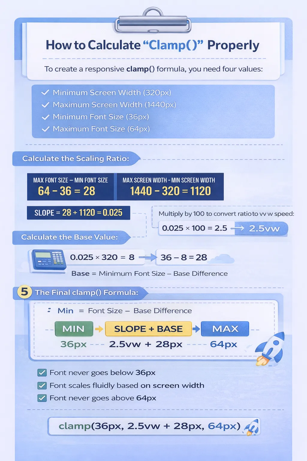
How to Calculate Clamp() Properly
To calculate a responsive clamp() formula, you need four values:
- Minimum screen width (example: 320px)
- Maximum screen width (example: 1440px)
- Minimum font size (example: 36px)
- Maximum font size (example: 64px)
Let’s calculate it step by step.
If your font should scale from 36px at 320px screen to 64px at 1440px screen, first calculate the scaling ratio:
64 − 36 = 28
1440 − 320 = 1120
28 ÷ 1120 = 0.025
Now multiply by 100 (because vw uses percentage):
0.025 × 100 = 2.5
So your scaling speed becomes: 2.5vw
Next, calculate the base value:
0.025 × 320 = 8
36 − 8 = 28
Now your final clamp formula becomes: clamp(36px, 2.5vw + 28px, 64px)
This ensures:
- Font never goes below 36px
- Font never goes above 64px
- Font scales smoothly between those sizes
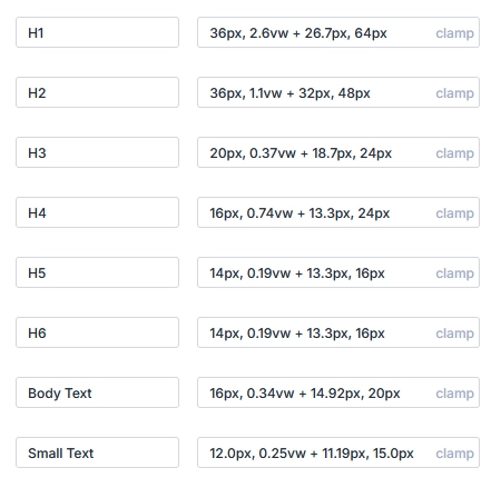
Create Typography Variables in Divi 5
You can combine this with Divi 5 Number Variables.
Example:
Create variable:
H1 Fluid Size = clamp(36px, 2.5vw + 28px, 64px)
H2 Fluid Size = clamp(30px, 2vw + 24px, 48px)
H3 Fluid Size = clamp(24px, 1.5vw + 20px, 36px)
H4 Fluid Size = clamp(20px, 1.2vw + 18px, 28px)
H5 Fluid Size = clamp(18px, 1vw + 16px, 22px)
H6 Fluid Size = clamp(16px, 0.8vw + 14px, 18px)
Now apply this variable everywhere.
If you update it once → all headings update site-wide.
That’s powerful.
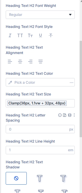
Apply Typography Variable in a Heading Module
Now let’s use it.
- Add a Heading module
- Go to Design → Heading Text
- Make sure the heading level is selected (H1, H2, etc.)
- Go to Font Size
- Hover over the Font Size field
- Click the Dynamic Content icon
- Select your created variable (example: H1 Font Size)
That’s it.
Now this heading is using your global clamp variable.
Why Clamp is Better Than Breakpoints
Old Method:
- Set different sizes for Desktop
- Set different sizes for Tablet
- Set different sizes for Mobile
- Manage multiple breakpoints
Clamp Method:
- One single line
- Smooth scaling
- No jumps between sizes
- Cleaner CSS
- Better performance
When Should You Use Clamp?
Use clamp when:
- You want smooth scaling
- You want modern responsive typography
- You want fewer breakpoints
- You want consistent design system
Avoid clamp if:
- You need very specific fixed sizes per device only
Why This Is Powerful in Divi 5
Before Divi 5:
- You had to set sizes manually
- Update headings one by one
- Manage responsive settings everywhere
With Divi 5 Variables + Clamp:
- One variable controls all headings
- Smooth responsive scaling
- Clean and structured design system
- Faster workflow
- Future-proof typography
Final Thoughts
Using clamp() in Divi 5 allows you to create fluid, professional typography without complex breakpoints.
When combined with Number Variables, you get a powerful global typography system that is:
- Easy to manage
- Fully responsive
- Scalable
- Consistent
This is the modern way to handle typography in Divi 5.
Boost your online presence with Technocrackers — your trusted partner for white label website development. Get scalable, high-performance solutions tailored for agencies and businesses.
Partner with experts, deliver more to your clients, and grow faster. Get a free consultation today.