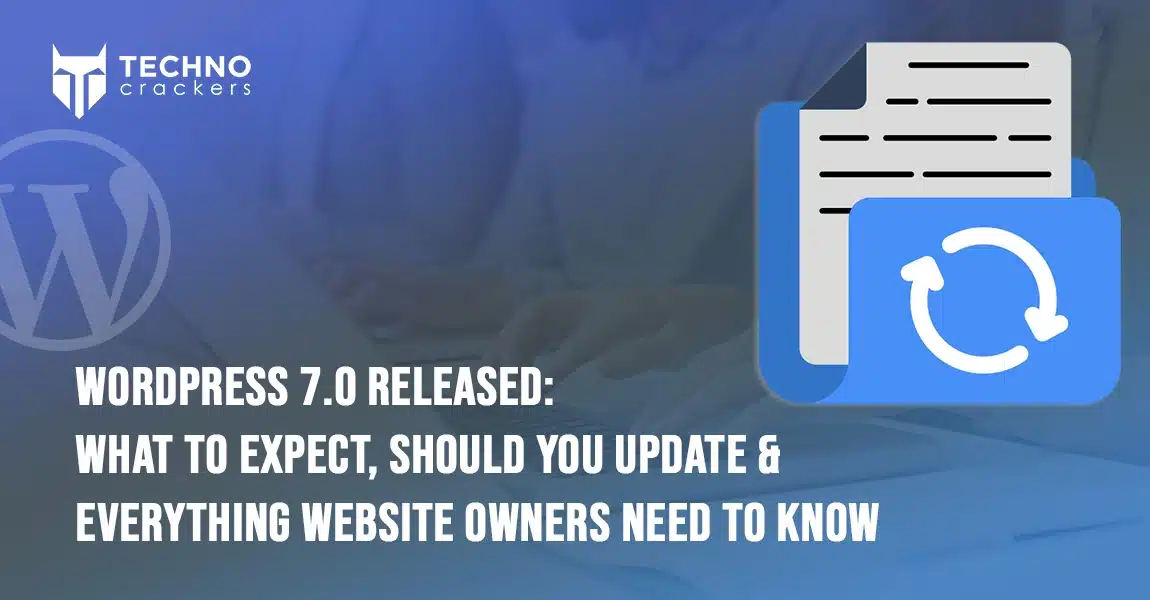
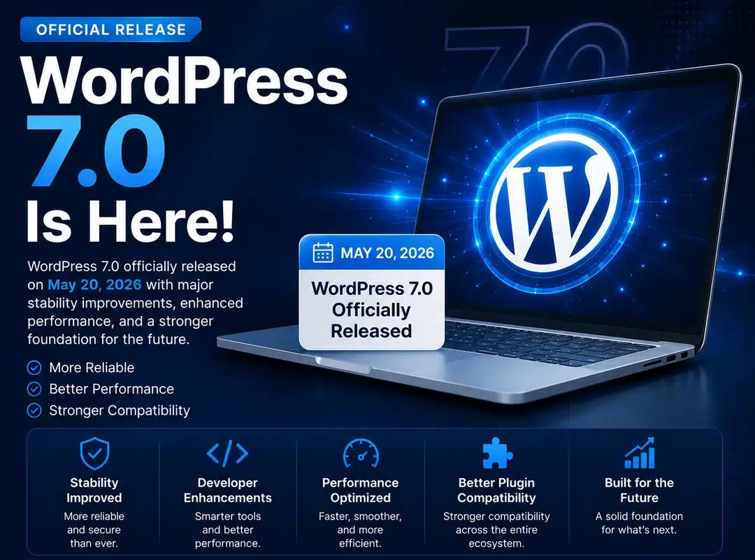
How to Use Divi 5 New Features: Menu Modules, Menu Looping & Interactions

How-to-Use-Divi-5-New-Features-Menu-Modules,-Menu-Looping-&-Interactions

Divi 5 introduces several powerful new features that give designers and developers more flexibility when building navigation and interactive elements in WordPress websites.

Among the most exciting updates are Menu Modules, Menu Looping, and Interactions. These features allow you to build custom menus, dynamic navigation systems, and interactive user experiences directly inside the Divi Visual Builder.

In this guide, we will explain these features and show you how to use them step by step.

What’s New in the Divi 5 Navigation System?

Divi 5 expands the navigation system by introducing modular menu components and advanced interaction tools.

These improvements allow users to create highly customizable navigation layouts such as:

  • Mega menus
  • Multi-level dropdown menus
  • Slide-in menus
  • Interactive navigation bars
  • Dynamic menus powered by content loops

Instead of relying on a single default menu module, Divi 5 allows you to combine different modules and interactions to create fully customized navigation structures.

The three main additions include:

  • New Menu Modules
  • Menu Looping
  • Interaction Builder

Together, these features make navigation more flexible and powerful than ever before.

1. New Menu Modules in Divi 5

Divi 5 introduces modular menu components that allow you to design navigation menus more freely.

The two most important modules used for navigation are the Link Module and the Dropdown Module.

Link Module

The Link Module allows you to place individual navigation links anywhere in your layout.

This makes it possible to build custom navigation menus without depending entirely on the default WordPress menu module.

You can use the Link Module to:

  • Add navigation links
  • Create button-style menu items
  • Build custom navigation layouts
  • Create mega menus
  • Design multi-level dropdown menus

Dropdown Module

The Dropdown Module allows you to create dropdown menus inside your navigation structure.

It can be used to:

  • Create multi-level dropdown menus
  • Organize navigation links
  • Build complex menu structures
  • Improve user navigation

By combining Link modules and Dropdown modules, you can build advanced navigation systems with multiple levels.

How to Use Divi 5 Menu Modules (Step-by-Step)

In this example, we will create a multi-level dropdown menu using Link and Dropdown modules.

custom-menu-editor

Step 1: Open the Divi Builder

  1. Go to your WordPress Dashboard
  2. Open the page or header where you want to create the menu
  3. Click Enable Divi Builder

Step 2: Add a Section and Row

Add a new section and choose a row layout.

This row will act as the container for your navigation menu.

Step 3: Add Link Modules for Main Menu Items

Inside the row column, add Link modules for your main navigation items.

Example:

  • Home
  • About
  • Gallery
  • FAQs
  • Contact

Each menu item is created using a Link module.

Step 4: Add a Dropdown Module

To create a dropdown menu:

  1. Add a Dropdown module below the parent Link module (for example under “Gallery”).
  2. Inside the Dropdown module, add multiple Link modules.

Example dropdown items:

  • Gallery 1
  • Gallery 2
  • Gallery 3
  • Gallery 4

These links will appear when the user hovers over the main menu item.

Step 5: Create a Nested Dropdown (Sub Menu)

You can also create a multi-level dropdown menu.

Inside the first dropdown, add another Dropdown module.

Example structure:

Gallery
    Gallery 1
    Gallery 2
    Gallery 3
           Gallery 3-1
           Gallery 3-2
    Gallery 4

This allows you to create deeper navigation structures.

Step 6: Configure Dropdown Settings

Inside the Dropdown module settings, configure:

Dropdown Position: Floating
Show Dropdown On: Hover

For the first dropdown:

Dropdown Direction → Below

For the second dropdown:

Dropdown Direction → Right

This setup allows:

  • First dropdown to open below the parent menu
  • Second dropdown to open to the right side

This creates a professional multi-level dropdown navigation menu.

Step 7: Customize the Menu Design

Use the Design tab to style your navigation.

You can adjust:

  • Typography
  • Colors
  • Background
  • Spacing
  • Hover effects
  • Alignment

This allows your menu to match your website’s design.

custom-menu-output

2. Menu Looping in Divi 5

Menu Looping is another powerful feature introduced in Divi 5.

It allows you to dynamically generate menu items from your WordPress menu system or other content sources.

Instead of manually creating each navigation link, Divi can automatically display menu items using loop queries.

This is especially useful when building:

  • Dynamic navigation menus
  • Category-based menus
  • Product menus
  • Large website navigation systems

How to Create Dynamic Menus with Menu Looping

In this example, we will create a dynamic menu using the Link Module Loop feature.

Step 1: Add a Link Module

First, add a Link module inside your row or menu container.

This module will be used to display menu items dynamically.

loop-menu-select-Link

Step 2: Enable Loop Option and Select Menu as Query Type

Open the Link Module settings and go to:

Content → Loop

Enable: Loop Element → ON

This tells Divi that the module should repeat dynamically.

Inside the Loop settings:

Set: Query Type → Menu

Then select the menu you want to display.

Example: Menu → Main Menu

Divi will now fetch menu items from the selected WordPress menu.

loop-menu-select-text

Step 3: Display Menu Text

In the Text field of the Link module:

Select the dynamic option: Loop Menu Text

This will automatically display the correct menu item name for each loop entry.

Now the Link module will automatically generate menu items such as:

  • Home
  • My Account
  • Checkout
  • Cart
  • Shop

Each item is dynamically pulled from the WordPress menu.

dynamically WordPress menu

Step 4: Style the Menu

Now you can style the Link module using the Design tab.

Customize:

  • Font style
  • Text color
  • Hover effects
  • Spacing
  • Alignment

This allows you to create a fully dynamic navigation menu using Divi 5.

loop-menu-output

3. Divi 5 Interactions

Divi 5 also introduces a powerful Interactions system that allows you to create interactive website elements without writing any code.

With Interactions, you can create:

  • Popup menus
  • Toggle navigation
  • Scroll animations
  • Hover effects
  • Dynamic element visibility

How Interactions Work

Divi interactions are based on three main components.

Trigger

A Trigger defines what action starts the interaction.

Examples:

  • Click
  • Hover
  • Scroll
  • Mouse movement

Effect

The Effect defines what happens when the interaction is triggered.

Examples:

  • Show element
  • Hide element
  • Toggle visibility
  • Scroll to section

Target

The Target defines which element will respond to the interaction.

This allows you to control different elements across the page.

How to add interactions in Divi 5 in menu

Divi 5 allows you to create a Mega Menu using Interactions without writing any code. In this method, we design the Mega Menu layout first and then use a button to show or hide it.

Step 1: Create the Mega Menu Layout

Add a Section or Row in the Divi Builder and design your Mega Menu (categories, products, links, etc.).
After designing it, hide the section by default.

Step 2: Add a Mega Menu Button

Add a Button or Link module in your header and name it Mega Menu.
This button will be used to open the Mega Menu.

Step 3: Open Interaction Settings

Open the Button/Link module settings and go to:
Advanced → Interactions → Add Interaction

Step 4: Set the Trigger

Set the Trigger Event to Click so the Mega Menu opens when the button is clicked.

Step 5: Set the Effect

Choose Toggle Visibility as the effect.
This will allow the Mega Menu to open and close on click.

Step 6: Select the Target Element

Select the Row or Section that contains the Mega Menu layout as the Target Module.

Now when users click the Mega Menu button, the hidden Mega Menu section will appear.

intraction-menu

Examples of What You Can Build

Using these Divi 5 features, you can build:

  • Mega menus
  • Multi-level dropdown menus
  • Dynamic navigation menus
  • Interactive navigation bars
  • Category-based menus
  • Popup navigation
  • Scroll-triggered navigation effects

These features significantly expand what you can create with Divi 5 navigation.

Benefits of Divi 5 Menu Features

More Flexibility

You are no longer limited to a single menu module.

Dynamic Content

Menu Looping automatically updates menus based on website content.

Interactive Experiences

Interactions help create engaging user experiences.

Better Customization

You can design navigation exactly the way you want.

Final Thoughts

The new Menu Modules, Menu Looping, and Interaction features in Divi 5 give designers more control than ever before.

With these tools, you can build advanced navigation systems, create dynamic menus, and add interactive elements without writing custom code.

If you want to build modern and flexible WordPress websites with Divi, these features will help you create powerful and engaging user experiences.

Need Help Building Advanced Divi or WordPress Features?

If you want to implement Divi 5 dynamic menus, loop builder features, custom interactions, or advanced WordPress functionality, the experts at TechnoCrackers can help you build powerful and scalable websites.

Book a Free Consultation and let’s discuss how we can bring your WordPress project to life.

How to Upgrade from Divi 4 to Divi 5 in WordPress (Step-by-Step Guide)

How-to-Upgrade-from-Divi-4-to-Divi-5-in-WordPress-(Step-by-Step-Guide)

Divi 5 is the newest version of the Divi theme for WordPress. It has been completely rebuilt to improve performance, speed, and the overall website-building experience.

If your website is currently using Divi 4, upgrading to Divi 5 will allow you to benefit from faster editing, improved stability, and a modern framework designed for future updates.

In this guide, we will explain how to upgrade from Divi 4 to Divi 5 step by step in simple language, so anyone can follow the process safely.

What Is Divi 5?

Divi 5 is the next generation of the Divi Builder. Instead of simply adding new features, the Divi team rebuilt the system from the ground up with a focus on performance and scalability.

Some major improvements in Divi 5 include:

  • Faster Visual Builder performance
  • Improved overall website speed
  • Cleaner and more modern code structure
  • Better scalability for large and complex websites
  • Greater flexibility for future features

These improvements make Divi 5 a faster, more efficient, and more powerful version of the Divi theme.

Things to Do Before Upgrading to Divi 5

Before starting the upgrade process, it is important to prepare your website properly.

Things to Do Before Upgrading to Divi 5

1. Backup Your Website

Always create a full backup of your website before upgrading.

Your backup should include:

  • Website files
  • WordPress database
  • Media files
  • Theme and plugin settings

You can create backups using plugins such as:

  • UpdraftPlus
  • All-in-One WP Migration
  • Your hosting provider’s backup system

Having a backup ensures that you can restore your website if anything goes wrong during the upgrade.

2. Create a Staging Website (Recommended)

It is highly recommended to perform the migration on a staging site first.

A staging site is a copy of your website where you can safely test updates without affecting your live website.

This allows you to:

  • Test the Divi 5 upgrade safely
  • Fix any issues before updating the live website
  • Avoid downtime for your visitors

3. Check Third-Party Plugins and Extensions

If your website uses third-party Divi extensions or plugins, check whether they support Divi 5.

Before upgrading:

  • Update all plugins to the latest version
  • Remove any unused plugins
  • Install Divi 5 compatible versions of extensions if available

This helps prevent compatibility issues during migration.

Methods for Update Divi5

Step-by-Step Guide to Upgrade from Divi 4 to Divi 5

Now let’s go through the complete upgrade process.

There are two ways to upgrade from Divi 4 to Divi 5.

Method 1 (Recommended): Update from Divi 4

The easiest way to upgrade is by updating your existing Divi theme.

First, make sure your website is running Divi version 4.27.6 or higher.

Steps

  1. Update your Divi theme to version 4.27.6 or later
  2. Go to your WordPress Dashboard
  3. Navigate to Divi → Dashboard

After updating to Divi 4.27.6, you will see an option that allows you to upgrade to Divi 5.

When you enable this option, WordPress will show another theme update. This update will be the latest Divi 5 version.

Simply update the theme again, and your website will be upgraded to Divi 5.

Divi Overview dashboard interface

Method 2: Manual Installation

The second method is installing Divi 5 manually.

Steps

  1. Log in to your Elegant Themes member account
  2. Download the latest Divi 5 theme file
  3. Go to your WordPress Dashboard
  4. Navigate to Appearance → Themes
  5. Click Add New
  6. Click Upload Theme
  7. Upload the Divi 5 ZIP file
  8. Install and activate the theme

This will install Divi 5 on your website.

install_theme

Run the Compatibility Check

After installing Divi 5, you need to run the Divi 5 Compatibility Check.

To do this, navigate to:

Divi → Divi 5 Migrator

The first time you open this tool, Divi will automatically run a compatibility scan.

This scan checks multiple areas of your website, including:

  • Pages
  • Posts
  • Custom Post Types
  • Theme Builder Templates
  • WooCommerce Products
  • Divi Library Items
  • Widgets
  • Presets

The system will generate a compatibility report showing if anything needs attention before migration.

divi5-migrator

Migrate Your Website

After reviewing the compatibility report, make sure all third-party extensions are updated to their Divi 5 compatible versions.

Once everything looks good, you can begin the migration process.

Steps

  1. Go back to the Divi 5 Migrator page
  2. Click Migrate This Site to Divi 5
  3. A confirmation message will appear
  4. Click Confirm to start the migration

Divi will now convert your Divi 4 layouts into the Divi 5 structure.

The migration process may take a few minutes depending on the size of your website.

divi5-migrator-complete

Understanding Backward Compatibility Mode

Divi 5 includes a feature called Backward Compatibility Mode.

This allows older Divi 4 modules and layouts to continue working even after upgrading.

Benefits include:

  • Your website will not break after upgrading
  • Older layouts can still function
  • You can migrate gradually if needed

This makes the transition from Divi 4 to Divi 5 much safer.

Migration Testing

After the migration is complete, carefully test your website.

Check the following areas:

  • Homepage layout
  • Header and footer
  • Buttons and modules
  • Contact forms
  • Mobile responsiveness
  • WooCommerce pages (if applicable)

Fix any styling or functionality issues if necessary.

Going Live

Once everything works correctly on the staging site, you can repeat the same steps on your live website.

After upgrading the live site:

  • Clear all website cache
  • Test your pages again
  • Confirm that all features are working properly

Your website will now be fully running on Divi 5.

If Something Goes Wrong

If you experience any issues during migration, you can:

  • Restore your website backup
  • Update incompatible plugins
  • Re-run the compatibility scan
  • Try migrating again after fixing the issue

This is why creating a backup and staging site is very important before upgrading.

Final Thoughts

Upgrading from Divi 4 to Divi 5 is an important step that improves your website’s performance and prepares it for future updates.

By following the steps in this guide — creating a backup, installing Divi 5, running the compatibility check, and completing the migration — you can safely upgrade your website.

Once the process is complete, you will benefit from faster performance, a smoother editing experience, and a more powerful website builder with Divi 5.

Need Help Building or Upgrading Your WordPress Website?
Whether you’re upgrading to Divi 5, improving performance, or building a fully customized WordPress website, the experts at TechnoCrackers can help you create a fast, scalable, and future-ready site.

Book a Free Consultation and let’s discuss how we can design, develop, and optimize your WordPress website.

How to Display ACF Repeater Fields Using the Loop Builder in Divi 5

How to Display ACF Repeater Fields Using the Loop Builder in Divi 5

Introduction

Dynamic content plays an important role in modern WordPress websites. Instead of manually creating repeated sections such as services, team members, or FAQs, developers can use structured data to automatically generate layouts.

The ACF Repeater Field from the Advanced Custom Fields (ACF) plugin allows you to store multiple rows of related data. With Divi 5’s Loop Builder, you can easily display this repeater data in a visually designed layout without writing custom code.

This guide explains how to use the Divi 5 Loop Builder to display ACF Repeater fields dynamically.

Understanding ACF Repeater Fields

An ACF Repeater Field lets you create a group of fields that can be repeated multiple times. Each row inside the repeater can contain the same set of subfields.

For example, you might use a repeater field to manage:

  • Services
  • Team Members
  • FAQs
  • Testimonials
  • Product Features

Each row can include fields like:

  • Title
  • Description
  • Image
  • Link

This makes content management simple and organized within the WordPress admin dashboard.

Using the Divi 5 Loop Builder with ACF Repeater Fields

Divi 5 introduces a powerful Loop Builder that can generate layouts based on dynamic data sources. One of these supported sources is ACF Repeater Fields.

Once a repeater field is configured in ACF, Divi can use it to automatically populate modules inside a loop.

Step 1: Enable the Loop Element

First, you need to enable looping for the module or element that will display the repeater data.

  1. Open the page using Divi Builder.
  2. Add the module that will display your content (for example, Text, Image, or Blurb).
  3. Open the Module Settings.
  4. Enable the Loop Element

Once enabled, the module will repeat its layout for each row inside the selected data source.

Enable the Loop Element

Step 2: Select the ACF Repeater Query

After enabling the loop option, you must define the data source.

  1. Locate the Query Type dropdown inside the loop settings.
  2. Choose ACF Repeater Field as the query source.
  3. Select the repeater field you want to use.

Divi will now read the repeater rows and generate the layout dynamically.

Select the ACF Repeater Query

Step 3: Connect Dynamic Content

Next, you need to connect the module fields to the repeater subfields.

  1. Open the module field such as Title, Content, or Image.
  2. Click the Dynamic Content icon.
  3. Choose the ACF Repeater Subfield you want to display.
  4. Click Apply.

The module will now display content from the selected repeater subfield.

Connect Dynamic Content

Step 4: Display Repeater Subfields

Each module field can display a specific type of repeater subfield.

Examples:

Text Module

  • Display repeater text fields such as title or description.

Image Module

  • Display image-type fields stored inside the repeater.

Button Module

  • Display link fields from the repeater.

Divi automatically repeats the module layout for every row in the repeater field.

Important Note About Dynamic Content

Divi’s Dynamic Content system is context-aware. This means it only shows fields that are compatible with the module setting you are editing.

For example, an ACF Image field type used inside an ACF Repeater field will not be available on text-based module fields. However, it will be avaiable on the Image module.

This ensures that only valid content types can be selected in each module.

Conclusion

Combining ACF Repeater Fields with the Divi 5 Loop Builder provides a powerful solution for building dynamic and scalable WordPress layouts. It allows you to create flexible sections that automatically update when new repeater data is added.

By using this approach, you can simplify content management while maintaining complete design control within Divi.

Need Help with WordPress or Divi Development?
Whether you need custom ACF integrations, Divi development, performance optimization, or a fully customized WordPress website, our experts at TechnoCrackers are here to help.

Book a Free Consultation today and let’s discuss how we can build smarter, faster, and more scalable WordPress solutions for your business.

Explore Elementor’s New Features: Transitions, Transform & Size Variables Explained

Explore-Elementor’s-New-Features-Transitions,-Transform-&-Size-Variables-Explained

Elementor Editor V4 introduces a major upgrade in how styles and layouts are handled. Instead of relying heavily on scattered settings and custom CSS, V4 moves toward a more structured, CSS-based design system.

The most powerful additions in Elementor Editor V4 include:

  • Transitions
  • Transform Controls
  • Size Variables

Let’s explore what’s new and how you can use these features inside Elementor Editor V4.

Transitions – Smoother, More Professional Animations

What Are Transitions?

Transitions allow elements to smoothly change from one state to another — such as hover effects, color shifts, scaling, or movement.

Previously, adding advanced transitions often required custom CSS. Now, Elementor gives you direct control inside the editor.

What You Can Control:

  • Duration (speed of animation)
  • Timing functions (ease, linear, etc.)
  • Property-specific transitions
  • Add Multiple Transitions for any css properties

Why It Matters

  • Creates a more interactive user experience
  • Makes buttons and UI elements feel responsive
  • Reduces dependency on custom CSS
  • Improves consistency across the design

How to Use Transitions in Elementor

  1. Edit any widget (Button, Image, Container, Heading, etc.)
  2. Go to the Style Tab > Effects
  3. Click on Transition   
  4. Add Transition properties like:
    • Duration (e.g., 0.3s)
    • Transition type Specific CSS properties (background-color, transform, opacity, etc.)

You can even add multiple transitions for different CSS properties.

transitions

Transform – Advanced Visual Effects Without Code

What Is Transform?

The Transform feature allows you to visually manipulate elements by:

  • Scaling
  • Rotating
  • Skewing
  • Translating (moving on X and Y axis)

All without writing a single line of CSS.

Why This Is Powerful

Transform opens up modern design possibilities like:

  • Dynamic card hover effects
  • Tilted background elements
  • Floating image layouts
  • Creative hero sections

Previously, these effects required manual CSS transforms. Now, everything is accessible directly inside Elementor’s visual controls.

How to Use Transform in Elementor

  1. Select the widget or container
  2. Go to Style Tab > Effects
  3. Open Transform
  4. Choose:
    • Normal State or Hover State
  5. Adjust:
    • Rotate
    • Scale
    • Offset (X/Y movement)
    • Skew

You can apply different transform values for hover to create interactive effects.

transform_options

Size Variables – Smarter, Consistent Spacing & Layout Control

What Are Size Variables?

Size Variables allow you to define reusable spacing values (like padding, margin, gap sizes) globally and apply them across your website.

Instead of manually entering pixel values everywhere, you can define structured spacing rules.

Benefits:

  • Consistent design system
  • Faster development workflow
  • Easier future updates
  • Cleaner and scalable layouts

For example:

  • Small spacing = 8px
  • Medium spacing = 16px
  • Large spacing = 32px

Update once → changes reflect everywhere.

This brings Elementor closer to professional design systems used in large-scale web applications.

How to Use Size Variables in Elementor Editor V4

Elementor V4 makes it very easy to create and apply Size Variables directly from the editor. Follow these steps:

  1. Edit Any Page in Elementor
    Open the page using Elementor Editor V4.
  2. Select the Element
    Click on any widget or container where you want to adjust spacing or typography (padding, margin, gap, font-size, etc.).
  3. Hover Over a Size Field
    When you hover over a size-related field (such as padding, margin, or font-size), you’ll see a Variable icon next to the input field.
  4. Click the Variable Icon
    Click the icon to:

    • Select an existing Size Variable
    • Or create a new one
  5. Create Size Variables
    You can define structured spacing values such as:

    • XS → 4px
    • S → 8px
    • M → 16px
    • L → 32px
  6. Apply the Variable
    Instead of manually entering pixel values, select your created variable from the list.

Why This Is Powerful

If you later update the “M” variable from 16px to 20px, every element using that variable across the entire website will update automatically.

This ensures:

  • Consistent spacing
  • Faster global design updates
  • A scalable and maintainable design system

Size Variables in Elementor V4 help you build websites the way professional front-end systems work — structured, consistent, and future-ready.

variable-manager

Why These Features Matter for Businesses

These updates aren’t just visual improvements — they impact:

Performance

Less custom CSS and third-party animation plugins.

Maintainability

Structured variables mean easier updates later.

Modern UI/UX

Smooth transitions and transforms align with current design trends.

Faster Development

Developers can build advanced layouts directly within Elementor.

Real-World Impact on Client Websites

At our IT company, we focus on creating websites that are:

  • Visually engaging
  • Performance-optimized
  • Scalable
  • Easy to maintain

With these new Elementor capabilities, we can now deliver:

  • Cleaner animations
  • Better interactive experiences
  • Consistent design systems
  • Faster project turnaround

Final Thoughts

Elementor’s new Transitions, Transform, and Size Variables features represent a major step forward in visual design control and workflow optimization.

Whether you’re a business owner looking for a modern website or a developer aiming to streamline production, these tools help build better WordPress websites — without increasing complexity.

If you’re planning to upgrade your site or build a new one using Elementor, now is the perfect time to leverage these powerful improvements.

Take Your WordPress Website to the Next Level
At TechnoCrackers, we specialize in WordPress development, Elementor customization, performance optimization, and scalable website architecture for businesses and agencies.

Book a Free Consultation and let’s turn your website idea into a high-performing digital experience.

Elementor Editor V4 Beta Released – Explore Atomic Elements, Variables & Flexbox New Features

Elementor-Editor-V4-Beta-Released-–-Explore-Atomic-Elements,-Variables-&-Flexbox-New-Features

The much-anticipated Editor V4 Beta has officially arrived in Elementor — bringing a major architectural shift to how we design websites in WordPress.

With the introduction of Atomic Elements, Variables Manager, and improved Flexbox layouts, Elementor is moving toward a cleaner, faster, and more scalable design system.

In this article, we’ll explore what’s new in Elementor Editor V4 Beta, how it works, and whether you should start using it in your projects.

What Is Elementor Editor V4?

Elementor Editor V4 is a redesigned editing experience that replaces the traditional Section → Column → Widget structure with a more modern, CSS-driven architecture.

Instead of nested sections and columns, V4 focuses on:

  • Div-based structure
  • Native Flexbox layout
  • Atomic components
  • Design variables (like design tokens)

This makes Elementor more aligned with modern front-end development standards.

1. Atomic Elements – A Cleaner Structure

One of the biggest upgrades in Editor V4 is Atomic Elements.

Atomic_elements

Instead of heavy widget wrappers, you now get simplified elements like:

  • Div Block
  • Flexbox
  • Tabs
  • Heading
  • Paragraph
  • Button
  • Etc..

These are lightweight and modular — meaning:

  • Less DOM output
  • Cleaner HTML structure
  • Better performance
  • More control over styling

Why Atomic Elements Matter

Traditional Elementor layouts could become deeply nested, especially for complex pages. Atomic Elements reduce unnecessary markup, helping improve:

  • Page speed
  • Maintainability
  • Scalability

For developers and advanced designers, this is a huge win.

2. Variables Manager – Design Once, Use Everywhere

The new Variables Manager is one of the most powerful additions in V4.

You can now define reusable design values such as:

  • Colors
  • Typography sizes
  • Spacing
  • Custom values

Variable_manager

Example:

Instead of manually setting padding to 40px on multiple sections, you create a variable:

–section_padding: 40px;

Apply it everywhere.

Later, change the value once → update across the entire website.

Why This Is Powerful

  • Consistent design system
  • Faster global updates
  • Easier client revisions
  • Cleaner workflow

This brings Elementor closer to professional design systems used in modern web development.

3. Improved Flexbox Layout Control

Flexbox was introduced earlier, but in Editor V4 it becomes more refined and central.

You now get better control over:

  • Alignment
  • Direction
  • Gap
  • Wrapping
  • Justify content

This makes layout creation:

  • More responsive
  • More flexible
  • More developer-friendly

Compared to the old column system, Flexbox offers greater control with less complexity.

Flex_box

4. Cleaner Custom CSS Handling

Editor V4 improves how custom CSS works inside Elementor.

Benefits include:

  • More stable CSS application
  • Better element targeting
  • Improved performance

For users who frequently add custom styles, this makes development smoother and more predictable.

New Elementor CSS feature comparison

Performance & DOM Improvements

With Atomic Elements and reduced nesting, Elementor V4 aims to:

  • Decrease DOM size
  • Improve load speed
  • Enhance front-end output

This is especially important for SEO and Core Web Vitals.

Elementor V4 performance and DOM improvements

Should You Use Elementor V4 Beta Now?

Since this is still a Beta version, here’s what you should know:

Good For:

  • Testing on staging sites
  • New experimental projects
  • Learning new workflow

Not Recommended For:

  • High-traffic production websites
  • Critical client projects

Always test thoroughly before using it live.

Final Thoughts

Elementor Editor V4 Beta marks a significant step forward for the platform.

With:

  • Atomic Elements
  • Variables Manager
  • Improved Flexbox
  • Cleaner architecture

Elementor is clearly evolving toward a more professional and scalable page-building system.

If you’re a designer or developer working with WordPress, this update is definitely worth exploring — especially for future-proofing your workflow.

Want expert help implementing Elementor or building high-performance WordPress websites?

Partner with Technocrackers for professional white label website development, custom WordPress solutions, and performance optimization. Get a free consultation today and scale your digital projects faster.

FAQ

Is Elementor Editor V4 stable?

Currently, it is in Beta. Use it carefully on non-production environments.

Will Elementor V4 break existing websites?

No immediate changes apply to existing sites unless you enable V4 features, but testing is strongly recommended.

Is Atomic Elements better for performance?

Yes, because they reduce unnecessary markup and improve DOM structure.

Divi Builder Not Loading After Update? Here’s How to Fix It

Divi Builder Not Loading After Update Here’s How to Fix It

Did your Divi Builder stop loading after a recent update?

Maybe you’re seeing:

  • A blank white screen
  • Infinite loading spinner
  • “Loading…” stuck forever
  • Builder not opening on the front-end
  • Visual Builder crashes

Don’t worry — this is a common issue after updating Divi, WordPress, or plugins. In most cases, it can be fixed in a few simple steps.

In this guide, I’ll show you exactly how to fix Divi Builder not loading after an update.

Why Divi Builder Stops Loading After an Update

This usually happens because of:

  • Plugin conflicts
  • PHP memory limit issues
  • Outdated theme or WordPress version
  • JavaScript errors
  • Caching problems
  • Server configuration issues

Let’s fix it step by step.

Step 1: Clear All Caches (Very Important)

Before doing anything technical, clear:

  • Browser cache
  • WordPress caching plugin cache
  • Hosting cache (if using server-level caching)
  • CDN cache (like Cloudflare)

After clearing cache, reload the page in Incognito mode.

Many times, this alone fixes the issue.

clear-cache

Step 2: Disable Static CSS File Generation

Sometimes static CSS causes problems.

For Divi 4 Go to: Divi → Theme Options → Builder → Advanced

Disable:

  • Static CSS File Generation

Save and clear cache.

clear-cache-divi4

For Divi 5 Go to: Divi → Theme Options = click on clear css cache

clear-cache-divi5

Step 3: Check for Plugin Conflicts

Plugin conflicts are the most common cause.

How to Test:

  1. Go to WordPress Dashboard → Plugins
  2. Deactivate all plugins

If it works now, one of your plugins is causing the issue.

Now reactivate plugins one by one to find the problem plugin.

Once found:

  • Update that plugin
  • Replace it
  • Or contact the developer

Plugin conflict troubleshooting guide

Step 4: Increase PHP Memory Limit

Sometimes updates require more memory.

Add this line to your wp-config.php file:

define(‘WP_MEMORY_LIMIT’, ‘256M’);

If that doesn’t work, contact your hosting provider and ask them to increase:

  • memory_limit
  • max_execution_time

Recommended values:

  • memory_limit → 256M or 512M
  • max_execution_time → 300

Increasing PHP memory in WordPress

Step 5: Enable Safe Mode in Divi

Divi has a built-in Safe Mode feature.

Go to: Divi → Support Center

Enable Safe Mode.

Safe Mode disables third-party plugins for your session only.

If the Builder loads in Safe Mode, then you definitely have a plugin conflict.

divi-safe-mode

Step 6: Check Browser Console for Errors

If Builder still does not load:

  1. Right click → Inspect
  2. Go to Console tab
  3. Look for red errors

Common issues:

  • JavaScript errors
  • Failed script loading
  • 403 or 500 server errors

If you see errors related to a plugin file, that plugin is the problem.

errors

Step 7: Reinstall Divi Theme

Sometimes the update files get corrupted.

To reinstall:

  1. Download latest Divi version from Elegant Themes
  2. Go to Appearance → Themes
  3. Click Add New → Upload Theme
  4. Upload fresh Divi zip file

Do NOT delete the existing Divi theme — just overwrite it.

Step 8: Check WordPress and PHP Version

Make sure you are using:

  • Latest stable WordPress version
  • PHP 8.0 or higher (recommended)

Old PHP versions often cause Builder issues after updates.

You can check PHP version inside:

Hosting Panel → PHP Settings

wp_update

Step 9: Check Hosting Firewall or ModSecurity

Some hosting firewalls block AJAX requests.

Contact your hosting provider and ask:

“Can you check if ModSecurity or firewall is blocking admin-ajax.php?”

This is a common hidden issue.


If Modesecurity is Enable then “Disable” it and check.


Quick Checklist Summary

If Divi Builder is not loading after update:

  • Clear all caches
  • Deactivate plugins
  • Increase memory limit
  • Enable Divi Safe Mode
  • Check browser console
  • Reinstall Divi
  • Update PHP version
  • Check hosting firewall

One of these steps will fix the issue in most cases.

How to Prevent This Issue in Future

Before updating:

  • Always take a backup
  • Update plugins first
  • Update Divi
  • Then update WordPress
  • Test on staging site if possible

This reduces risk of breaking your site.

Final Thoughts

Divi Builder not loading after an update can look scary, but in most cases it’s caused by:

  • Plugin conflict
  • Low server memory
  • Cache issue

Follow the steps above calmly and you’ll fix it quickly.

Need expert help fixing Divi or WordPress issues? Partner with Technocrackers for professional WordPress support, white label development, and performance optimization. Get a free consultation today and keep your website running flawlessly.

How to Make Typography Automatically Responsive in Divi 5 Using Clamp() Variables

How to Make Typography Automatically Responsive in Divi 5 Using Clamp() Variables

Typography is one of the most important parts of web design.
If your headings are too big on mobile or too small on large screens, your design will not look professional.

In older methods, we had to use:

  • 64px on Desktop
  • 48px on Tablet
  • 36px on Mobile

And control everything using media queries.

But in modern CSS — and in Divi 5 — we can use something smarter:

clamp()

With clamp(), your typography becomes automatically responsive and fluid without using breakpoints.

In this guide, I’ll explain:

  • What clamp() is
  • How it works
  • How to calculate it
  • How to use it in Divi 5
  • How to create your own fluid typography system

What is clamp()?

clamp() is a CSS function that sets a value between a minimum and maximum limit.

The basic structure is: clamp(MIN, PREFERRED, MAX)

It means:

Use the preferred value, but never go below MIN and never go above MAX.

This allows your text to scale smoothly between two sizes.

Simple Example

Let’s say you write:

font-size: clamp(36px, 5vw, 64px);

This means:

  • Minimum size = 36px
  • Maximum size = 64px
  • Between those, it scales using viewport width (vw)

So:

  • On small screens → text stays 36px
  • On medium screens → text grows smoothly
  • On large screens → text stops at 64px

No breakpoints needed.

What is vw?

vw means viewport width.

1vw = 1% of screen width

If screen width is 1000px:

1vw = 10px

So if you use: 2vw

That equals: 20px

That’s how fluid scaling works.

How to Calculate Clamp() Properly

To calculate a responsive clamp() formula, you need four values:

  1. Minimum screen width (example: 320px)
  2. Maximum screen width (example: 1440px)
  3. Minimum font size (example: 36px)
  4. Maximum font size (example: 64px)

Let’s calculate it step by step.

If your font should scale from 36px at 320px screen to 64px at 1440px screen, first calculate the scaling ratio:

64 − 36 = 28
1440 − 320 = 1120

28 ÷ 1120 = 0.025

Now multiply by 100 (because vw uses percentage):

0.025 × 100 = 2.5

So your scaling speed becomes: 2.5vw

Next, calculate the base value:

0.025 × 320 = 8
36 − 8 = 28

Now your final clamp formula becomes: clamp(36px, 2.5vw + 28px, 64px)

This ensures:

  • Font never goes below 36px
  • Font never goes above 64px
  • Font scales smoothly between those sizes

Calculate Clamp()

Create Typography Variables in Divi 5

You can combine this with Divi 5 Number Variables.

Example:

Create variable:

H1 Fluid Size = clamp(36px, 2.5vw + 28px, 64px)

H2 Fluid Size = clamp(30px, 2vw + 24px, 48px)

H3 Fluid Size = clamp(24px, 1.5vw + 20px, 36px)

H4 Fluid Size = clamp(20px, 1.2vw + 18px, 28px)

H5 Fluid Size = clamp(18px, 1vw + 16px, 22px)

H6 Fluid Size = clamp(16px, 0.8vw + 14px, 18px)   

Now apply this variable everywhere.

If you update it once → all headings update site-wide.

That’s powerful.

Create Heading Typography Variables

Apply Typography Variable in a Heading Module

Now let’s use it.

  1. Add a Heading module
  2. Go to Design → Heading Text
  3. Make sure the heading level is selected (H1, H2, etc.)
  4. Go to Font Size
  5. Hover over the Font Size field
  6. Click the Dynamic Content icon
  7. Select your created variable (example: H1 Font Size)

That’s it.

Now this heading is using your global clamp variable.

Apply Typography Variable in a Heading Module

Why Clamp is Better Than Breakpoints

Old Method:

  • Set different sizes for Desktop
  • Set different sizes for Tablet
  • Set different sizes for Mobile
  • Manage multiple breakpoints

Clamp Method:

  • One single line
  • Smooth scaling
  • No jumps between sizes
  • Cleaner CSS
  • Better performance

When Should You Use Clamp?

Use clamp when:

  • You want smooth scaling
  • You want modern responsive typography
  • You want fewer breakpoints
  • You want consistent design system

Avoid clamp if:

  • You need very specific fixed sizes per device only

Why This Is Powerful in Divi 5

Before Divi 5:

  • You had to set sizes manually
  • Update headings one by one
  • Manage responsive settings everywhere

With Divi 5 Variables + Clamp:

  • One variable controls all headings
  • Smooth responsive scaling
  • Clean and structured design system
  • Faster workflow
  • Future-proof typography

Final Thoughts

Using clamp() in Divi 5 allows you to create fluid, professional typography without complex breakpoints.

When combined with Number Variables, you get a powerful global typography system that is:

  • Easy to manage
  • Fully responsive
  • Scalable
  • Consistent

This is the modern way to handle typography in Divi 5.

Boost your online presence with Technocrackers — your trusted partner for white label website development. Get scalable, high-performance solutions tailored for agencies and businesses.

Partner with experts, deliver more to your clients, and grow faster. Get a free consultation today.

Divi 5 Number Variables: The Smart Way to Manage Section Spacing Globally

Divi 5 Number Variables The Smart Way to Manage Section Spacing Globally

Consistent spacing is one of the most important parts of professional web design. Proper section padding — especially left and right spacing based on device width — improves readability, user interaction, and overall design balance.

In many other theme builders, if you want the same spacing across multiple sections or site-wide, you must manually add padding and margins to each section. And if you later decide to adjust spacing? You have to update every section one by one.

Thankfully, Divi 5 solves this problem with Number Variables and Presets.

In this guide, I’ll show you how to set up global spacing in Divi 5 the smart way.

Step 1: Create Global Spacing Variables

First, we create reusable spacing variables.

How to Create Number Variables

  1. Edit any page with Divi 5
  2. Go to Variables
  3. Click Number Variable
  4. Create spacing variables based on your breakpoints

For example, I created these:

  • Large Desktop Padding = 80px
  • Desktop Padding = 60px
  • Tablet Padding = 40px
  • Mobile Padding = 20px

After creating them, click Save Variables.

Now your spacing values are stored globally and can be reused anywhere on the site.

spacing_variable

Step 2: Apply Variables to a Section

Now let’s apply these variables to a section and make them global.

  1. Create or edit any section
  2. Go to Design → Spacing
  3. Open Padding
  4. Click the Responsive icon (hover over the Padding label to see it)

You’ll now see padding controls for different breakpoints.

Assign Your Number Variables

Hover over the padding input field (Top/Bottom or Left/Right).
You will see the Dynamic Content icon.

Click the icon and select the spacing variable you created.

Here’s the setup I use:

Section Top & Bottom Spacing

  • 80px on all breakpoints

Section Left & Right Spacing

  • Large Desktop → 80px
  • Desktop → 60px
  • Tablet → 40px
  • Mobile → 20px

Your layout will now automatically adjust based on device size.

Test it on the frontend to confirm everything looks correct.

If spacing needs adjustment, simply edit the variable once — and it updates everywhere.

That’s the power of variables.

assign_spacing

Step 3: Save as a Global Spacing Preset

Once your spacing is perfect:

  1. Go to Design → Spacing
  2. Click the Preset icon (top right of the Spacing panel)
  3. Choose Create New Preset From Current Styles
  4. Give it a name (example: Global Section Spacing)
  5. Save it

Now you can apply this preset to any section across your entire website with one click.

You can even create multiple spacing presets for different layout styles.

preset

Why This Is Better Than Other Builders

In most theme builders:

  • You manually set padding for each section
  • Global changes require editing every section
  • Maintaining consistency becomes time-consuming

In Divi 5:

  • Spacing values are centralized
  • One update changes everything
  • Design consistency is guaranteed
  • Your workflow becomes faster and cleaner

Final Result

Using Divi 5 Number Variables + Presets, you can:

  • Maintain perfect spacing consistency
  • Save development time
  • Easily update spacing site-wide
  • Build cleaner, scalable layouts

This method is ideal for professional designers who want a structured, system-based design approach instead of manual styling everywhere.

If you want expert help implementing advanced Divi development techniques or scalable website solutions, consider working with professional web development experts.

Partner with Technocrackers for professional white label WordPress development, custom website design, and performance optimization. Get a free consultation today and build high-performance websites faster.

Contact us

Let's Unleash Your Digital Potential Together.

Address

C-605, Ganesh glory 11, Nr. BSNL Office, Jagatpur Road, S.G. Highway, Jagatpur, Ahmedabad, India - 382481.

Phone

INDIA : (091) 8200639242 USA : +1 (310) 868-6009

Limited Time Offer

X

Try a Free 2-Hour Test Task

Experience our quality, speed, and communication on any small WordPress task before you commit. No contract. No cost. No obligation.
[For New Agency Partners]

"*" indicates required fields

Name*