





Table of Contents
- What Is a Tooltip?
- Why Use JetTricks for Elementor Tooltips?
- What You Need
- Step 1: Enable the Tooltip Extension
- Step 2: Add a Widget in Elementor
- Step 3: Enable the Tooltip
- Step 4: Add Tooltip Content
- Step 5: Choose the Tooltip Position
- Step 6: Add or Remove the Tooltip Arrow
- Step 7: Select an Animation
- Step 8: Select the Tooltip Trigger
- Step 9: Control Tooltip Visibility on Different Devices
- Step 10: Configure Follow Cursor
- Step 11: Set the Tooltip Delay
- Step 12: Adjust the Offset and Distance
- Step 13: Configure the Z-Index
- Step 14: Choose Where the Tooltip Is Added
- Step 15: Use a Custom Selector
- Step 16: Style the Tooltip
- Step 17: Preview the Tooltip
- Example: Add a Tooltip to an Image
- Step 1: Add the Image
- Step 2: Enable JetTricks
- Step 3: Add the Description
- Step 4: Configure the Interaction
- Step 5: Style the Tooltip
- Step 6: Test It
- When Should You Use Tooltips?
- Conclusion
Tooltips are a simple way to provide additional information without adding extra content directly to your page layout. A tooltip can appear when a visitor interacts with an element, allowing you to explain an image, heading, table, icon, or another page element without taking up permanent space.
With JetTricks, you can add customizable tooltips to Elementor widgets and control their content, position, animation, trigger, visibility, and appearance. JetTricks also supports tooltip settings for different devices, making it easier to create responsive interactions.
In this guide, we’ll show you how to add and customize a tooltip effect in Elementor using JetTricks.
What Is a Tooltip?
A tooltip is a small information box that appears when a visitor interacts with a specific element on a webpage.
For example, you could use a tooltip to:
- Explain an unfamiliar icon.
- Provide additional information about an image.
- Add a short description to a heading.
- Explain a feature or service.
- Provide additional information without making the page longer.
- Add helpful hints to interactive elements.
Instead of displaying all the information permanently, you can keep the interface clean and reveal additional details only when they are needed.
Why Use JetTricks for Elementor Tooltips?
JetTricks provides dedicated tooltip controls inside Elementor, so you don’t have to build the effect manually with custom CSS or JavaScript.
You can control settings such as:
- Tooltip content
- Position
- Arrow visibility
- Animation
- Trigger
- Device visibility
- Cursor behavior
- Delay
- Offset
- Distance
- Z-index
- Tooltip container
- Custom selector
- Typography
- Background
- Width
- Text alignment
JetTricks also allows the tooltip content to come from either an editor field or an Elementor template, giving you flexibility when creating more advanced tooltip designs.
What You Need
Before creating the tooltip, make sure you have:
- A WordPress website
- Elementor installed
- JetTricks installed and activated
- A page or template that you can edit with Elementor
JetTricks provides visual effects and interactive features for Elementor, including tooltips, hotspots, unfold effects, parallax, sticky elements, and other effects.
Step 1: Enable the Tooltip Extension
First, you need to activate the tooltip functionality in JetTricks.
From your WordPress dashboard, go to:
JetPlugins → JetTricks → Widgets & Extensions
Look for the Tooltip Widget Extension option and enable it.
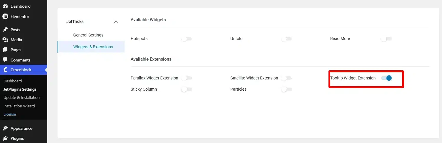
The settings are saved automatically after enabling the extension.
Once enabled, you can configure tooltips directly from the Elementor editor.
Step 2: Add a Widget in Elementor
Open the page where you want to create the tooltip and click Edit with Elementor.
Add the widget that you want to use as the tooltip trigger.
For example, you can add an Image widget.
You can also use tooltips with other suitable Elementor elements, such as:
- Images
- Headings
- Text elements
- Tables
- Icons
- Other widgets
The idea is to attach the tooltip to an existing widget rather than creating a separate tooltip element.
Step 3: Enable the Tooltip
Select the widget you want to use.
Then open: Advanced → JetTricks
Find the tooltip settings and enable:
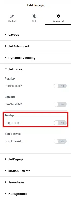
Use Tooltip?
Once enabled, the tooltip configuration options will become available.
Step 4: Add Tooltip Content
JetTricks allows you to choose how the tooltip content will be created.
The Content Type option provides two choices:
- Editor
- Template
Editor
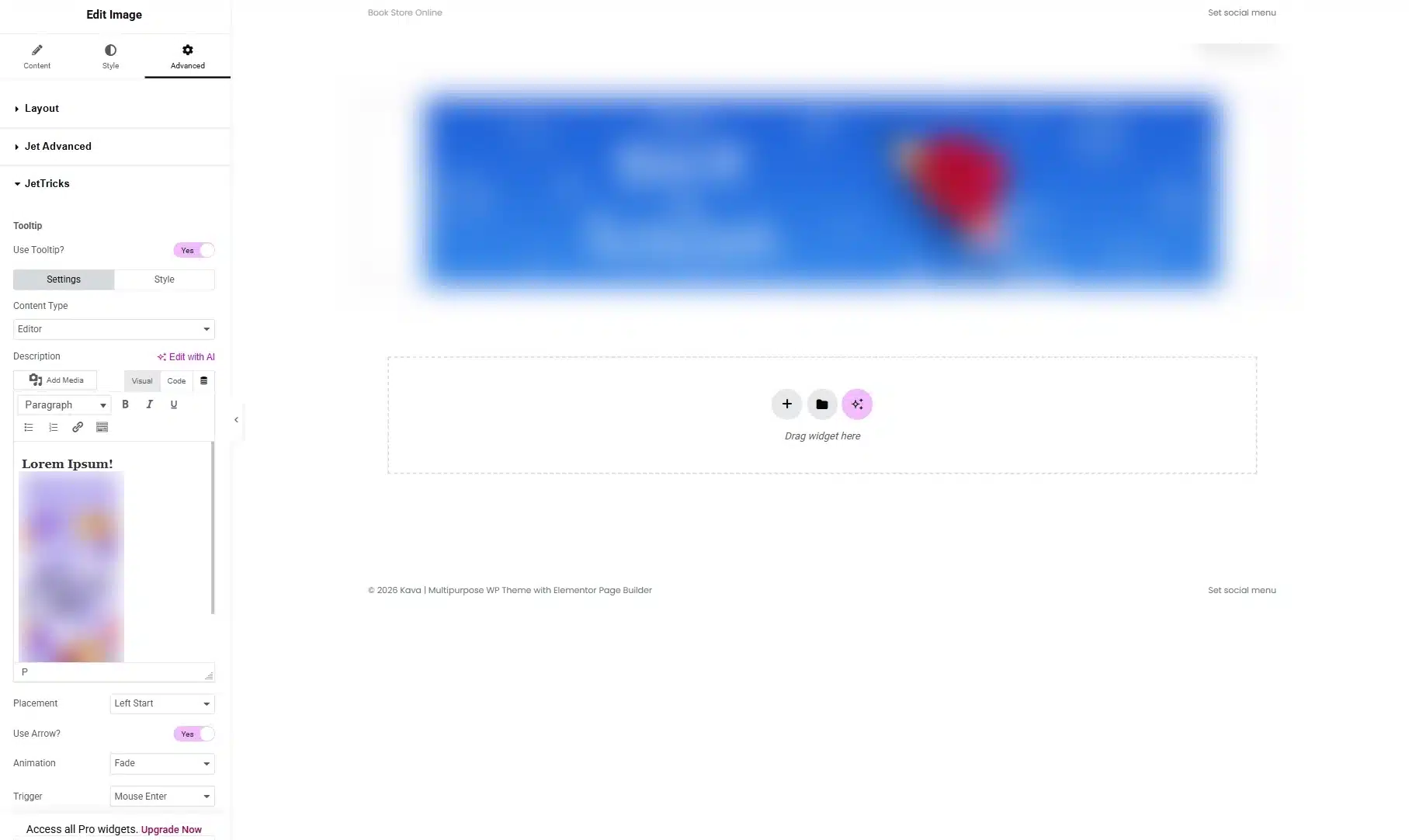
The Editor option allows you to enter the tooltip content directly into the widget settings.
You can use this option when you need a simple tooltip containing text, an image, an icon, or other basic content.
For example, if you have an image showing a product feature, your tooltip could provide a short explanation of that feature.
Template
The Template option allows you to use an Elementor template as the tooltip content.
This is useful when you need a more structured tooltip design instead of simple text.
You can create an Elementor template containing multiple elements and then select that template as the tooltip content.
This gives you more control over the appearance and layout of complex tooltip content.
Step 5: Choose the Tooltip Position
Next, configure where the tooltip should appear relative to the widget.
The Placement option lets you select the tooltip’s position.
Depending on your design, you can position the tooltip above, below, or beside the target element.
Choose a position that doesn’t interfere with nearby content.
For example:
- Use Top when there is enough space above the widget.
- Use Bottom when the widget is close to the top of the page.
- Use Left or Right when the layout has sufficient horizontal space.
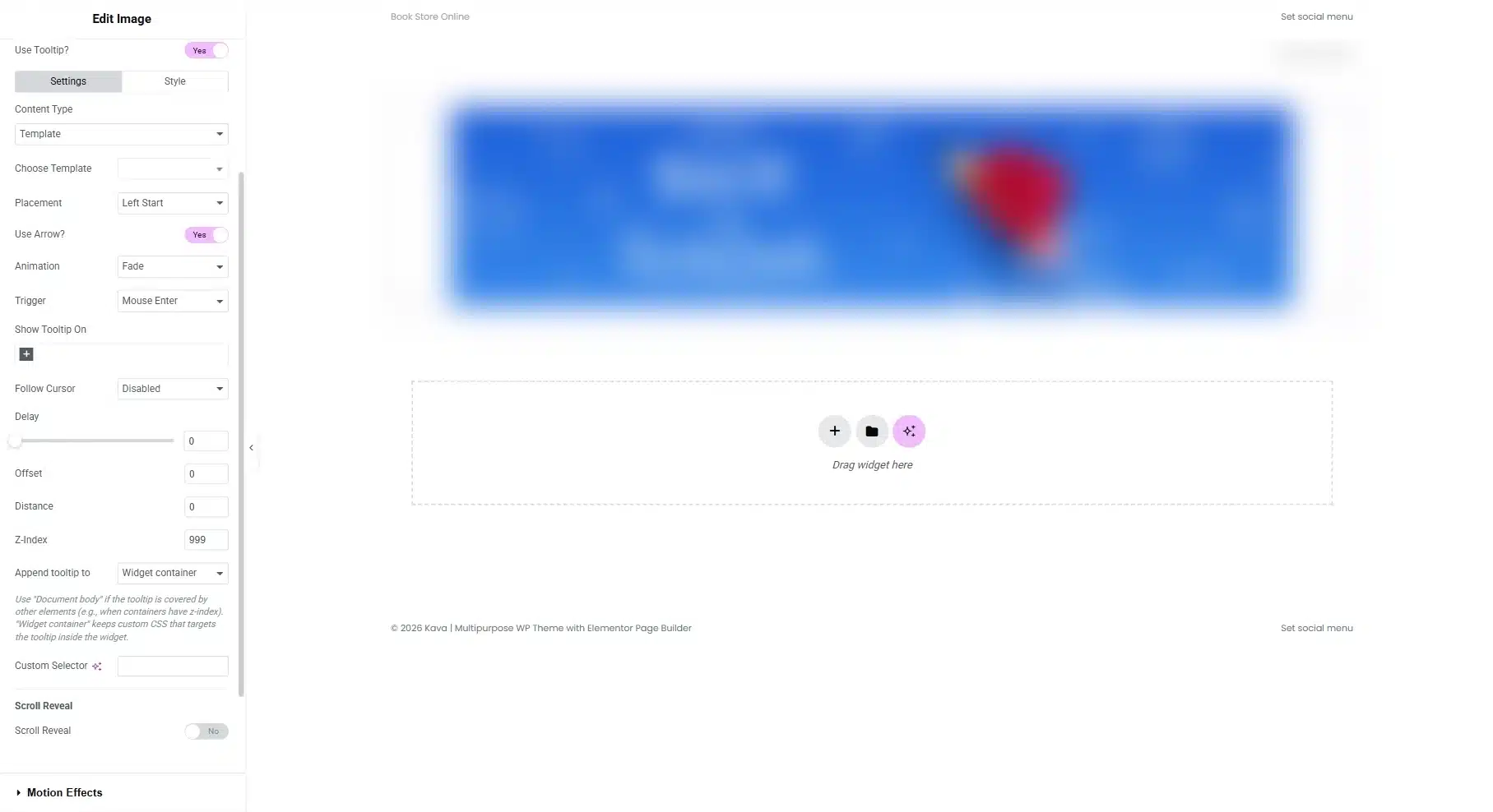
You can also fine-tune the position later using the offset settings.
Step 6: Add or Remove the Tooltip Arrow
JetTricks includes a Use Arrow? option.
When enabled, a small arrow appears between the tooltip and the target element.
The arrow helps visitors understand which element the tooltip belongs to.
You can disable the option if you prefer a cleaner tooltip design without an arrow.
Step 7: Select an Animation
The Animation setting controls how the tooltip appears.
Choose an animation that matches the overall interaction style of your website.
A subtle animation such as a fade effect can work well for informational tooltips, while other animation options can create a more noticeable interaction.
Avoid using overly dramatic animations for tooltips that contain important information because the effect could distract visitors.
Step 8: Select the Tooltip Trigger
The Trigger setting determines what interaction causes the tooltip to appear.
Depending on your configuration, you can choose an appropriate interaction such as hover or focus.
For desktop interfaces, hover can be useful because users can quickly preview additional information.
For accessibility and keyboard interactions, focus-based behavior can also be useful.
Choose the trigger based on how visitors are expected to interact with the element.
Step 9: Control Tooltip Visibility on Different Devices
One useful feature is the ability to determine which devices should display the tooltip.
The Show Tooltip On setting allows you to select devices such as:
- Desktop
- Tablet Portrait
- Mobile Portrait
This is especially useful because hover-based interactions don’t work the same way on touch devices.
For example, you might display a tooltip on desktop and tablet but use a different interaction strategy on mobile.
JetTricks’ newer versions also provide device-based tooltip visibility controls for Elementor and Gutenberg.
Step 10: Configure Follow Cursor
The Follow Cursor option determines whether the tooltip remains fixed near the target element or follows the visitor’s cursor.
If it is disabled, the tooltip stays positioned relative to the selected element.
If enabled, the tooltip can move along with the cursor.
This can be useful for certain interactive designs, but a fixed tooltip may be easier to read for standard informational content.
Step 11: Set the Tooltip Delay
The Delay setting controls how quickly the tooltip appears or disappears after the trigger occurs.
A short delay can prevent the tooltip from appearing accidentally when someone quickly moves their cursor across the page.
For example, if a user moves the cursor across several icons, adding a small delay prevents every tooltip from appearing immediately.
Choose a delay that feels natural for your website’s interaction pattern.
Step 12: Adjust the Offset and Distance
JetTricks provides positioning controls that let you fine-tune the tooltip location.
Offset
The Offset setting adjusts the tooltip’s position relative to the target element.
Depending on the placement, the offset can move the tooltip horizontally or vertically.
Distance
The Distance setting controls how far the tooltip moves away from the target during its animation.
These settings are useful when the default tooltip position doesn’t align perfectly with your design.
Step 13: Configure the Z-Index
The Z-Index setting controls the stacking order of the tooltip.
This becomes particularly useful when the tooltip overlaps other page elements.
If another element appears above your tooltip, you can increase its z-index value so that the tooltip appears on top.
For example: Tooltip Z-index: 999
The exact value isn’t important as long as it places the tooltip above the elements it needs to overlap.
Step 14: Choose Where the Tooltip Is Added
The Append Tooltip setting allows you to choose where the tooltip is added in the page structure.
Depending on the configuration, you can append it to:
- Widget container
- Document body
Using the document body can be useful when the tooltip needs to appear above elements that might otherwise restrict or hide it because of container overflow or stacking contexts.
Step 15: Use a Custom Selector
The Custom Selector option is useful when you don’t want the entire widget to act as the tooltip trigger.
For example, imagine you have a table and want the tooltip to appear only when a visitor hovers over a particular cell.
You can inspect the widget’s HTML structure, identify the relevant class or selector, and enter it into the Custom Selector field.
This allows you to target a specific part of the widget instead of applying the tooltip to the entire element.
Step 16: Style the Tooltip
After configuring the functionality, switch to the Style tab.
Here, you can customize the visual appearance of the tooltip.
Depending on your design requirements, you can adjust:
- Width
- Typography
- Text color
- Text alignment
- Background
- Padding
- Border
- Border radius
- Other available styling controls
Try to keep the tooltip design consistent with your website’s overall visual style.
For example, if your website uses rounded cards and soft spacing, use a similar style for the tooltip instead of introducing a completely different design.
Step 17: Preview the Tooltip
After configuring all settings, save or update the Elementor page.
Then open the page on the front end and test the tooltip.
Check the following:
- Does the tooltip appear when expected?
- Is the content easy to read?
- Is the placement correct?
- Does the animation feel natural?
- Does the tooltip overlap other content?
- Does it work correctly on mobile?
- Does it remain visible above nearby elements?
- Does the tooltip disappear correctly?
Testing the front-end result is important because the Elementor editor may not always represent the exact interaction visitors will experience.
Example: Add a Tooltip to an Image
Let’s create a simple example.
Imagine you have an image of a product feature and want to provide additional information when visitors interact with it.
Step 1: Add the Image
Open your page in Elementor and add an Image widget.
Step 2: Enable JetTricks
Go to: Advanced → JetTricks → Use Tooltip?
Enable the tooltip.
Step 3: Add the Description
Select Editor as the content type and enter a short explanation.
For example: “This feature provides additional storage space for your account.”
Step 4: Configure the Interaction
Set:
- Placement: Top
- Arrow: Enabled
- Animation: Fade
- Trigger: Hover
- Follow Cursor: Disabled
Step 5: Style the Tooltip
Adjust the width, typography, spacing, background, and text color to match your website.
Step 6: Test It
Save the page and hover over the image on the front end.
The tooltip should appear without adding permanent explanatory text around the image.
When Should You Use Tooltips?
Tooltips work best when the additional information is useful but doesn’t need to remain visible all the time.
Good use cases include:
- Explaining icons
- Defining technical terms
- Providing short product information
- Explaining image features
- Adding helpful hints
- Providing additional context
- Clarifying unfamiliar interface elements
However, avoid placing essential information exclusively inside a tooltip. Visitors should still be able to understand the primary purpose of the page without needing to discover every tooltip.
Conclusion
Adding tooltips to Elementor doesn’t have to require custom coding. With JetTricks, you can attach interactive tooltips to Elementor widgets and control everything from the content and placement to animations, triggers, device visibility, and styling.
The process is straightforward: enable the Tooltip Widget Extension, select an Elementor widget, activate Use Tooltip?, add your content, configure the interaction settings, style the tooltip, and test the result on the front end.
When used carefully, tooltips can provide useful additional information while keeping your Elementor layouts clean and user-friendly.