


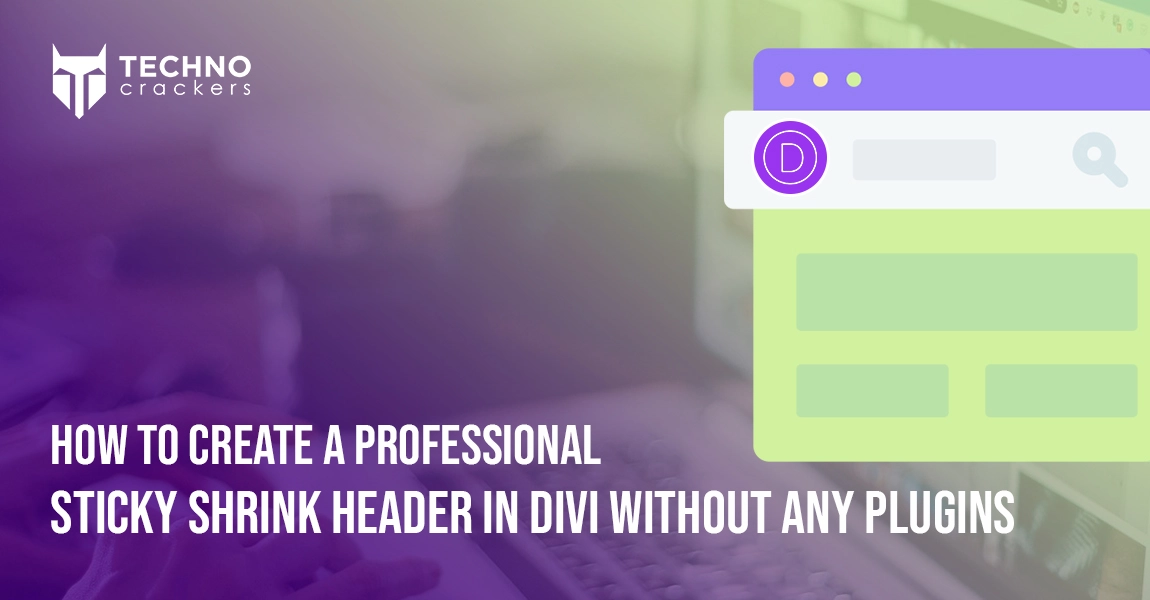
Table of Contents
A clean, modern website isn’t just about colors and layout — it’s also about user experience. One of the most popular UX enhancements used on professional websites today is the sticky shrinking header.
This feature allows your navigation bar to stay visible as users scroll, while smoothly shrinking in size to maximize screen space. It keeps important navigation links always accessible and improves the browsing experience — especially on long pages.
In this tutorial, we’ll walk you through how to create a professional sticky shrink header in Divi using built-in features — fast, clean, and performance-friendly.
Why Use a Sticky Shrink Header?
A well-optimized header can make a big difference in how visitors interact with your site. Sticky headers provide:
- Continuous navigation access
- Better UX for mobile and desktop users
- Modern, professional design feel
- More space for content while keeping branding visible
Whether you’re building a business site, portfolio, or e-commerce store, this effect adds polish and functionality your visitors will notice.
Step-by-Step: Create a Sticky Shrink Header Using Divi
Below is the exact method we used to build this feature in our demo site — and you can follow the same steps:
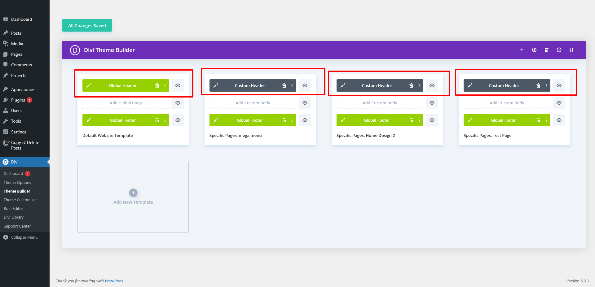
Step 1: Create a New Header Layout
- Go to: Divi → Theme Builder
- Click Add Global Header or create a custom header for selected post types or pages.
- Choose Build From Scratch.
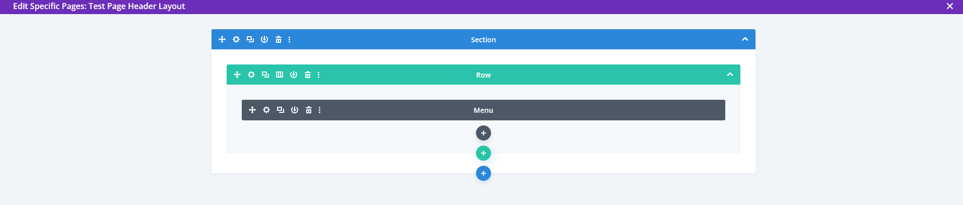
Step 2: Add Your Structure
Inside your header, add:
- Section
- Row
- Menu Module
This will be the foundation for your navigation.
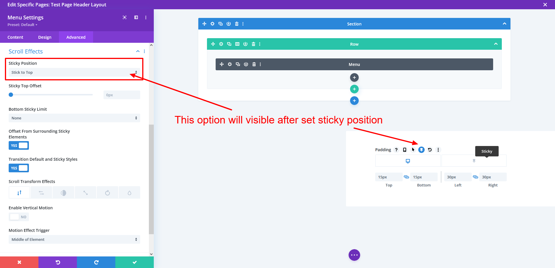
Step 3: Enable Sticky Behavior
Now the magic begins.
- Open the Menu Module Settings
- Go to: Advanced → Scroll Effects
- Under Sticky Position, select: Sticky: Top
Once enabled, Divi will display a new sticky icon next to editable fields (similar to hover states).
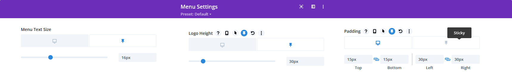
Step 4: Apply Shrinking Effects (Sticky State Styling)
To create a professional shrinking effect, adjust the following settings for both normal and sticky states:
- Logo Size
- Menu Text Size
- Padding / Spacing
- Background Color
- Box Shadow (optional)
Example:
| Property | Normal State | Sticky State |
| Logo Height | 40px | 30px |
| Menu Font Size | 18px | 16px |
| Top/Bottom Padding | 30px | 10px |
These subtle visual changes create a smooth professional shrinking animation when users scroll.
Step 5: Save & Publish
Once everything looks perfect:
Click Save → Exit the Theme Builder → Visit your site.
You should now see your sticky shrink header in action — smooth, modern, and fully responsive.
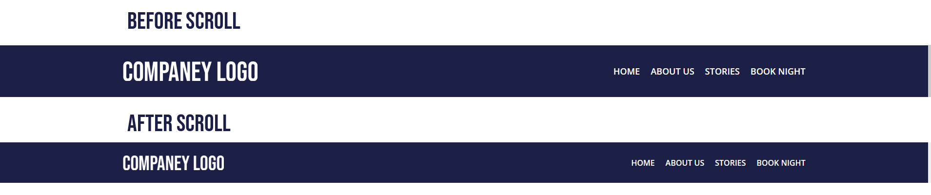
Final Result: A Clean, Modern Navigation Experience
Your new header will now:
- Stick to the top while scrolling
- Shrink smoothly to save space
- Maintain full navigation visibility
- Enhance overall user experience
All without installing extra plugins or affecting site speed.
Final Thoughts
A sticky shrinking header may seem like a small design change, but it dramatically improves:
- Branding visibility
- Navigation usability
- Professional perception
If you’re building a WordPress site that requires custom Divi UI interactions, sticky headers, or performance-optimized front-end behavior, our team can take full ownership of the project—from design implementation and development to testing and launch.
You can Schedule a Consultation to discuss your goals, timelines, and how we can deliver a polished, production-ready solution for your website.