





Table of Contents
- Introduction
- What Is Aspect Ratio in Divi 5?
- Why Should You Use Aspect Ratio?
- Practical Ways to Use Aspect Ratio in Divi 5
- 1. Keep Loop & Blog Images the Same Size
- 2. Create Uniform Team Member Photos
- 3. Make Videos Responsive
- 4. Design Better Hero Sections
- 5. Create Consistent Image Galleries
- Best Practices
- Final Thoughts
- FAQ
Introduction
Creating a responsive website is important for every modern business. Images, videos, and other elements should look good on desktop, tablet, and mobile devices.
Divi 5 introduces the Aspect Ratio setting, making it much easier to keep your layouts clean and consistent without writing custom CSS.
In this guide, you’ll learn what Aspect Ratio is, why it matters, and how to use it in your Divi 5 website.
What Is Aspect Ratio in Divi 5?
Aspect Ratio controls the shape of an element by keeping the same width-to-height proportion on every screen size.
Instead of setting a fixed height, Divi automatically adjusts the height based on the width.
For example:
- 16:9 – Best for videos and hero banners
- 1:1 – Perfect for square images
- 4:5 – Great for portrait images
- 3:2 – Ideal for blog featured images
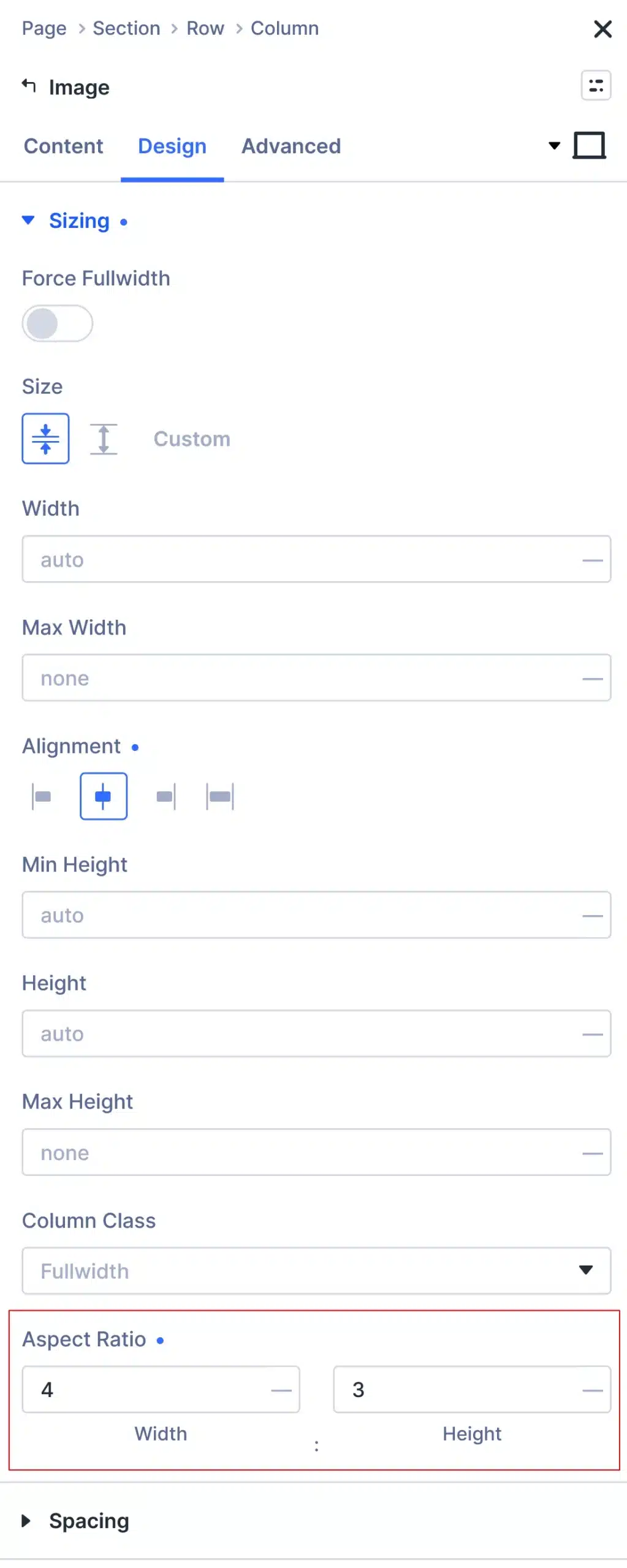
You can find this setting under:
Design → Sizing → Aspect Ratio
Why Should You Use Aspect Ratio?
Without Aspect Ratio, different image sizes can make your website look unorganized.
Using Aspect Ratio helps you:
- Keep images the same size
- Make layouts look cleaner
- Improve mobile responsiveness
- Prevent layout shifts while loading
- Create a more professional design
Practical Ways to Use Aspect Ratio in Divi 5
1. Keep Loop & Blog Images the Same Size
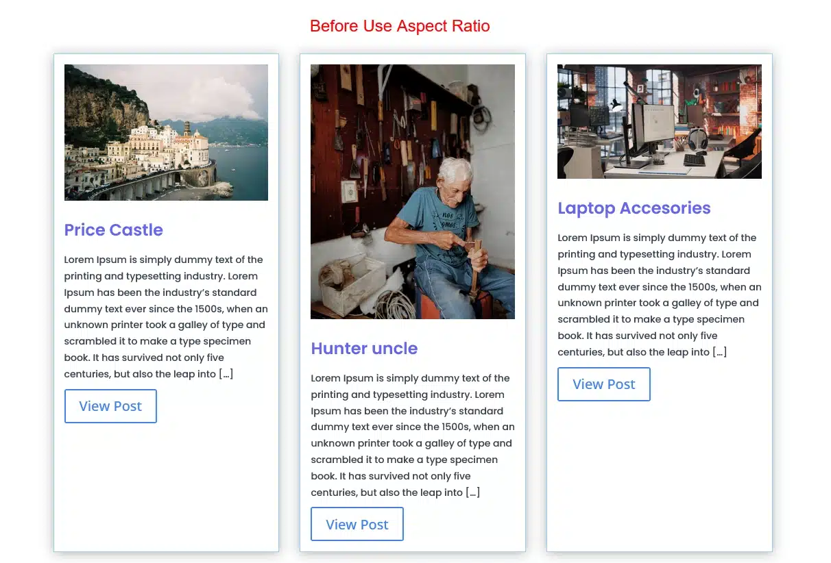
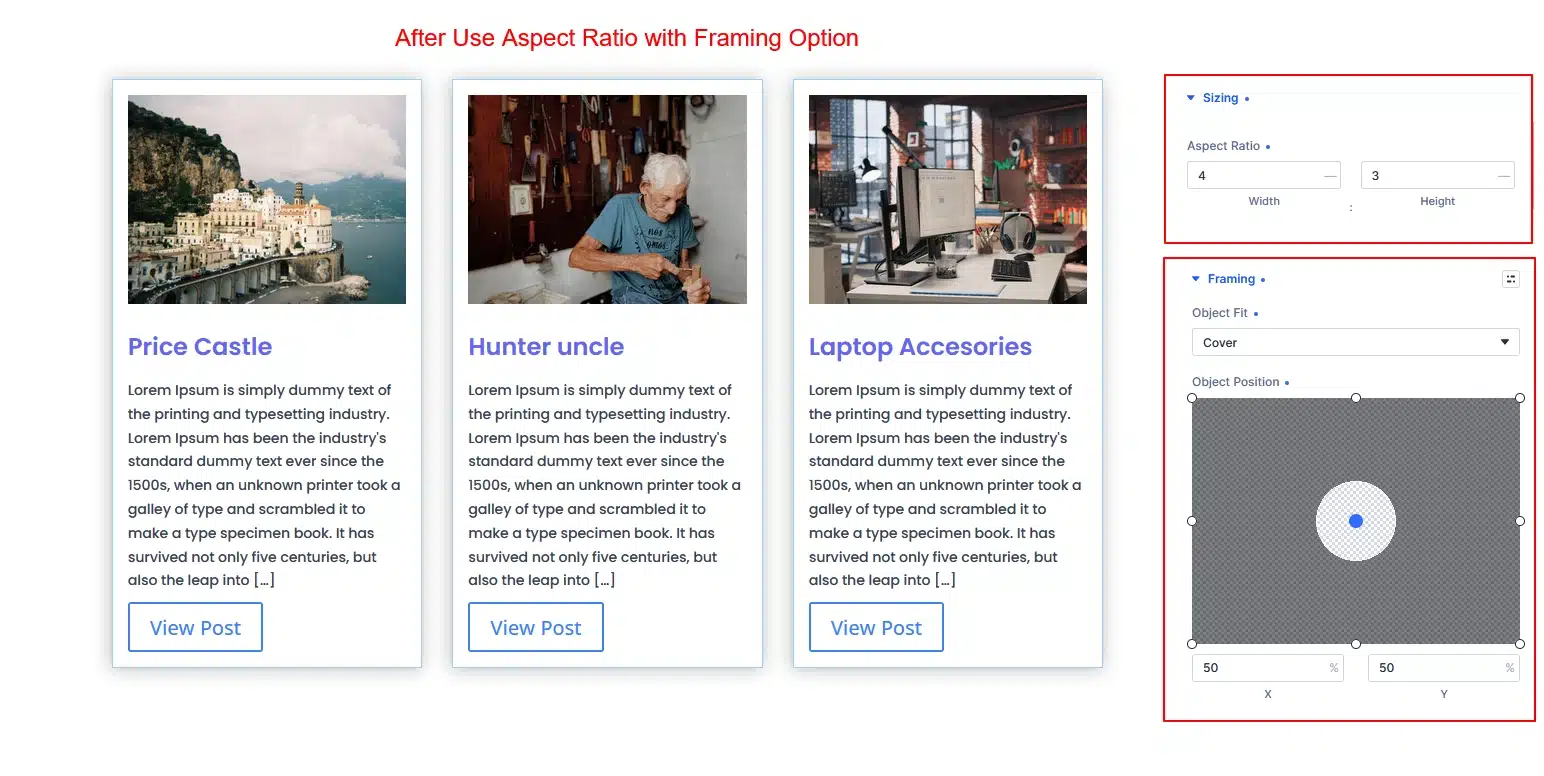
If your blog posts have featured images with different dimensions, your blog grid may look uneven.
By applying the same Aspect Ratio to every featured image, all blog cards will have the same height.
Recommended Ratio: 3:2 or 4:3
How to Use :
In module setting : Design > Image > > Sizing > Aspect Ratio: 3:2 or 4:3
2. Create Uniform Team Member Photos
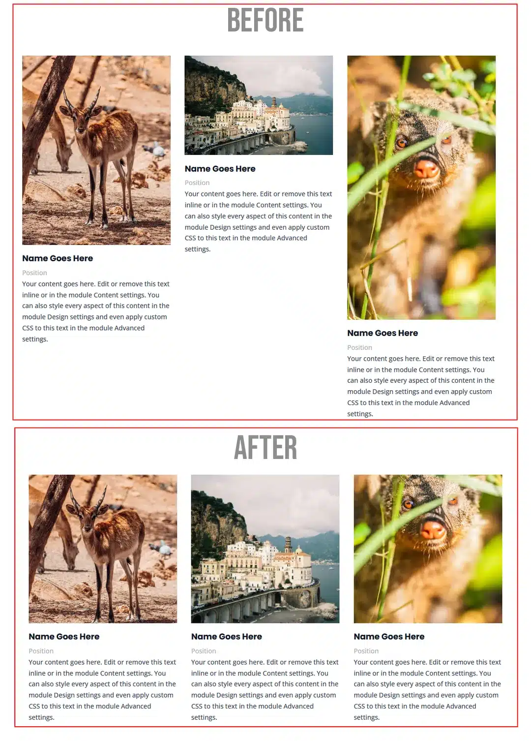
Many websites use images collected from different people.
Some are square.
Some are portrait.
Some are landscape.
Using Aspect Ratio keeps every team member image the same size and gives your page a professional appearance.
Recommended Ratio: 4:5
How to Use :
In module setting : Design > Image > > Sizing > Aspect Ratio: 1:1 or 4:5
3. Make Videos Responsive
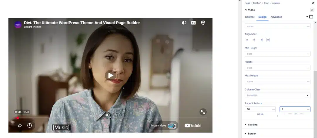
Embedding YouTube or Vimeo videos can sometimes create spacing problems on smaller devices.
Setting an Aspect Ratio ensures the video stays responsive on every screen size.
Recommended Ratio: 16:9
4. Design Better Hero Sections
Hero banners often contain background images or featured visuals.
Instead of giving the image a fixed height, use Aspect Ratio so it scales naturally across desktops, tablets, and phones.
This creates a cleaner responsive design.
Recommended Ratio:
- 16:9
- 21:9 (for wide hero sections)
5. Create Consistent Image Galleries
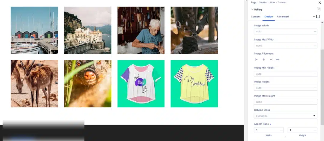
If your gallery contains images uploaded in different sizes, the layout may look messy.
Applying the same Aspect Ratio keeps every image aligned.
This works especially well for:
- Portfolio pages
- Project galleries
- Product images
- Instagram feeds
Recommended Ratio: 1:1
Best Practices
To get the best results, follow these simple tips:
- Use 16:9 for videos.
- Use 3:2 or 4:3 for blog images.
- Use 4:5 for portraits and team photos.
- Use 1:1 for galleries and square images.
- Test your layout on desktop, tablet, and mobile before publishing.
- Combine Aspect Ratio with Object Fit: Cover if images appear stretched.
Final Thoughts
The Aspect Ratio feature in Divi 5 is a simple but powerful tool for creating responsive websites.
Whether you’re building a blog, business website, portfolio, or landing page, using Aspect Ratio helps keep your layouts clean and professional on every device.
If you’re designing with Divi 5, it’s a feature worth using in almost every project.
FAQ
What is Aspect Ratio in Divi 5?
Aspect Ratio keeps the width and height of an element proportional, making it responsive across different screen sizes.
Where can I find the Aspect Ratio setting?
Go to Design → Sizing → Aspect Ratio inside the Divi module settings.
Which Aspect Ratio is best for blog images?
A 3:2 or 4:3 ratio works well for most blog layouts.
Which Aspect Ratio should I use for videos?
A 16:9 ratio is the standard choice for YouTube and Vimeo videos.
Does Aspect Ratio improve responsive design?
Yes. It helps maintain consistent image sizes, reduces layout shifts, and creates a cleaner experience on desktop, tablet, and mobile devices.