





Table of Contents
- What Is the Divi 5 Variable Generator?
- Why Use a Font Scale?
- Divi 5 Font Scale Types at a Glance
- 1. Fluid Scale
- 2. Fixed Scale Responsive
- How Fixed Scale Responsive Works
- Responsive Breakpoint Control
- Scale Ratio at Each Breakpoint
- When Should You Use Fixed Scale Responsive?
- 3. Fixed Scale Single
- Fluid vs Fixed Responsive vs Fixed Single
- Which Font Scale Type Should You Use?
- Our Recommendation
- How to Use Font Variables in Your Divi 5 Design System
- Don’t Forget Your Presets
- Can You Change Your Font Scale Later?
- A Simple Workflow for Setting Up Divi 5 Font Variables
- Step 1: Decide Your Base Font Size
- Step 2: Choose Your Scale Type
- Step 3: Set Your Scale Ratio
- Step 4: Create Your Variables
- Step 5: Review the Preview
- Step 6: Apply the Variables to Presets
- Step 7: Test Across Devices
- Final Thoughts
Typography plays a major role in how a website looks and feels. Headings need to stand out, body text needs to remain readable, and smaller elements such as labels and captions should still feel consistent throughout the design.
In Divi 5, you can make this process much easier by using the Variable Generator to create a complete set of font size variables instead of defining every font size individually.
But there is an important decision to make before generating your typography variables: which font scale type should you use?
Divi 5 provides three main options:
- Fluid Scale
- Fixed Scale Responsive
- Fixed Scale Single
Each option handles typography differently. One can smoothly adjust font sizes as the screen changes, another gives you precise values at individual breakpoints, and the third keeps the same value everywhere.
In this guide, we’ll explain how these three font scale types work, what makes them different, and when each one makes sense for your Divi 5 website.
What Is the Divi 5 Variable Generator?
The Variable Generator is part of Divi 5’s Variable Manager. It helps you create groups of related design values automatically rather than entering every value manually.
For example, you can use it to create a consistent set of values for things such as:
- Font sizes
- Spacing
- Gaps
- Widths
- Border radius
- Border widths
- Other numerical design settings
For typography, the generator can create a series of font size variables based on the settings you choose.
This means you can establish your typography system once and reuse those values throughout your website.
How to Open the Variable Generator
Open the Variable Manager from the Divi 5 Visual Builder and look for the number variables section.
From there, choose the option for generating sizing variables and select the Font Size Scale.
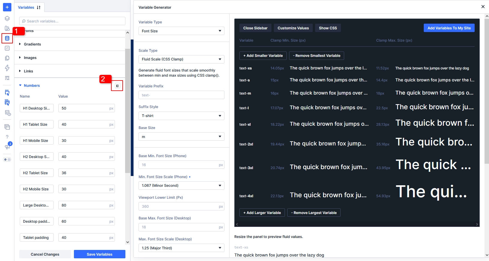
The generator provides configuration controls along with a preview, allowing you to see how your scale will be structured before adding it to your website.
Once you’re happy with the settings, you can add the generated variables to your site.
This is especially useful when you’re building a website with a large number of pages or modules because the same typography values can be reused instead of recreated repeatedly.
Why Use a Font Scale?
Without a typography system, it’s easy for font sizes to become inconsistent.
For example, you might manually choose:
- 16px for one paragraph
- 18px for another
- 31px for one heading
- 34px for another heading
- 42px for a hero heading
Individually, these choices may look fine. But across a complete website, they can make the typography feel unplanned.
A font scale creates a relationship between your different text sizes.
Instead of choosing every value independently, you define a base size and a ratio that can be used to generate smaller and larger steps.
This gives you a more predictable hierarchy for:
Small text → Body text → Subheadings → Headings → Large display text
The real advantage comes when these values are saved as Divi variables.
If you later decide that your overall typography needs to be slightly larger or smaller, you can adjust the underlying variables instead of editing dozens of modules individually.
Divi 5 Font Scale Types at a Glance
Before looking at each option individually, here’s the easiest way to understand the difference:
| Font Scale Type | How It Behaves | Best Use |
|---|---|---|
| Fluid Scale | Font sizes gradually adapt between defined limits | Modern responsive websites |
| Fixed Scale Responsive | Font sizes change at selected breakpoints | Designs requiring precise breakpoint values |
| Fixed Scale Single | One value remains unchanged across screen sizes | Static text and specific fixed-size elements |
The biggest difference is how the font size responds to the viewport.
Let’s look at each option in more detail.
1. Fluid Scale
If you’re building a modern responsive website, Fluid Scale is often the most flexible option.
Instead of changing from one font size to another at a specific breakpoint, a fluid font size can gradually adjust as the viewport becomes wider or narrower.
For example, a heading could become slightly smaller as the screen gets narrower rather than suddenly switching from one size to another.
This can help create a smoother transition between desktop, tablet, and mobile layouts.
How Fluid Scale Works
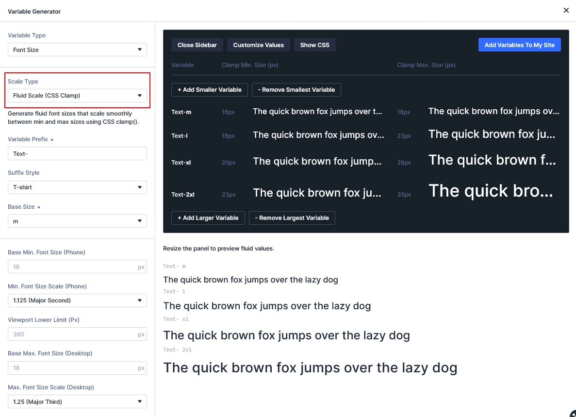
Fluid typography generally works with minimum and maximum values.
Think of it this way:
Minimum Size → Flexible Scaling → Maximum Size
Divi handles the calculations for you, so you don’t have to manually create the CSS required for fluid scaling.
A common CSS approach for this type of behavior uses the clamp() function:
clamp(minimum, preferred, maximum)
The minimum prevents the text from becoming too small, while the maximum prevents it from growing beyond your chosen limit.
Fluid Scale Settings
Depending on your configuration, you’ll find settings that control how the generated scale behaves.
Important settings can include:
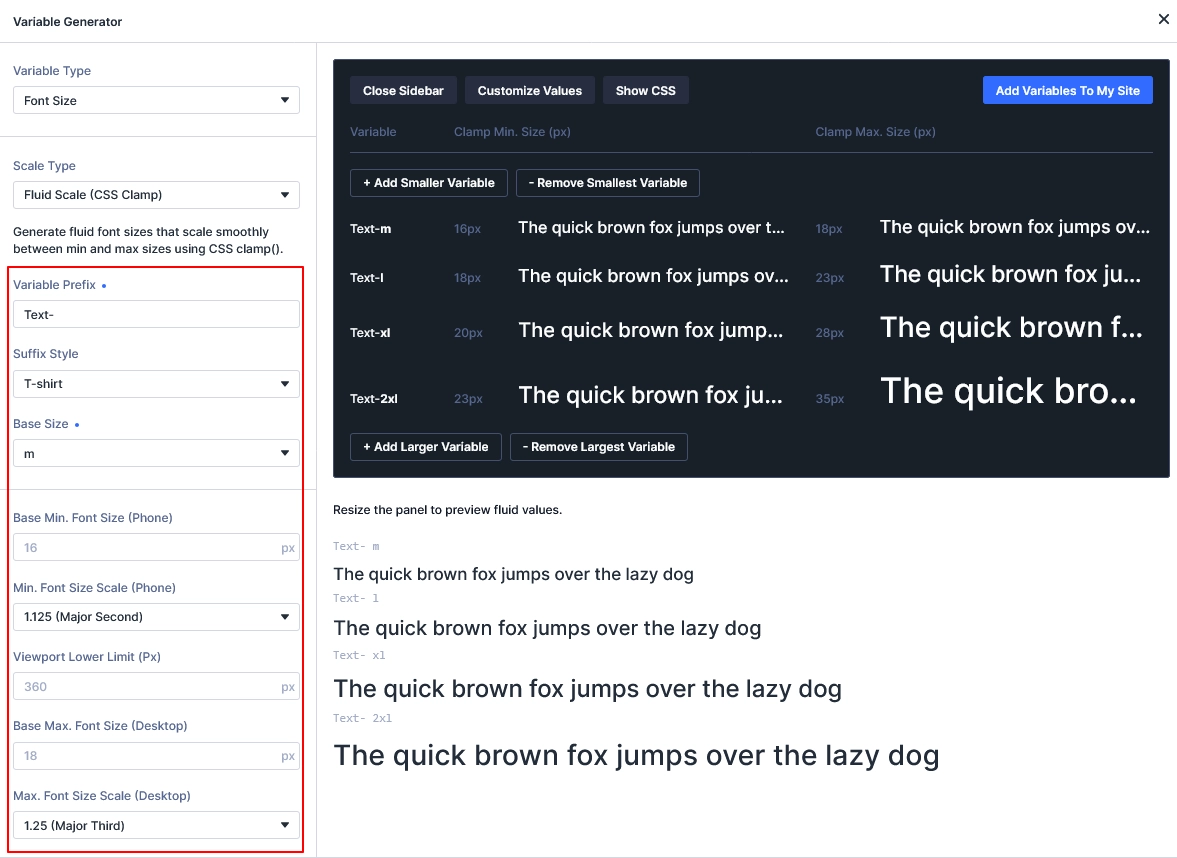
Base Size
This establishes the central point of your typography scale.
For example, you might use your primary body text size as the base.
Minimum Font Size
This determines how small the base value can become toward the smaller end of your responsive range.
Maximum Font Size
This determines the largest size the base value can reach.
Viewport Range
This defines the range in which the fluid scaling occurs.
Content Width Settings
Divi can also use your content area’s width when calculating the scale.
This is useful because typography doesn’t always need to respond to the entire browser width. A website with a narrow content container can require a different typographic relationship than a full-width layout.
Choosing a Scale Ratio
The ratio controls the relationship between the different font sizes in your scale.
For example, a larger ratio can create a more dramatic difference between body text and headings, while a smaller ratio produces a more subtle hierarchy.
For most websites, it’s a good idea to avoid creating an extremely dramatic scale unless the design specifically calls for it.
The goal is to create a hierarchy that is noticeable but still comfortable to read.
When Should You Use Fluid Scale?
Fluid Scale is a strong choice for:
- Responsive business websites
- Landing pages
- Blog and editorial layouts
- Marketing websites
- Flexible content layouts
- Websites that need smooth typography transitions
- Design systems intended to work across many screen sizes
If you want your typography to naturally adapt without manually defining every breakpoint, this is usually the option to consider first.
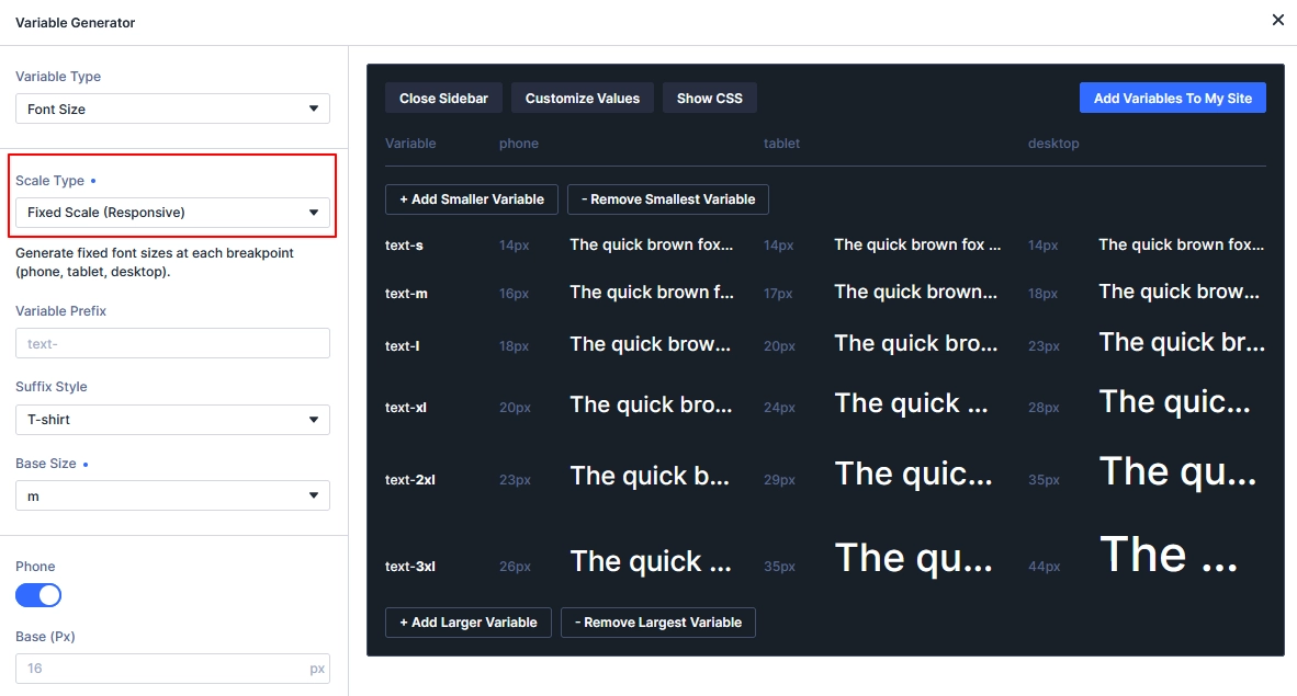
2. Fixed Scale Responsive
Not every website needs continuously changing typography.
Sometimes your design requires specific font sizes at specific screen widths. That’s where Fixed Scale Responsive becomes useful.
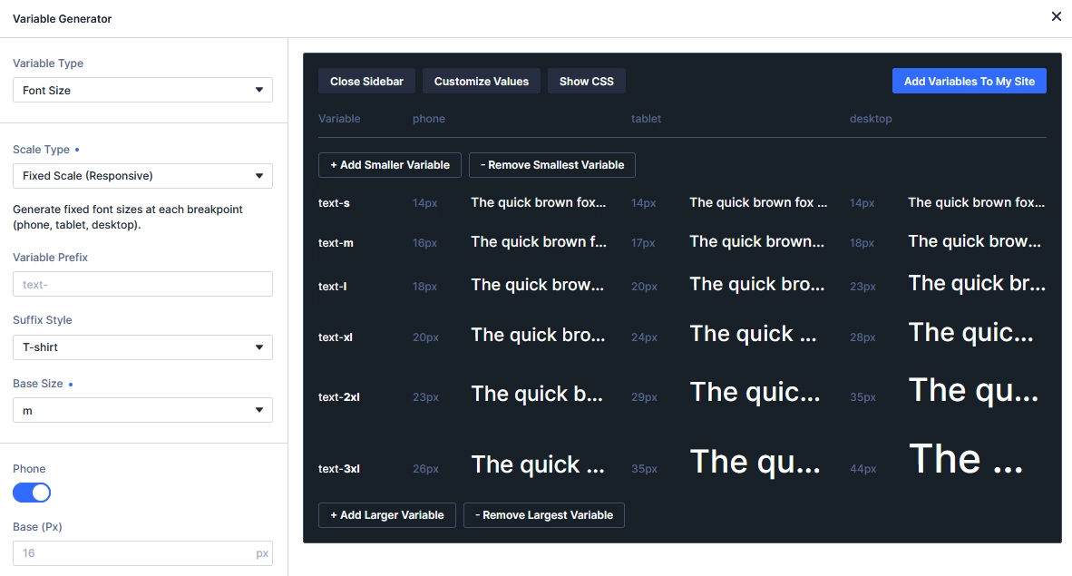
Instead of allowing the font size to gradually change, you define values for your selected responsive breakpoints.
For example:
Desktop: 48px
Tablet: 38px
Phone: 30px
The font doesn’t continuously transition between those values. Instead, the appropriate value is applied when the corresponding breakpoint becomes active.
How Fixed Scale Responsive Works
The generated variables can contain different values depending on the active breakpoint.
This gives you much more direct control over your typography.
Imagine a website design where the designer has provided exact typography specifications for:
- Desktop
- Tablet
- Mobile
Rather than trying to recreate those values with a fluid formula, you can enter the required values at the relevant breakpoints.
Responsive Breakpoint Control
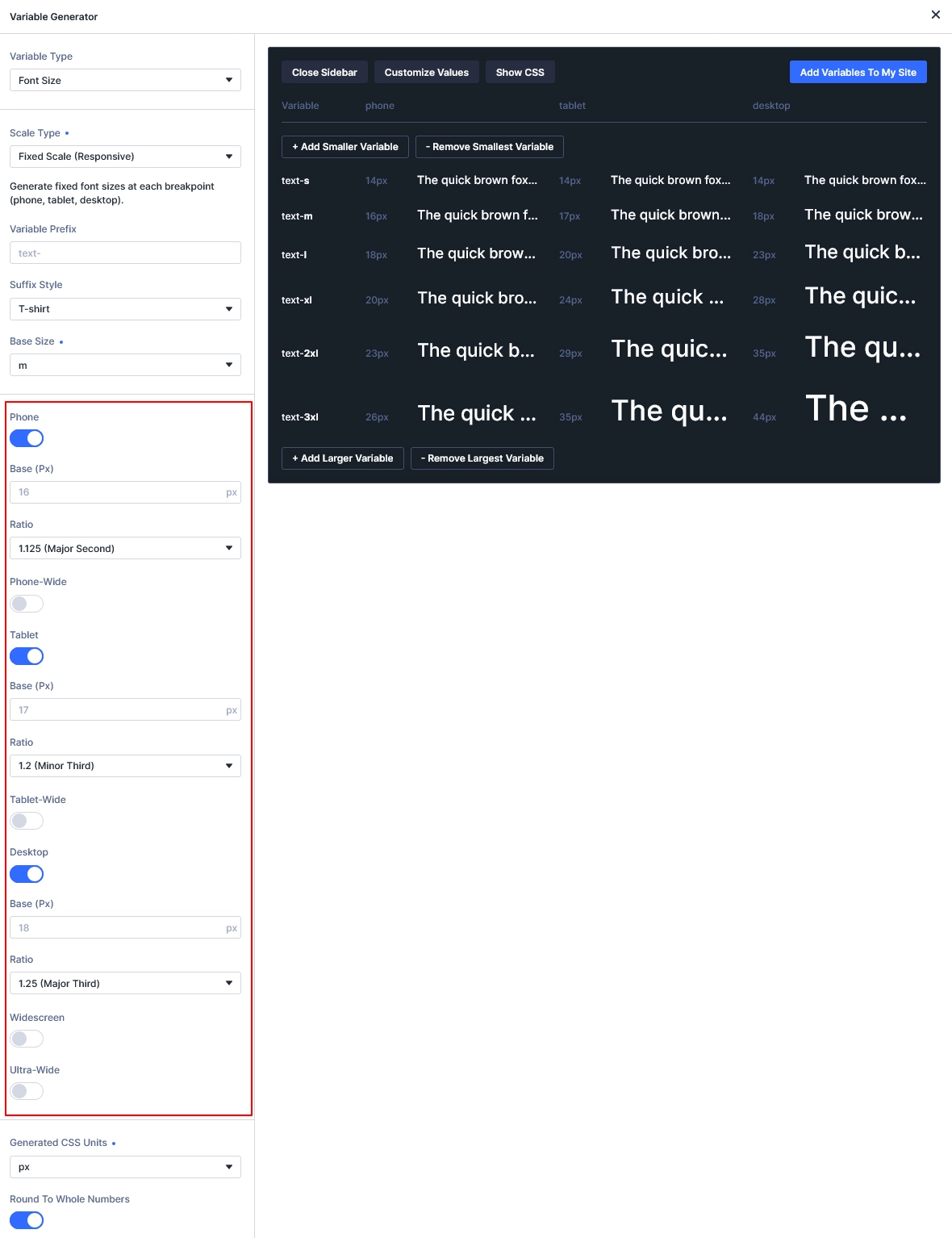
Divi 5 supports multiple responsive breakpoint options.
You can choose the breakpoints that should participate in your generated scale and configure the typography for each one.
This can be especially useful when your mobile design isn’t simply a smaller version of your desktop design.
For example, a desktop hero heading might be intentionally large, while the mobile version needs a significantly smaller size to prevent the heading from taking up too much vertical space.
Scale Ratio at Each Breakpoint
Another useful part of the Fixed Responsive approach is that you can establish the scale relationship independently at different breakpoints.
For example, you could use:
- A compact ratio on mobile
- A moderate ratio on tablet
- A larger ratio on desktop
This gives you greater control over the hierarchy of your typography as the screen size changes.
When Should You Use Fixed Scale Responsive?
Consider this option when:
- You have an approved design with exact font sizes
- Desktop and mobile typography need to be noticeably different
- Your layout changes significantly between breakpoints
- You need precise responsive control
- You’re working from a Figma or other design specification
- Your project uses custom breakpoints
The trade-off is that you have more settings to manage.
3. Fixed Scale Single
The third option is Fixed Scale Single.
This is the simplest approach because each generated variable receives a single value.
That value remains the same regardless of the device or viewport width.
For example:
Text Small: 0.875rem
Text Medium: 1rem
Text Large: 1.25rem
Heading: 2rem
The values remain unchanged across screen sizes.
How Fixed Scale Single Works
Unlike Fluid Scale, there is no gradual resizing.
Unlike Fixed Scale Responsive, there are no separate values for different breakpoints.
Instead, you create one typography scale and use it everywhere.
This makes the option very straightforward to configure.
Fixed Scale Settings
The main settings are generally centered around two important values:
Base Size
This establishes the starting point for the scale.
Scale Ratio
The ratio determines how the other sizes are generated from the base.
Once those values are configured, Divi can create the rest of the scale.
When Should You Use Fixed Scale Single?
This option can make sense for:
- Small labels
- Captions
- Metadata
- Utility text
- Legal or fine-print text
- Fixed-width layouts
- Simple prototypes
- Specific brand elements requiring consistent sizes
It can also be useful when you deliberately want a particular text element to remain the same size regardless of the screen.
However, for a complete responsive website typography system, you may want to consider one of the responsive approaches instead.
Fluid vs Fixed Responsive vs Fixed Single
So, which option should you actually choose?
Here’s a practical way to decide.
Choose Fluid Scale if…
You want typography to adjust smoothly between different screen sizes.
It’s a good fit when your website uses flexible layouts and you don’t want to manually manage font sizes at every breakpoint.
Choose Fixed Scale Responsive if…
You need exact control over typography at specific breakpoints.
This is particularly useful when you’re following a detailed design system or client-approved design specification.
Choose Fixed Scale Single if…
You want one consistent value everywhere.
It’s best suited to specific text roles rather than an entire responsive typography system.
Which Font Scale Type Should You Use?
There isn’t one option that is perfect for every project.
Your decision should depend on the behavior you want from your typography.
| If Your Priority Is… | Recommended Option |
|---|---|
| Smooth responsive scaling | Fluid Scale |
| Exact mobile/tablet/desktop values | Fixed Scale Responsive |
| One consistent value everywhere | Fixed Scale Single |
| A modern responsive design system | Fluid Scale |
| Matching exact design specifications | Fixed Scale Responsive |
| Static utility text | Fixed Scale Single |
Our Recommendation
For most modern Divi 5 websites, Fluid Scale is a great starting point.
It reduces the amount of manual responsive typography work and allows text to adapt naturally between screen sizes.
However, don’t choose it simply because it’s the most responsive option.
If your project has strict typography specifications, Fixed Scale Responsive may give you the control you need.
And if a particular text role should never change size, Fixed Scale Single can be the better solution.
How to Use Font Variables in Your Divi 5 Design System
Creating the variables is only the first step.
The real benefit comes from using those variables consistently throughout your website.
For example, you could create variables for:
- Small text
- Body text
- Large body text
- H4
- H3
- H2
- H1
- Display headings
You can then use those variables when configuring your Divi modules and presets.
Instead of entering a value such as 18px every time you create a paragraph style, you can reference your typography variable.
This creates a much more maintainable design system.
Why This Matters
Imagine you have 50 pages on a website and later decide that your body text should be slightly larger.
If the font size has been manually entered everywhere, changing it can become a tedious task.
But if your modules reference a shared variable, you can update the variable and let the design system handle the change.
This is one of the biggest advantages of using variables in a larger Divi 5 project.
Don’t Forget Your Presets
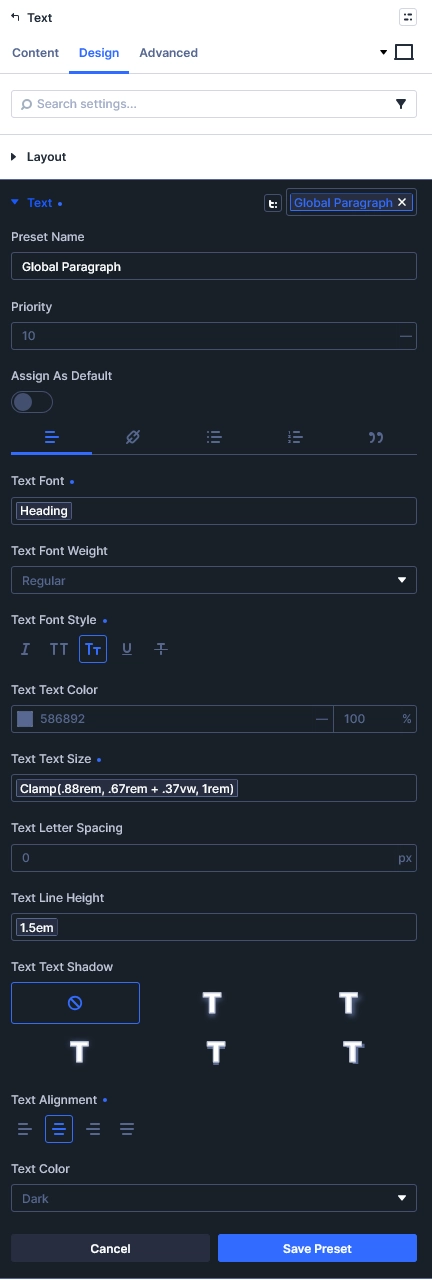
Font variables become even more useful when combined with Divi 5 presets.
For example, you could create a heading preset that uses your H2 font-size variable.
Then that preset can be reused across different modules and layouts.
The overall relationship becomes:
Font Variables → Presets → Modules → Website
This approach helps keep typography consistent across pages without requiring you to manually repeat the same settings.
Can You Change Your Font Scale Later?
Yes, but you should make changes carefully.
Once your variables are being used throughout a website, changing their values can affect multiple modules and presets.
That’s actually one of the benefits of a variable-based design system—but it also means you should understand where the variable is being used before making a major change.
Before modifying an existing typography scale:
- Identify where the variables are being used.
- Check your main templates.
- Review important pages.
- Test desktop, tablet, and mobile layouts.
- Make sure the updated hierarchy still looks balanced.
- Preview the changes before publishing.
If you’re rebuilding an existing website, it’s also worth creating your typography scale early in the project rather than manually assigning font sizes throughout the build.
A Simple Workflow for Setting Up Divi 5 Font Variables
If you’re starting a new Divi 5 project, here’s a practical workflow you can follow.
Step 1: Decide Your Base Font Size
Start with the size you want for your primary body text.
Step 2: Choose Your Scale Type
Decide whether your typography should be:
- Fluid
- Breakpoint-specific
- Static
Step 3: Set Your Scale Ratio
Choose how much larger or smaller each step should be compared with the previous one.
Step 4: Create Your Variables
Use Divi 5’s Variable Generator to generate the typography scale.
Step 5: Review the Preview
Check how the generated values relate to one another before adding them to your site.
Step 6: Apply the Variables to Presets
Connect your typography variables to your heading, body, button, and other relevant presets.
Step 7: Test Across Devices
Always check the result on desktop, tablet, and mobile.
This final step is particularly important when using a fluid or responsive scale.
Final Thoughts
Divi 5’s Font Size Variable Generator makes it easier to build a consistent typography system without manually creating every font-size value.
The three scale types serve different purposes:
Fluid Scale is ideal when you want typography to adapt smoothly across screen sizes.
Fixed Scale Responsive is better when you need specific values at specific breakpoints.
Fixed Scale Single works when a text value should remain unchanged.
The best choice isn’t necessarily the one with the most responsive behavior. Instead, think about how your website is designed and how much control you need over typography.
Once you’ve selected the right scale, connect your generated variables to Divi 5 presets and reuse them throughout your website. This gives you a cleaner, more consistent, and easier-to-maintain typography system.
If you’re building a new Divi 5 website, setting up your typography variables early can save significant time later—and make global design changes much easier.