





Table of Contents
- 1. What Is a Flip Box in Elementor?
- 2. What You Need Before Getting Started
- 3. How to Add a Flip Box to Elementor
- Step 1: Open Your Page in Elementor
- Step 2: Add the Flip Box Widget
- Step 3: Configure the Front Side
- Step 4: Configure the Back Side
- Step 5: Choose the Flip Animation
- 4. How to Customize the Front and Back Sides
- Step 1: Adjust Colors and Typography
- Step 2: Set the Border and Spacing
- Step 3: Add a Call-to-Action Button
- 5. How to Enhance Flip Boxes with JetTricks
- Step 1: Enable the Required JetTricks Feature
- Step 2: Add a Tooltip to a Supporting Element
- Step 3: Apply a Scroll Reveal Effect
- Step 4: Use Parallax for Supporting Visuals
- 6. How to Make Flip Boxes Responsive
- 7. Best Practices for Using Flip Boxes
- 8. Conclusion
Flip boxes are interactive content elements that reveal additional information when visitors hover over or interact with a card. They are useful for presenting services, highlighting features, showcasing team members, and displaying product details without taking up too much space on a webpage.
When building a WordPress website with Elementor, you can combine interactive card designs with visual effects from Crocoblock’s JetPlugins to create a more engaging user experience. However, JetTricks does not include a dedicated flip box widget. For the actual flip animation, you can use Elementor’s Flip Box widget or the Animated Box widget available in JetElements, then enhance the surrounding design with JetTricks effects where appropriate.
In this guide, you’ll learn how to create flip boxes in Elementor, customize their content and appearance, and use JetTricks to add complementary visual effects to your website.
1. What Is a Flip Box in Elementor?
A flip box is an interactive card with two sides: a front side and a back side. The front typically displays a heading, icon, image, or short description, while the back reveals additional details, a call-to-action button, or a link.
When a visitor interacts with the card, it transitions between the two sides using an animation.
Flip boxes are particularly useful for:
- Service sections: Display a service title on the front and its description on the back.
- Product highlights: Show a product image first, followed by important features or a purchase link.
- Team member profiles: Introduce a person on the front and reveal their role or biography on the back.
- Feature cards: Present a feature name and icon, with supporting information on the reverse side.
- Pricing highlights: Summarize a plan on the front and provide additional details on the back.
These elements help organize information into compact, interactive sections while maintaining a consistent page layout.
2. What You Need Before Getting Started
Before creating flip boxes, make sure your WordPress website has the following:
- WordPress: Your website’s content management system.
- Elementor: The page builder used to design and customize your page.
- JetTricks: The Crocoblock plugin for adding visual effects and interactive elements.
- Elementor Flip Box or JetElements Animated Box: A widget that provides the actual two-sided card and flip animation.
Important: Elementor’s Flip Box widget is a Pro feature. If you want to use the JetElements Animated Box widget instead, you’ll need the JetElements plugin. JetTricks can complement either approach, but it does not replace the dedicated flip box widget.
3. How to Add a Flip Box to Elementor
Start by creating a section where you want to display your interactive cards.
Step 1: Open Your Page in Elementor
Log in to your WordPress dashboard and navigate to Pages. Select the page you want to edit, then click Edit with Elementor.
Once the Elementor editor opens, choose an existing section or create a new container for your flip boxes.
For a service or feature section, a three-column layout is a good starting point. It provides enough space for each card while keeping the content organized.
Step 2: Add the Flip Box Widget
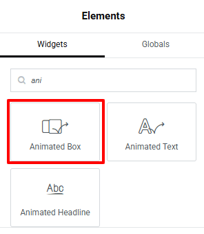
In the Elementor widget panel, search for Flip Box.
Drag the widget into your chosen container. If you are using JetElements, search for Animated Box instead and add that widget to the page.
After adding the widget, you’ll see the default card layout in the preview area.
You can now configure the front and back content, choose an animation, and adjust the card’s dimensions.
Step 3: Configure the Front Side
The front side introduces the content visitors will see before interacting with the card.
In the widget’s content settings, add the following elements as needed:
- Icon or image: Choose a visual element that represents the card’s purpose.
- Title: Add a concise heading, such as “Web Design Services.”
- Description: Include a short introductory sentence.
- Height: Set a suitable card height so that multiple cards align consistently.
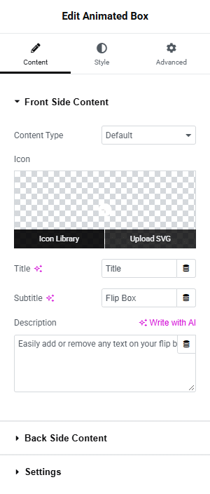
For example, a web design card might display a monitor icon, the title “Web Design,” and a brief description about creating responsive websites.
Keep the front side simple. Its purpose is to attract attention and encourage visitors to explore the information on the reverse side.
Step 4: Configure the Back Side
Next, open the Back Side settings of your selected widget.
Add the information that should appear when the card flips. You can include:
- A detailed description of the service or feature.
- Supporting text explaining its benefits.
- A button such as “Learn More” or “View Services.”
- A destination URL for the button.
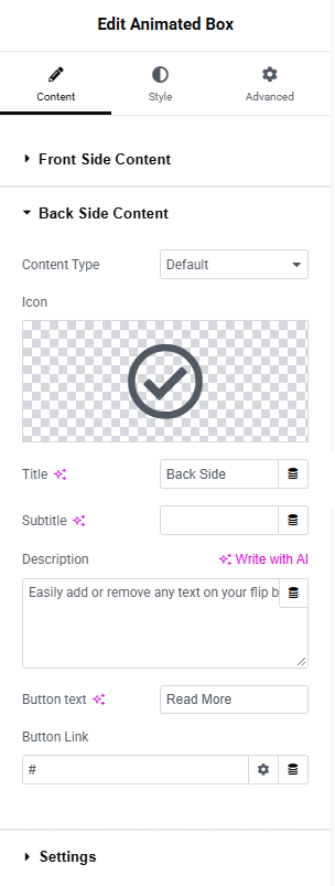
For the web design example, the reverse side could explain your design process and include a button linking to the services page.
Make sure the button leads to a relevant destination and that its label clearly communicates what happens when visitors click it.
Step 5: Choose the Flip Animation
Open the widget’s settings and select an animation effect.
Depending on the widget, available options may include flip, slide, push, zoom, or fade effects. Some widgets also let you select the direction of the animation.
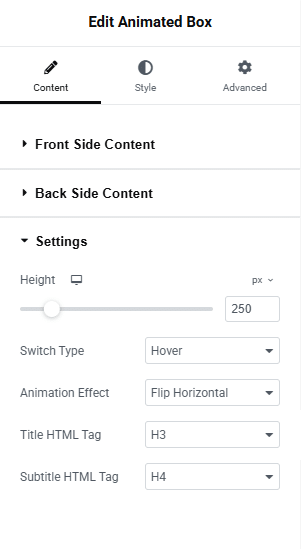
Choose an effect that fits the website’s overall design. A simple horizontal or vertical flip generally works well for service cards and feature sections.
If you are using JetElements Animated Box, you may also have alternative interaction types, such as click or toggle-based interactions, depending on the selected settings.
Preview the animation before moving on to the styling options.
4. How to Customize the Front and Back Sides
Once the content is in place, customize the card’s appearance to match your website’s design system.
Step 1: Adjust Colors and Typography
Open the Style tab of your flip box widget.
Customize the front and back sides independently by adjusting:
- Background colors.
- Heading and description colors.
- Font family, size, weight, and line height.
- Icon size and spacing.
- Text alignment.
- Internal padding.
For example, you could use a light background on the front and a darker brand color on the back. This contrast makes the transition more noticeable without requiring excessive animation.
Step 2: Set the Border and Spacing
Adjust the border, corner radius, and spacing to create a consistent card design.
Use the same height, width, and internal padding for cards in the same row. This helps prevent uneven layouts when headings or descriptions differ in length.
If your design includes icons, leave enough space between the icon, heading, and description to keep the content readable.
Step 3: Add a Call-to-Action Button
If the widget supports a button on the back side, configure its text, color, border, and hover state.
Use action-oriented labels such as:
- Explore Features
- View Details
- Learn More
- Get Started
Avoid adding too many links or buttons to a single card. One clear action usually provides a better user experience.
5. How to Enhance Flip Boxes with JetTricks
After building the flip boxes, you can use JetTricks to add complementary visual effects to supported Elementor elements and sections.
JetTricks provides features such as tooltips, hotspots, parallax, scroll reveal, and other visual effects. These can help create a more dynamic page without requiring custom animation code.
Step 1: Enable the Required JetTricks Feature
From your WordPress dashboard, navigate to the JetTricks settings under the Crocoblock or JetPlugins menu.
Open the Widgets & Extensions settings and enable the feature you want to use, if it is not already active.
Available features may vary depending on your installed plugin version and configuration.
Step 2: Add a Tooltip to a Supporting Element
Tooltips are useful when a card or icon needs to provide a small amount of additional information.
Select a supported Elementor widget, open its Advanced settings, and locate the JetTricks controls. Enable the Tooltip option if it is available for that element.
Configure the tooltip content, placement, trigger, and animation.
For example, a feature card could include a small information icon with a tooltip explaining a technical term. This keeps the main card uncluttered while making extra information available.
Use tooltips for supplementary information rather than hiding essential content that visitors need to understand the card.
Step 3: Apply a Scroll Reveal Effect
A scroll reveal effect can animate supported elements as they enter the visitor’s viewport.
Select the relevant Elementor element or section and open the JetTricks controls in the Advanced tab. Enable the Scroll Reveal effect if supported, then configure its available animation settings.
This can be useful for introducing a row of feature cards as visitors scroll down the page.
Keep the animation subtle and avoid applying several competing effects to the same section. Too much movement can distract visitors from the content.
Step 4: Use Parallax for Supporting Visuals
If your page includes decorative images or a background section around the flip boxes, you can use JetTricks’ Parallax extension to introduce movement while scrolling.
Select a supported widget or section and configure the Parallax settings in the editor.
For example, a subtle parallax effect on a background image can complement a row of service cards without interfering with their flip interaction.
Note: JetTricks effects are separate from the flip animation itself. Apply them to supported elements and test the result to ensure that the effects do not conflict with one another.
6. How to Make Flip Boxes Responsive
Your flip boxes should work properly on desktops, tablets, and mobile devices.
Step 1: Adjust the Card Layout
Open Elementor’s responsive editing controls and preview the page at different screen sizes.
A three-column desktop layout may work better as two columns on tablets and a single column on mobile devices.
Adjust the container width, column gap, and card dimensions for each breakpoint.
Step 2: Optimize Text and Spacing
Reduce oversized headings and excessive padding on smaller screens.
Make sure descriptions remain readable and buttons have enough space to be tapped comfortably.
Avoid fixed heights that cut off content when the text wraps onto additional lines. If necessary, adjust the height or simplify the content.
Step 3: Test the Interaction
Hover-based interactions may not behave the same way on touchscreens.
Test whether visitors can access the back-side content on mobile devices. If the chosen widget supports click or toggle interactions, consider using an appropriate interaction for touch-based browsing.
Also test keyboard navigation, focus states, and the visibility of important links. Essential information should not depend exclusively on hovering.
7. Best Practices for Using Flip Boxes
To create a polished and user-friendly flip box section, follow these recommendations:
- Keep the content concise: Use short headings and descriptions so visitors can scan each card quickly.
- Maintain consistent styling: Use the same typography, card dimensions, spacing, and animation style throughout the section.
- Choose meaningful icons: Select visuals that help visitors understand the purpose of each card.
- Use animation selectively: Reserve flip effects for content that benefits from an interactive presentation.
- Make calls to action clear: Use descriptive button labels and link them to relevant pages.
- Check mobile usability: Ensure that the reverse side can be accessed on touch devices.
- Avoid unnecessary effects: Combining flip animations with multiple motion effects can make a page feel distracting or slow.
- Test performance: Preview the published page and check that animations and other visual effects work smoothly.
8. Conclusion
Flip boxes are a practical way to present additional information without filling a webpage with lengthy descriptions. With Elementor’s Flip Box widget or JetElements’ Animated Box widget, you can create two-sided cards, customize their content, and select an animation that suits your website.
JetTricks can complement these cards with additional visual effects, including tooltips, scroll reveal animations, and parallax effects on supported elements. By combining the appropriate widgets with thoughtful styling and responsive settings, you can build interactive service sections, feature cards, and promotional layouts that remain easy to navigate.
Start with a simple card design, test the interaction across devices, and add visual effects only where they improve the visitor experience.