How to Set Indexer Option for Filters in Crocoblock JetSmartFilters

Filters can make or break the user experience on your website, especially when it comes to large product catalogs or content-heavy pages. JetSmartFilters from Crocoblock offers a smart solution for precise filtering, but with the Indexer option activated, it becomes even more powerful. By optimizing how your filters work behind the scenes, the Indexer ensures faster results, smoother navigation, and an overall better experience for your visitors. Let’s dive into how you can set up the Indexer and take your site’s filtering capabilities to the next level.

Step 1: Activate the Indexer Module

Before you can use the Indexer option, you need to make sure that the JetSmartFilters Indexer Module is activated.

  • Go to WordPress Dashboard > JetPlugins > JetSmartFilters Settings.
  • Under the Available Modules tab, find the Indexer module.
  • Toggle the switch to enable it, and then click Save.

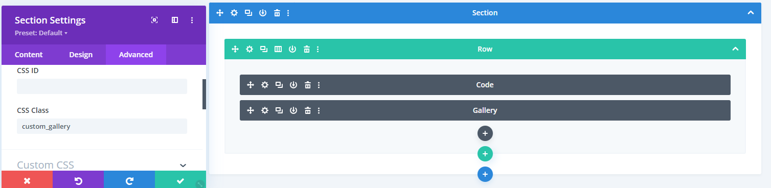
Step 2: Create or Edit a Filter

Now that the Indexer is activated, you can configure it for specific filters.

  • Go to WordPress Dashboard > Smart Filters > Add New Filter (or edit an existing one).
  • When creating or editing a filter, scroll down to the Filter Options section.
  • You will see the option to enable the Indexer for this filter.

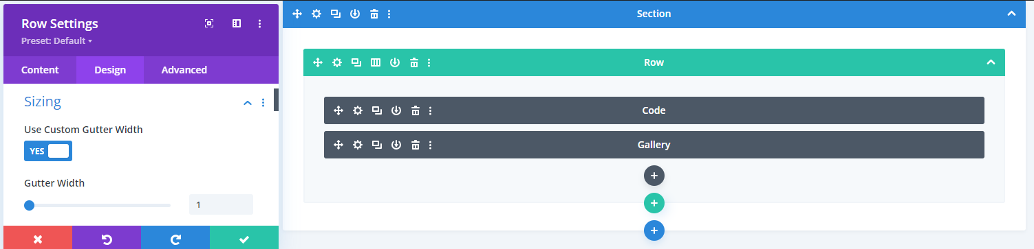
Step 3: Enable Indexer for the Filter

In the filter options, set the Indexer for the filter type you’re using (Checkboxes, Dropdown, Range, etc.).

  1. Enable Indexer:
    • There will be a toggle or checkbox option labeled Enable Indexer. Turn it on to activate the Indexer for this specific filter.
  2. Indexing by Term Count or Meta Value Count:
    • If your filter is based on taxonomies (like categories or tags), you can choose to index by term count.
    • If your filter is based on meta fields (like price or custom fields), the indexer can count meta values to improve filtering speed.

Step 4: Set the Indexer Options

Once the indexer is enabled, you will have additional settings available for more granular control:

  • Reindex Automatically: Enable this option if you want the index to automatically refresh when new posts or products are added.
  • Manual Reindexing: If you prefer to control when the index is refreshed, you can leave this option off and reindex manually.

Step 5: Reindex Filter Data

To ensure the index works properly, you may need to manually reindex the filter data. This process will cache the filter results for faster performance.

  • After saving the filter, go to WordPress Dashboard > JetSmartFilters > Indexer.
  • You’ll see a list of filters with indexing enabled.
  • Click Reindex next to the filter you just configured. This will rebuild the index for the filter.

Step 6: Add the Filter to a Page

Once the indexer is enabled and configured, you can now add the filter to your product grid, post grid, or any listing you’ve created.

  • Open your page in Elementor or Gutenberg where the filter will be used.
  • Add the Smart Filter widget and link it to the grid you want to filter.
  • Make sure to test the filter by selecting different options to confirm that the indexing is working and improving the filter’s response time.

Conclusion

Setting up the Indexer in JetSmartFilters may only take a few minutes, but the improvement in performance will be long-lasting. Once configured, your filters will respond faster, making your website more efficient and user-friendly.

Whether you’re managing a small blog or a large online store, activating the Indexer is a simple yet effective way to enhance the browsing experience for your users, ensuring they can easily find what they need, whenever they need it.

Correct indexer settings ensure your JetSmartFilters run smoothly and offer a better user experience. If you’re looking for professional WordPress website development, Book a Free Consultation Now.

WP Engine Banned? Here’s How to Keep Your WordPress Site Secure

wp engine ban from wordpress

WP Engine’s ban from WordPress.org is a significant development for anyone involved with WordPress. While many hosting providers integrate closely with WordPress.org’s resources, this incident highlights a serious breakdown in that relationship. The immediate effects of this move are still unfolding, but it’s clear that users of WP Engine will need to adapt quickly to avoid disruption. Understanding the implications and finding the right solutions will be key for businesses to navigate this shift.

This blog covers WP Engine’s ban from WordPress.org, the impact on users, and steps to address the situation. We’ll also explain how TechnoCrackers can help with solutions like site migration, security measures, and ongoing support to keep your WordPress site running smoothly.

What is the WP Engine Ban Issue?

The conflict between WP Engine and WordPress.org centers around a legal issue involving trademark licensing. WP Engine allegedly caused site disruptions for thousands of users while attempting to block notifications from WordPress.org, which ultimately led to their ban WordPress.org acted swiftly, cutting off WP Engine’s access to its resources and advising users to switch hosts for uninterrupted service.

This decision was driven by the need to protect the broader WordPress ecosystem and prevent further disruptions for its user base.

Impact of WP Engine’s Ban

The ban on WP Engine significantly impacts its users, leading to immediate concerns over security and functionality. Without access to WordPress.org resources, users lose essential updates, plugins, and integrations that help maintain site security and performance. This creates potential vulnerabilities, with downtime and disruptions likely.

Businesses that rely on WP Engine now face risks of future support issues, limited access to updates, and an urgent need to find new hosting solutions to ensure stability and ongoing security for their WordPress sites.

Solution: What Users Should Do Now

WP Engine users must act quickly to ensure their sites remain secure and functional. First, switching to a reliable WordPress hosting alternative is crucial. Recommended options include SiteGround, Kinsta, and Bluehost, which offer strong integration with WordPress.org’s resources.

Steps for migrating your site:

  • Backup your site fully before starting the migration.
  • Choose a new hosting provider and follow their migration process.
  • Test your site after migration to ensure everything works.

Post-migration tips:

  • Regularly update plugins and themes manually.
  • Use security plugins and schedule backups to keep your site protected.

How TechnoCrackers Can Help?

TechnoCrackers is well-equipped to guide users through the challenges posed by WP Engine’s ban, ensuring a smooth transition and continued site performance.

  • Expert WordPress Migration Services: We manage the full migration of your site to a new host, prioritizing zero downtime and safeguarding your data. Our process is thorough, allowing businesses to switch without technical concerns.
  • Manual Plugin/Theme Updates via FTP: Without automatic updates from WordPress.org, we manually handle plugin and theme updates using FTP, ensuring your site stays secure and functional. This is especially critical during transitions when automatic systems might be disrupted.
  • Backup & Security Measures: Before making any changes, we implement robust backup strategies and security protocols. This guarantees that your site’s content and design are safe, and any potential risks during the migration are minimized. Our team actively monitors to ensure no breakages during the transition.
  • Custom Solutions for Your Needs: Each business is unique, and we recognize that no one-size-fits-all solution works. TechnoCrackers delivers custom strategies to meet the specific challenges you face, whether it’s optimizing your site for better performance, addressing specific design concerns, or improving overall user experience. Our solutions are designed to mitigate any disruption caused by the WP Engine ban.
  • Custom WordPress Development: As part of our broader support services, we offer advanced WordPress development to enhance your site’s features and functionality. Whether it’s improving speed, adding new tools, or refining the user interface, we ensure your site is equipped for success.
  • Ongoing Support & Maintenance: Once your site is up and running on a new host, our commitment doesn’t end. We provide ongoing maintenance and performance monitoring, ensuring your site continues to run efficiently. Regular security checks, plugin updates, and performance improvements are all part of the package to ensure your site remains secure and optimized in the long term.


This combination of services ensures that businesses can transition away from WP Engine smoothly, while enhancing their WordPress sites for future success.

Conclusion: Moving Forward with TechnoCrackers

Resolving the WP Engine issue is critical to maintaining your site’s security, performance, and functionality. A swift migration to a reliable hosting provider will prevent disruptions and security risks. TechnoCrackers is committed to guiding you through this transition smoothly, with expert services designed to meet your specific needs and ensure your WordPress site stays optimized.

Contact TechnoCrackers today for a consultation on migrating your WordPress site and enhancing your online presence with customized solutions and ongoing support.

How to Create a Portfolio Gallery in Divi without a Plugin?

Building a portfolio gallery in Divi without relying on additional plugins is simpler. With just a bit of custom code, you can create a fully filterable, visually appealing portfolio that showcases your work beautifully. This guide walks you through the entire process, allowing you to create a stunning gallery that’s easy to manage and completely integrated with Divi.

Let’s get started on building your custom portfolio!

Step-by-Step Guide to Creating a Portfolio Gallery in Divi

Step 1: Add Custom Code to Your Theme

Access the Divi Settings:

  • Go to Dashboard > Divi > Theme Options > Integration.
  • Paste the following JavaScript code into the <head> or <body> box to enable dynamic filtering functionality:
 
<script>
  jQuery(document).ready(function ($) {
    // Assign categories to gallery items based on the title attribute
    $('.custom_gallery .et_pb_gallery_item').each(function () {
      var title = $(this).find('.et_pb_gallery_image a').attr('title');
      var category = title ? title.toLowerCase().replace(/\s+/g, '-') : 'uncategorized';
      $(this).addClass(category);
    });

    // Implement filter functionality
    $('.custom_gallery .gallery-filters button').on('click', function () {
      $('.custom_gallery .gallery-filters button').removeClass('active');
      var filterValue = $(this).attr('data-filter');
      if (filterValue === 'all') {
        $('.custom_gallery .et_pb_gallery_item').show();
      } else {
        $('.custom_gallery .et_pb_gallery_item').hide();
        $('.custom_gallery .' + filterValue).show();
      }
      $(this).addClass('active');
    });
  });
</script>

Note: This code dynamically assigns categories to your gallery images based on their titles and creates a filterable portfolio gallery.

  • Go to Dashboard > Divi > Theme Options > custom css
    • Paste the following css code
.custom_gallery .et_pb_gallery_items {
     display: flex;
     flex-wrap: wrap;
}
.custom_gallery .et_pb_gallery_item {
     display: block;
     padding:15px;
}
.gallery-filters {
     display: flex;
     justify-content: center;
     gap: 20px;
     margin-bottom: 20px;
     flex-wrap: wrap;
}
.gallery-filters button {
     padding: 10px 30px;
     text-transform: uppercase;
     font-weight: bold;
     font-size: 14px;
     cursor: pointer;
     transition: 0.3s all ease;
     border: none;
     background: #00308F;
     color: #fff;
     border-radius: 30px;
     box-shadow: 4px 4px 0px 0px rgba(136,143,231,0.5);
      min-width: 160px;
}
.gallery-filters button.active,
.gallery-filters button:hover {
     background: #F0BD03;
     border-color: transparent;
     box-shadow: 4px 4px 0px 0px rgba(240,189,0,0.5);
}

Step 2: Create the Portfolio Section on Your Desired Page

Design Your Portfolio Section:

  • Go to the page where you want to add the portfolio gallery.
  • Add a new Section and assign it to the class “custom_gallery.”

  • Within this section, add a Row.
  • In the Raw setting, go to  Design > sizing > use custom gutter width and set the gutter width value to 1.

  • Add a Text Block or Code Block inside the row and insert the following HTML code:
<div class="gallery-filters-main">
    <div class="gallery-filters">
       <button class="active" data-filter="all">All</button> 
       <button data-filter="engagement-photos">Engagement Photos</button> 
       <button data-filter="couple-photos">Couple Photos</button> 
       <button data-filter="single-photos">Single Photos</button>
   </div>
</div>

Note: You can customize the button text and data-filter values as needed.

  • Add the Gallery Module:
    • After the above code, add the Gallery module within the same row.

Step 3: Assign Titles to Your Images

Set Titles for Filtering:

  • Go to Dashboard > Media.
  • Assign titles to each image in your gallery corresponding to the data-filter text you used earlier. For example, use ” engagement-photos,” ” couple-photos,” etc., to match the filter buttons.

Step 4: Save and Publish

Finalize and Publish:

  • Save all changes and publish your page to showcase a beautifully filtered portfolio gallery on your website.


Extra Tips for Enhancing Your Portfolio Gallery

  • Customize Your Filters: You can create additional categories or change the existing ones to fit your portfolio’s content better.
  • Use CSS for Styling: Apply custom CSS to further style your gallery, filter buttons, and hover effects to make your portfolio more visually appealing.

Conclusion

Creating a dynamic portfolio gallery in Divi is straightforward and highly customizable. With a few lines of code and Divi’s built-in tools, you can easily manage and display your work without needing any extra plugins.

This setup keeps your site lightweight and flexible, making it an efficient choice for showcasing your portfolio. Now that your gallery is live, you have a professional way to highlight your projects and leave a lasting impression on visitors.

How to Make Global Theme Settings While Creating a Site with Divi Builder?

When building a website with Divi Builder, setting up global settings from the start can significantly simplify your design process and ensure consistency throughout your site. Global settings allow you to establish foundational elements such as fonts, colors, and spacing, which are applied across all pages, saving you from manually adjusting them on each section. This approach not only speeds up the creation of your website but also ensures that every part of it reflects a cohesive design language, no matter how large or complex the site becomes.

Whether you’re crafting a blog, portfolio, or business website, taking the time to configure global settings means you can focus on the creative aspects of your site rather than repeatedly tweaking design elements. This guide will walk you through how to set global typography, layout, and color options in Divi so you can build a site that’s visually appealing and easy to manage and update.

Let’s start laying the foundation for a streamlined, professional website!

Step 1: Adjusting Your Website’s Layout and Typography

To customize your website’s layout and typography, go to Dashboard > Appearance > Customize > General Settings.
In the General Settings panel, you will see three sections:

  • Layout Settings
  • Typography
  • Background

Step 2: Set Layout Settings

  • The Layout panel helps you modify various sizing and spacing options.
  • You can increase or decrease the spacing between sections, rows, and columns.

Set Website Content Width

  • This is where you can set the maximum width of your content section. Your content will not expand wider than the maximum width set here. The default is set to 1080px.
  • Recommended widths: 1400px, 1200px, or as per your design requirements.

Set Website Gutter Width

  • Divi provides a gutter width for horizontal spacing between elements. Optional values for gutter width range from 1 to 4, with the default set to 3.
  • Set Website Gutter Width to 3.

Step 3: Set Typography

In the Typography panel, you can adjust the default appearance of the text across your entire website.

  • Body Text Size: Set the body font size. The default size is 14px.
  • Body Line Height: Set the line height of the body text.
  • Header Text Size: Set the header text size (e.g., 40px, 36px, etc.). The font size set here for H1 will automatically adjust all other headings (H2 to H6) to smaller sizes.
  • Header Letter Spacing: Set the letter spacing for all headers (H1, H2, H3, H4, H5, H6), blockquotes, and slide titles.
  • Header Line Height: Set the line height for header text.
  • Header Font Style: Set header text to italic, uppercase, or underlined for site-wide application.
  • Header and Body Font: Divi provides access to nearly all Google fonts, allowing you to set any font for both headers and body site-wide.
  • Header Font Weight: Set header font-weight globally (e.g., thin, light, medium, bold, ultra-bold).
  • Body Font Weight: Set body font-weight globally (e.g., thin, light, medium, bold, ultra-bold).
  • Body Text Color: Set the global color for body text.
  • Link Color: Set the link color for text, which will apply site-wide.

Step 4: Set Background

  • Set the background color of your theme or add a background image for your entire site.
  • This step is beneficial if you enable the boxed layout from the Layout Settings. However, it is optional based on your design preferences.

Step 5: Customize Font Styles for Tablets and Phones for Responsiveness

To customize font styles for responsive devices:

  • Go to Dashboard > Appearance > Customize > Mobile Styles.
  • You can set the section height, row height, body text size, and header text size for tablet and mobile views.
  • These settings will help you create smaller font sizes for headers and body text on responsive devices globally.


Step 6: Set Global Colors Site-Wide

  • Create any page and edit with Divi Builder.
  • Create any section and go to Section Settings > Background.
  • At the bottom of the background options are three tabs: Saved, Global, and Recent Colors.
  • Click on Global.
  • You can add, update, and delete global colors here.
  • Add your site colors based on your design or logo, and use the global color option to use these colors throughout your site.


Make these changes before starting your site for easily apply font sizes of body text, header text, colors, section spacing and container width globally.

Conclusion

Configuring global settings in Divi Builder lays the groundwork for a seamless, efficient design process. From typography to colors and spacing, these settings help maintain consistency across your website while allowing you to easily make adjustments. With these foundational elements in place, building and customizing your site becomes quicker, smoother, and more professional. Now, you’re all set to create a visually stunning and cohesive website that will leave a lasting impression.

Divi’s global options make it easier to build a polished, consistent website without repetitive work. If you’re looking to create or upgrade your WordPress website with professional development, Book a Free Consultation.

How to Create Different Header and Footer in Divi for Particular Pages?

Creating unique headers and footers for specific pages in Divi allows you to tailor the look and feel of different sections of your website. With Divi’s Theme Builder, you can design custom headers and footers and assign them to individual pages without hassle.

Here’s how you can easily create and manage distinct headers and footers for your site using Divi’s built-in features.

Step 1: Access the Divi Theme Builder

Navigate to the Divi Theme Builder:

  • In your WordPress dashboard, go to Divi > Theme Builder.

Divi provides a default template for creating a global header and footer. So, if you want to apply a custom header and footer to all pages, you can easily create a global header and footer from the default template using the Divi builder.

Step 2: Create a New Header or Footer

Add a New Template:

  • Click on the “Add New Template.”

  • Then Click on “Builder New template.”

  • A window asking you to choose the pages where you want this template to apply.

  • Select the specific page(s) for which you want to create a custom header and footer, and click Create Template.

Build a Custom Header:

  • Delete the global selected header if showing and Click on “Add Custom Header” under the new template.
  • Choose “Build Custom Header” to start designing the header.
  • Use the Divi Builder to create the layout and design of your header as per your needs.

Build a Custom Footer:

  • Delete the global selected footer if showing and Click on “Add Custom Footer” under the new template.
  • Choose “Build Custom Footer” to design the footer.
  • Customize the footer using the Divi Builder.

Step 3: Save and Assign the Template

Save Your Changes:

  • After creating the header and footer, click the green Save button at the builder’s top.

Assign the Template to Specific Pages:

  • Ensure the template is assigned to the correct page(s) per your earlier selection.
  • You can also change conditions easily by clicking on the Setting Icon.

Manage and Edit Your Templates

– You can edit the custom headers and footers anytime by returning to the Divi Theme Builder and clicking on the template you want to modify.

Additional Tips

  • Use Display Conditions: You can create multiple templates and assign different headers/footers to various pages, categories, or post types using the display conditions in the Divi Theme Builder.
  • Export/Import Templates: You can export templates from one Divi site to another, making it easier to reuse designs.

Ending notes,

By leveraging Divi’s Theme Builder, you can effortlessly create custom headers and footers for specific pages. This approach not only enhances the user experience but also gives you complete control over the design and layout of your site. With the flexibility to edit, assign, and reuse templates, you can maintain a consistent and professional look across all website sections, no matter how diverse your content may be.

Strategic header and footer layouts in Divi can transform your website’s flow, branding, and conversions. Ready to build a better WordPress website? Book a Free Strategy Call.

How to Setup Global Theme Settings in Elementor before Starting the Website?

Setting up global settings in Elementor before starting your website can save you time and effort while ensuring a consistent, professional design throughout your site. With Elementor’s powerful tools, you can easily define your global fonts, colors, button styles, and more, which will automatically apply to all your pages and widgets. Whether you’re building a personal blog or a full-scale business site, establishing these settings early on helps streamline your workflow, allowing you to focus more on creativity rather than repetitive design adjustments.

This guide will walk you through each step to set up and customize your global settings, ensuring your website looks polished from the start.

Step 1: Open Elementor Settings

  • Log in to your WordPress Dashboard.
  • Navigate to Elementor > Settings from the WordPress sidebar.

Step 2: Access Global Settings in Elementor

  • Create or edit a page/post using Elementor.
  • Click the Edit with Elementor button to launch the Elementor editor.

Step 3: Access the Global Settings Menu

  • In the Elementor editor, click on the three horizontal lines (hamburger menu) located in the top-left corner of the Elementor panel.

  • Select Site Settings from the menu.

Step 4: Customize Global Settings

In the Site Settings panel, you can modify several global settings:

1. Global Colors

  • Click on Global Colors to set color palettes for your entire site.
  • Edit the predefined colors (Primary, Secondary, Text, Accent) or add new ones.
  • Any color change here will automatically apply to all elements using global colors.

2. Global Fonts

  • Go to Global Fonts to define typography across your website.
  • You can set the font family, weight, size, and style for different categories (Primary, Secondary, Text, Accent).
  • Applying global fonts ensures a consistent text style across all widgets and pages.

3. Typography

  • Customize the overall typography for headings (H1 to H6), body text, and paragraphs.
  • Set default font sizes, line height, and letter spacing.

4. Buttons

  • Define global button styles, including text size, padding, background colors, border radius, and hover effects.
  • Any button created on the site will use these default settings unless customized individually.

5. Background

  • Set a global background for your website using a solid color, image, or gradient.

6. Theme Styles

  • Manage default styles for forms, images, and other essential elements.
  • You can override certain theme styles here for a more consistent look.

Step 5: Save Global Settings

  • After configuring all the desired settings, click the  Update  button at the bottom of the panel to save your changes.
  • These settings will now apply globally across all pages and elements designed using Elementor.

Step 6: Applying Global Styles to Widgets

  • When editing any widget in Elementor, you can apply the global colors or fonts by clicking the Global tab in the Style settings for that widget.
  • Choose from your predefined global colors or fonts to ensure consistency.

Step 7: Reset Global Settings (If Needed)

  • If you need to reset any global settings to their default state, you can do so from the same  Site Settings  menu.
  • Click the “Reset” button for the respective setting you want to revert.

Conclusion:

By setting up global settings in Elementor, you simplify the design process and create a cohesive look across your entire site. From fonts and colors to button styles and background settings, these global configurations will apply seamlessly to all your pages, allowing for a consistent and unified design. With these settings in place, you’ll find it much easier to maintain and update your site as it grows. Now that you’ve mastered the global settings, you can confidently build a website that stands out and performs beautifully.

If you need expert help setting up your Elementor website or want a fully customized, high-performance site built for your business, Book a Free Consultation with our development team and let us bring your vision to life.

How to Add Static Content Layouts using Crocoblock JetEngine?

Adding a static layout before your blog listing can make a big difference if you want to enhance your blog’s layout using Crocoblock and Elementor. In this guide, you’ll learn how to integrate a static layout seamlessly before your blog posts using Crocoblock’s JetEngine and Elementor’s powerful theme builder tools. By following these steps, you can design a fully customized, engaging blog archive page that not only showcases your content but also highlights important static elements at the top.

Let’s dive in and start building your custom blog listing layout.

Step 1: Install Required Plugins

Make sure the following plugins are installed:

  • Elementor Pro (required for the theme builder functionality).
  • JetEngine  from Crocoblock (for creating the blog listing).

Step 2: Create a Custom Blog Listing Using JetEngine

NOTE: Follow this step for static layout

First, create a listing template for your blog posts, which will be used to dynamically display posts on your archive page.

1. Go to JetEngine > Listings

  • Navigate to  JetEngine > Listings  in your WordPress dashboard.
  • Click  Add New.

2. Choose the Listing Source

  • Set the  Listing Source  to  Posts.
  • Choose  Post  as the post type (since it’s for blog posts).
  • Select  Elementor  as the  Listing Item Layout.
  • Click  Create Listing Item.

3. Design the Blog Listing Template

  • You will be redirected to the Elementor editor. Here, you can design how each blog post will appear in the archive.
  • Use the following dynamic widgets for blog content:
    • Dynamic Field: For the post title, excerpt, or any custom fields.
    • Dynamic Image: For the featured image.
    • Dynamic Meta: For post metadata such as author, date, or categories.
    • Dynamic Link: To link to the full blog post.

Example Layout for Blog Listing:

  • Featured Image (Dynamic Image)
  • Title (Dynamic Field for Post Title)
  • Excerpt (Dynamic Field for Post Excerpt)
  • Meta Data (Dynamic Meta for Author, Date, Category)
  • Read More Button (Dynamic Link for Full Post)

4. Style the Blog Listing

  • Style each element using Elementor’s design options (spacing, typography, colors).
  • Ensure your design is responsive for different screen sizes (desktop, tablet, and mobile).

5. Publish the Blog Listing

  • After finalizing the design, click Publish.

Step 3: Create a Blog Archive Template Using Elementor

Now that you have your custom blog listing, you can use Elementor’s theme builder to create an Archive Template where this listing will be displayed.

1. Navigate to Elementor Theme Builder

  • Go to Templates > Theme Builder from the WordPress dashboard.
  • In the Theme Builder, go to the Archive tab.
  • Click Add New Archive.

2. Choose the Archive Type

  • Choose Archive as the type of template you want to create.
  • Give it a name (e.g., “Blog Archive Template”).

3. Add the Listing Grid to Display the Blog Posts

  • Once in the Elementor editor, add the Listing Grid widget to the page.
  • Under Select Listing, choose the Blog Listing template you created in JetEngine.
  • This will automatically display your blog posts according to your created custom layout.

4. Inject alternative listing items field

  • To customize the new item, one should click the “Add Item” button.

  • Under Select Listing, choose the Static Listing template that you created earlier in JetEngine.

  • This will automatically display your blog posts according to your created custom layout.

4. Customize the Blog Archive Page Layout

  • You can further customize the layout by adding static content at the top of the page.
    • Heading: Add a heading like “Our Blog” or “Latest Articles”.
    • Text: Add a brief description or introduction to your blog section.
    • Banner: Use the Image widget for a banner or static image.
  • You can also adjust the layout of the blog listing by controlling the number of columns, post count per page, etc.

5. Add Pagination (Optional)

  • You may want to add pagination at the bottom of the blog listing if you have many posts.
  • In the Listing Grid widget settings, enable pagination and choose whether to display numbered pages or use a “Load More” button.

Step 4: Set Conditions for the Archive Template

Once the design is complete, set the conditions for applying the template to your blog archive page.

1. Set Display Conditions

  • Click Publish in Elementor.
  • Elementor will prompt you to set the display conditions.
  • Set the condition to apply the template to All Archives or Post Archives.
  • Click Save & Close.

Wrapping up,

By implementing a static layout before your blog posts using Crocoblock’s JetEngine and Elementor, you ensure that your blog archive is both visually appealing and highly functional. This approach allows you to maintain control over your design while offering an improved user experience with dynamic elements.

With just a few steps, you can create a polished, professional-looking blog that stands out and keeps visitors engaged. Happy designing!

If you want expert help setting this up—or need a fully optimized, high-performing WordPress website—our team at TechnoCrackers can build, customize, and automate everything for you. Book a Free Consultation today and let’s create a powerful, conversion-ready website tailored to your business.

How to Create Mega Menu Using Essential Elements Kit?

Creating a dynamic, visually appealing mega menu can significantly improve your website’s navigation and user experience. With the Essential Addons for Elementor (ElementsKit), you can easily build a custom mega menu that enhances the structure and accessibility of your site, all without needing any coding knowledge.

This guide walks you through setting up a fully customizable mega menu that integrates perfectly with your website’s design. Let’s begin making your site’s navigation more user-friendly and engaging!

Step 1: Install Required Plugins

  • Install Elementor and Elementor Pro  (if you don’t have it installed).
  • Install and activate Essential Addons for Elementor  (Elements Kit).
  • Navigate to ElementsKit> Modules to ensure the  ElementsKit Mega Menu module  is activated, then enable the  Mega Menu  option.

Step 2: Enable Mega Menu for Your Theme

Some themes need a slight adjustment to support the Mega Menu.

  • Go to ElementsKit > Header Footer & Mega Menu.
  • Enable the  Header Footer   builder.
  • Make sure the  Mega Menu  module is activated.

Step 3: Create a New Mega Menu Template

  • Go to Templates > Add New  in the WordPress dashboard.
  • Choose  Section  as the type, and name it appropriately (e.g., “Mega Menu Section”).
  • Click  Create Template  to open the Elementor editor.

1. Design Your Mega Menu Content

  • In the Elementor editor, design the content you want to display in your mega menu.
  • To organize the mega menu layout, use  sections, Columns,  and  Widgets (such as images, headings, or icons).
  • Add  Navigational Links, Product Listings, Images,  or  Custom Widgets  as needed.
  • Style your menu using Elementor’s design options to fit your site’s theme.

2. Save the Mega Menu Template

  • Once you’ve finished designing, click  Publish.

Step 4: Assign the Template to the Menu Item

  • Go to Appearance > Menus.
  • Find the  menu item  where you want to apply the mega menu (create one if needed).
  • Expand the menu item by clicking the arrow.
  • You will see an  ElementsKit Mega Menu Options  section under the menu item.

  • Toggle the  Enable  button to activate the mega menu for that specific item.
  • In the  Mega Menu Template  dropdown, select the template you created earlier.
  • You can also enable  Full Width  if you want the mega menu to span across the screen.

Step 5: Configure Mega Menu Settings

1. Mega Menu Column Settings:

  • You can set the width for each column inside your mega menu template.
  • If you want a custom width for each column, go to the Columns settings in Elementor and adjust the width for desktop, tablet, and mobile.

2. Mega Menu Alignment:

  • In the ElementsKit Mega Menu Options, choose how you want the mega menu to appear (left-aligned, right-aligned, or centered).

Step 6: Add Styling (Optional)

You can customize the  hover effects, background colors, padding,  and  typography  of your mega menu to match your website’s branding. To further customize, use Elementor’s styling options in the editor.


Step 7: Preview and Publish

1. Preview Your Mega Menu:

  • After assigning the template, visit your website and hover over the menu item to see how the mega menu appears.

2. Return to  Appearance > Menus  if everything looks good and click  Save Menu.

Conclusion:

Building a mega menu with ElementsKit is a simple yet powerful way to enhance your site’s navigation and showcase more content in a structured way. By following these steps, you can create a custom, visually striking menu that fits seamlessly with your website’s style and offers a smooth browsing experience for your visitors. Once your mega menu is live, managing and updating it is just as easy, making it a valuable addition to any website requiring robust navigation options. Your site is ready to impress with a sleek and functional mega menu!

Mega menus make complex websites easier to navigate and more engaging. If you’re planning a new WordPress project or redesign, Book a Free Consultation.

Contact us

Let's Unleash Your Digital Potential Together.

Address

C-605, Ganesh glory 11, Nr. BSNL Office, Jagatpur Road, S.G. Highway, Jagatpur, Ahmedabad, India - 382481.

Phone

INDIA : (091) 8200639242 USA : +1 (310) 868-6009

Limited Time Offer

X

Try a Free 2-Hour Test Task

Experience our quality, speed, and communication on any small WordPress task before you commit. No contract. No cost. No obligation.
[For New Agency Partners]

"*" indicates required fields

Name*