Table of Contents
- What’s New in Divi 5 for Responsive Design?
- Why Use Variables for Responsive Design?
- Step 1: Create Responsive Design Variables
- Step 2: Apply Variables to Modules
- Step 3: Use Divi 5 Breakpoints Smartly
- Step 4: Combine Variables + Breakpoints (Best Practice)
- Step 5: Responsive Spacing Without CSS
- Step 6: Test and Scale Your Design
- Final Thoughts
Responsive design is no longer just about resizing layouts—it’s about consistency, speed, and scalability. With Divi 5, building responsive websites has become smarter and faster thanks to Design Variables and custom Breakpoints.
In this blog, I’ll show you how to create a smart, fully responsive design using Divi 5’s new Variables and Breakpoints features, without writing custom CSS or relying on third-party tools.
What’s New in Divi 5 for Responsive Design?
Divi 5 (by Elegant Themes) introduces two powerful features that completely change responsive workflows:
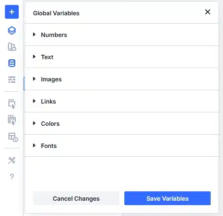
- Design Variables
Reusable global values such as:
- Colors
- Fonts
- Numbers (spacing, sizes)
- Text
- Images
- Links
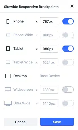
- Advanced Responsive Breakpoints
More control over how your design behaves across:
- Desktop
- Tablet
- Mobile
…and future-ready layouts with cleaner overrides.
Together, these features allow you to design once and adapt everywhere.
Why Use Variables for Responsive Design?
Before Divi 5:
- You manually adjusted values per device
- Small design changes took a lot of time
- Inconsistent spacing and typography were common
With Divi 5 Variables:
- Change once → updates everywhere
- Maintain consistent spacing and typography
- Scale designs faster for large websites
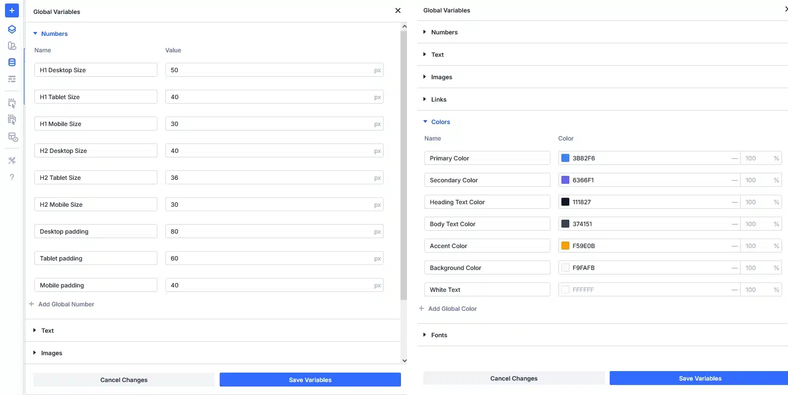
Step 1: Create Responsive Design Variables
Open any page in Divi Builder, then click the Variables Manager.
Recommended Variables for Responsive Layouts
Typography Variables
- Heading Font
- Body Font
- H1 Desktop Size
- H1 Tablet Size
- H1 Mobile Size
- Add H2 to H6 size like (H1 Desktop, Tablet and Mobile Variables)
Spacing Variables
- Section Padding Desktop
- Section Padding Mobile
- Column Gap
- Row Max Width
Color Variables
- Primary Color
- Secondary Color
- Text Color
- Background Light
Using these variables ensures design consistency across all breakpoints.
Step 2: Apply Variables to Modules
Once variables are created:
- Select any module (Text, Heading, Button, Section)
- Click the dynamic variable icon
- Choose your saved variable
Example:
- Assign H1 Desktop Size to headings
- Assign Section Padding Desktop to section padding
- Assign color variables to buttons and backgrounds
Now your layout is fully controlled by variables.
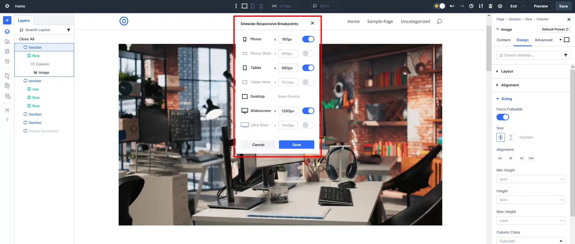
Step 3: Use Divi 5 Breakpoints Smartly
Divi 5 improves breakpoint handling by making overrides:
- Cleaner
- More predictable
- Easier to manage
How to Optimize Breakpoints
- Use Desktop as the base design
- Adjust only what’s needed for Tablet and Mobile
- Avoid duplicating values—use variables instead
Example:
- Desktop heading size → H1 Desktop Size
- Mobile heading size → H1 Mobile Size
This avoids manual resizing on every module.
Step 4: Combine Variables + Breakpoints (Best Practice)
Smart Workflow Example
- Create Three font-size variables:
- Title Size Desktop
- Title Size Tablet
- Title Size Mobile
- Assign Desktop variable to default view
- Switch to Mobile breakpoint
- Assign Mobile variable
Now:
- Every title updates instantly
- Future design changes take seconds
- Zero layout inconsistencies
This is true smart responsive design.

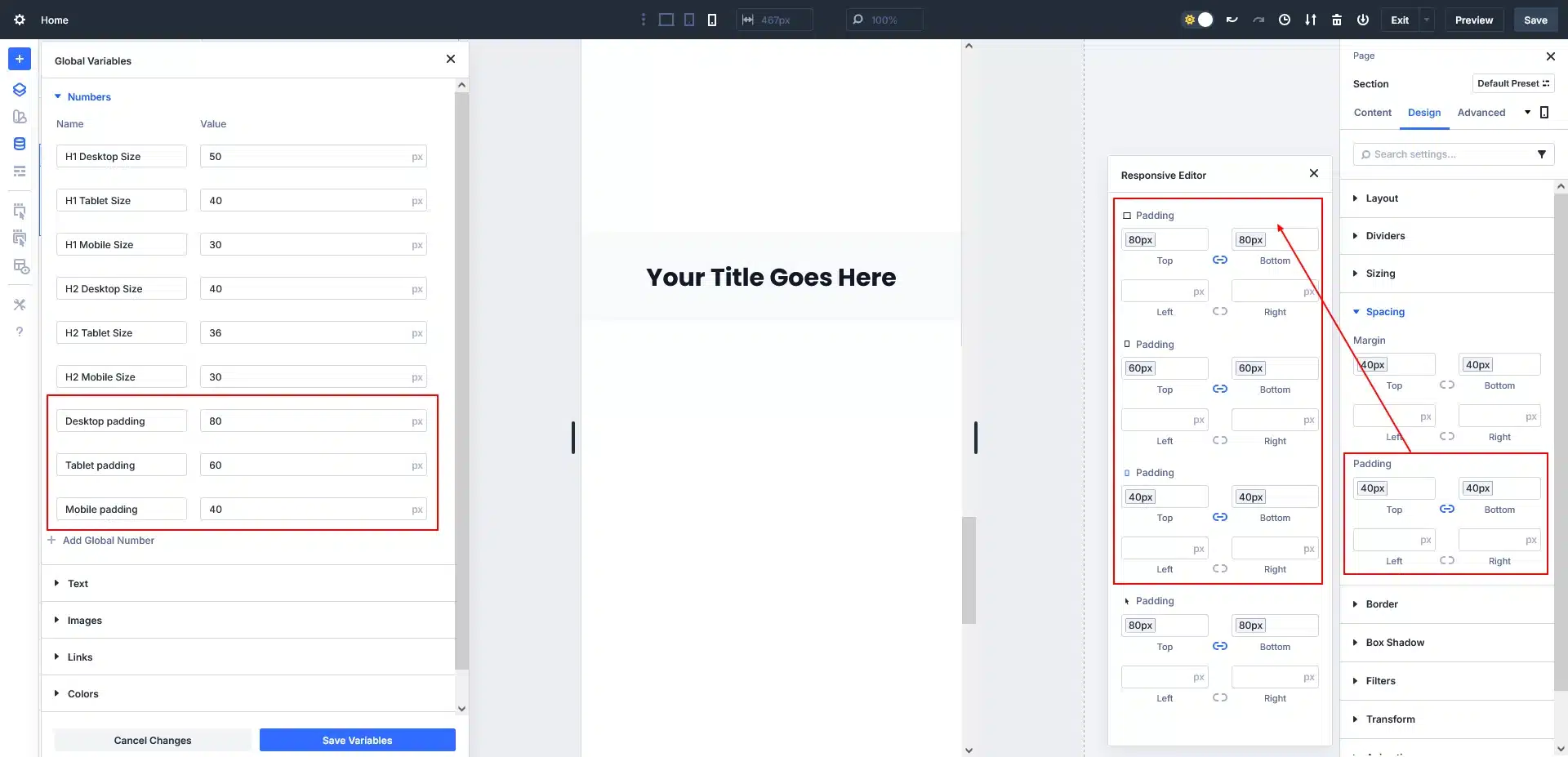
Step 5: Responsive Spacing Without CSS
Spacing is one of the biggest responsive challenges.
With Divi 5:
- Use number variables for padding & margin
- Assign different values per breakpoint
- Maintain perfect rhythm across devices
Example:
- Desktop padding: 80px
- Tablet padding: 60px
- Mobile padding: 40px
One variable update = site-wide improvement.
Step 6: Test and Scale Your Design
Before publishing:
- Preview Desktop, Tablet, and Mobile
- Adjust only variables—not individual modules
- Reuse the same variable system on new pages
This approach makes Divi 5 ideal for:
- Business websites
- Blogs
- Landing pages
- Large-scale WordPress projects
Final Thoughts
Divi 5’s Variables and Breakpoints transform responsive design from a manual task into a system-driven workflow.
Key Takeaways:
- Design once, adapt everywhere
- Reduce repetitive styling work
- Maintain visual consistency
- Build faster and smarter
If you’re building modern WordPress websites, Divi 5 responsive variables are a must-use feature.
Don’t let design limitations hold you back — Request a WordPress quote now and partner with TechnoCrackers to create a stunning, responsive, and scalable WordPress website.