





Table of Contents
- What Is Flexbox Order in Divi 5?
- Watch Divi 5 Flexbox Ordering in Action
- How to Reorder Columns in Divi 5
- Method 1: Use Display Order
- Step 1: Open Your Column Settings
- Step 2: Set the Desktop Order
- Step 3: Switch to the Phone Breakpoint
- Method 2: Change the Layout Direction
- Method 3: Use Layout Wrapping
- Which Setting Should You Use?
- Final Result
Divi 5 makes responsive layouts easier with its built-in Flexbox controls. One useful feature is Display Order, which lets you change the visual order of rows, columns, or elements at different screen sizes without changing the original layout structure.
For example, you may have four footer columns on desktop:
Company → Products → Resources → Contact & Support
But on mobile, you may want Contact & Support to appear first.
With Divi 5, you can make this change directly from the Visual Builder using Flexbox settings.
What Is Flexbox Order in Divi 5?
The Order setting controls where a flex item appears visually inside its parent container.
You can use it for:
- Columns
- Modules
- Rows
- Module Groups
The setting can also be changed separately for different responsive breakpoints, so your desktop and mobile layouts can have different visual orders.
This means you don’t need to move your columns around manually in the Divi Builder just to change their mobile position.
Watch Divi 5 Flexbox Ordering in Action
You can add the Divi 5 ordering demonstration video here:
Video: Reorder Based on Hierarchy
If you are using the WordPress Video module, simply add the MP4 video URL as the video source. You can also use an HTML5 video element if your editor supports custom HTML.
How to Reorder Columns in Divi 5
Let’s use a simple four-column footer as our example.
Our footer contains:
- TechnoCrackers
- Products
- Resources
- Contact & Support
Desktop Layout
On desktop, we want the columns to appear normally:
| Column | Display Order |
|---|---|
| TechnoCrackers | 0 |
| Products | 1 |
| Resources | 2 |
| Contact & Support | 3 |
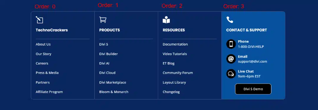
So the desktop layout looks like:
TechnoCrackers → Products → Resources → Contact & Support
Method 1: Use Display Order
Display Order is useful when you need a specific custom order for individual elements.
Step 1: Open Your Column Settings
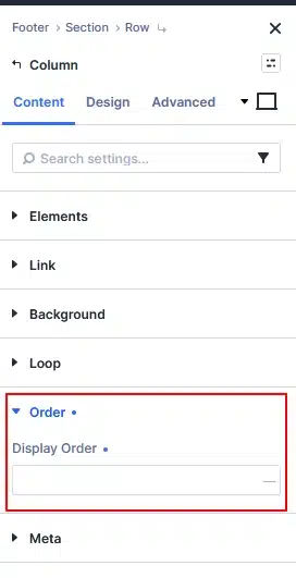
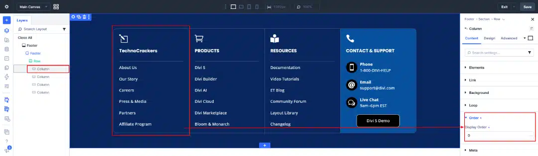
Open the settings of the column you want to move.
Go to: Content → Order → Display Order
Divi 5 provides the Order controls inside the element settings, allowing you to define the visual sequence of flex items.
Step 2: Set the Desktop Order
For our four-column footer, keep the desktop order like this:
- TechnoCrackers → 0
- Products → 1
- Resources → 2
- Contact & Support → 3
This keeps the original desktop layout.
Step 3: Switch to the Phone Breakpoint
Now we want to change the order only on mobile.
Use Divi’s responsive controls to switch the Display Order field to the Phone breakpoint.
Then set the values like this:
| Column | Desktop | Phone |
|---|---|---|
| TechnoCrackers | 0 | 1 |
| Products | 1 | 2 |
| Resources | 2 | 3 |
| Contact & Support | 3 | 0 |
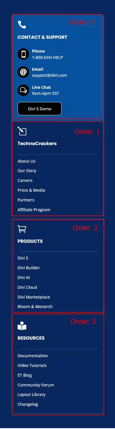
The mobile order will now become:
Contact & Support → TechnoCrackers → Products → Resources
Add your mobile screenshot here.
The important part is that you don’t need to change the desktop order. The Phone breakpoint can have its own Display Order values. Divi 5 supports responsive Flexbox settings across breakpoints.
Why Does 0 Come First?
Divi uses the numeric Display Order value to determine the visual sequence.
For example:
- -1 appears before 0
- 0 appears before 1
- 1 appears before 2
- 2 appears before 3
You can also use negative values when you need an element to move further toward the beginning of the layout.
A Simple Example
If your columns have:
Company = 1
Products = 2
Resources = 3
Contact = 0
The visual order becomes:
Contact → Company → Products → Resources
You only need to change the elements whose position you want to adjust. You don’t necessarily need to change every item’s order value.
Method 2: Change the Layout Direction
Another way to change the visual arrangement is Layout Direction.
You can find it under:
Design → Layout → Layout Direction
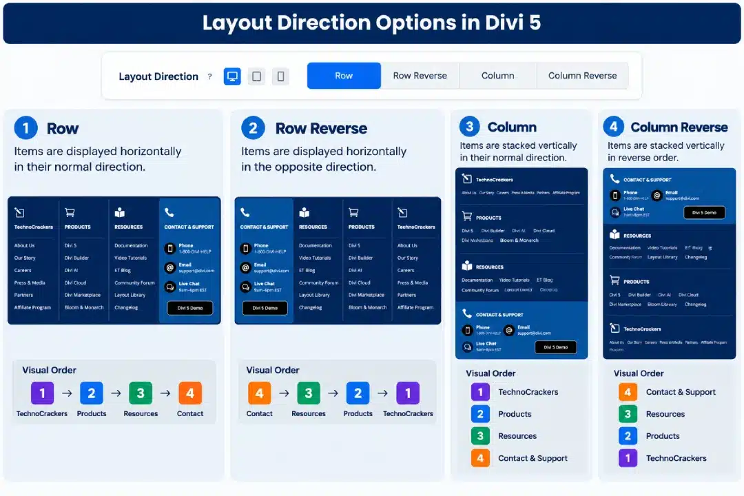
Divi 5 provides four options:
- Row
- Row Reverse
- Column
- Column Reverse
Row
Items are displayed horizontally in their normal direction.
1 → 2 → 3 → 4
This is the typical desktop arrangement.
Row Reverse
Items are displayed horizontally in the opposite direction.
4 → 3 → 2 → 1
This can be useful when you want to reverse the complete row.
Column
Items are stacked vertically.
1
2
3
4
This is especially useful when your columns stack on mobile.
Column Reverse
Items are stacked vertically in reverse order.
4
3
2
1
Layout Direction controls the overall flow of the child elements inside the flex container
Important: Layout Direction changes the flow of the entire group. If you need a very specific custom order, Display Order gives you more individual control.
Method 3: Use Layout Wrapping
The third option is Layout Wrapping.
You can find it under:
Design → Layout → Layout Wrapping
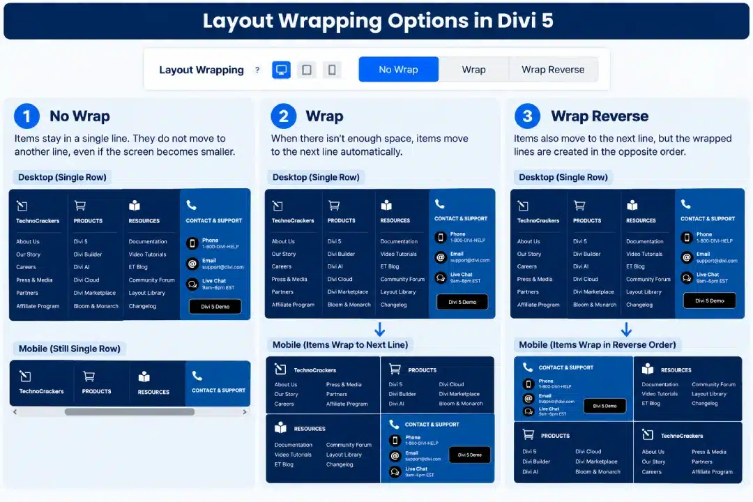
Divi 5 provides:
- No Wrap
- Wrap
- Wrap Reverse
Wrap
When there isn’t enough space, flex items can move onto another line.
For example:
Desktop:
1 | 2 | 3 | 4
On a smaller screen, they can wrap:
1 | 2
3 | 4
This is useful when you want elements to automatically move to another line as the available space becomes smaller.
Wrap Reverse
Wrap Reverse works similarly, but the wrapped lines are created in the opposite direction.
This can be useful when you want to control how multiple lines of flex items stack.
However, Wrap Reverse is not a replacement for Display Order when you need to move one specific column or element to a particular position.
Which Setting Should You Use?
These three settings solve different layout problems:
| Setting | Best Used For |
|---|---|
| Display Order | Moving specific elements into a custom order |
| Layout Direction | Changing the overall flow from row to column or reversing it |
| Layout Wrapping | Allowing items to move onto additional lines |
For our four-column footer example, Display Order is the most direct approach because we want one specific column — Contact & Support — to move to the top on mobile.
Final Result
With Divi 5 Flexbox controls, you can keep your desktop layout exactly as it is while creating a different visual order for smaller screens.
In our example:
Desktop
TechnoCrackers → Products → Resources → Contact & Support
Mobile
Contact & Support → TechnoCrackers → Products → Resources
No duplicate footer is required, and you don’t need custom CSS just to change the visual order.
Divi 5’s Flexbox system provides these controls directly inside the Visual Builder, including responsive ordering, direction, and wrapping.