





Table of Contents
- What Is a Tooltip?
- How to Create a Tooltip in Divi 5
- Step 1: Add the Tooltip Module to an Element
- Step 2: Add Your Tooltip Content
- Step 3: Choose How the Tooltip Appears
- Step 4: Control Tooltip Movement and Position
- Step 5: Adjust the Tooltip Timing
- Step 6: Add a Tooltip Arrow
- Step 7: Customize the Tooltip Design
- Tips for Using Divi 5 Tooltips
- Why Use Divi 5’s Tooltip Module?
- Final Thoughts
Tooltips are a great way to provide extra information without adding more content to your page.
With Divi 5’s new Tooltip Module, you can create interactive tooltips directly inside the Visual Builder. You can attach a tooltip to buttons, icons, images, text, and other Divi elements, then control its content, position, behavior, and design without custom code.
In this guide, we’ll show you how to create and customize a tooltip using Divi 5’s built-in options.
What Is a Tooltip?
A tooltip is a small popup that appears near an element when a visitor interacts with it.
For example, you can use a tooltip to:
- Explain an icon or button
- Provide additional information
- Add hints to form fields
- Explain pricing features
- Show product details
- Define technical terms
Tooltips are especially useful when you want to provide extra information without making the main layout feel crowded.
How to Create a Tooltip in Divi 5
Step 1: Add the Tooltip Module to an Element
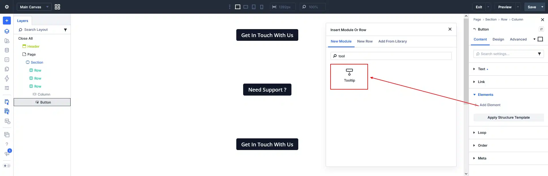
Open the Divi 5 Visual Builder and select the element where you want to add a tooltip.
The Tooltip Module works as a nested element, so open:
Content → Elements → Add New Element
Then search for and select the Tooltip module.
For Example: Add Button
Go to: Button → Elements → Add New Element (eg. Tooltip)
The parent element becomes the tooltip’s anchor. For example, if you add the Tooltip Module inside a Button Module, the button becomes the element that triggers the tooltip.
Step 2: Add Your Tooltip Content
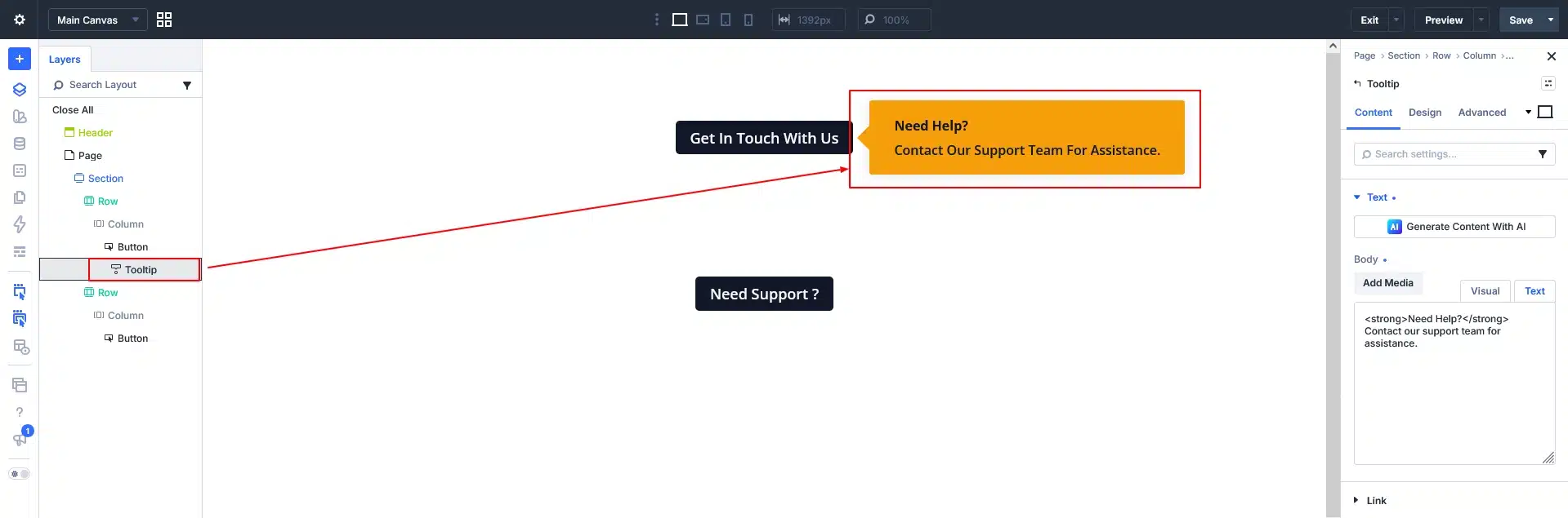
After adding the Tooltip Module, add the information you want to display.
You can use the Text option to add simple tooltip content.
For example:
Need Help?
Contact our support team for assistance.
You can also add other Divi elements inside the tooltip, such as:
- Text
- Icons
- Images
- Buttons
- Other nested modules
This makes the Tooltip Module useful for creating more than just simple text popups.
Step 3: Choose How the Tooltip Appears
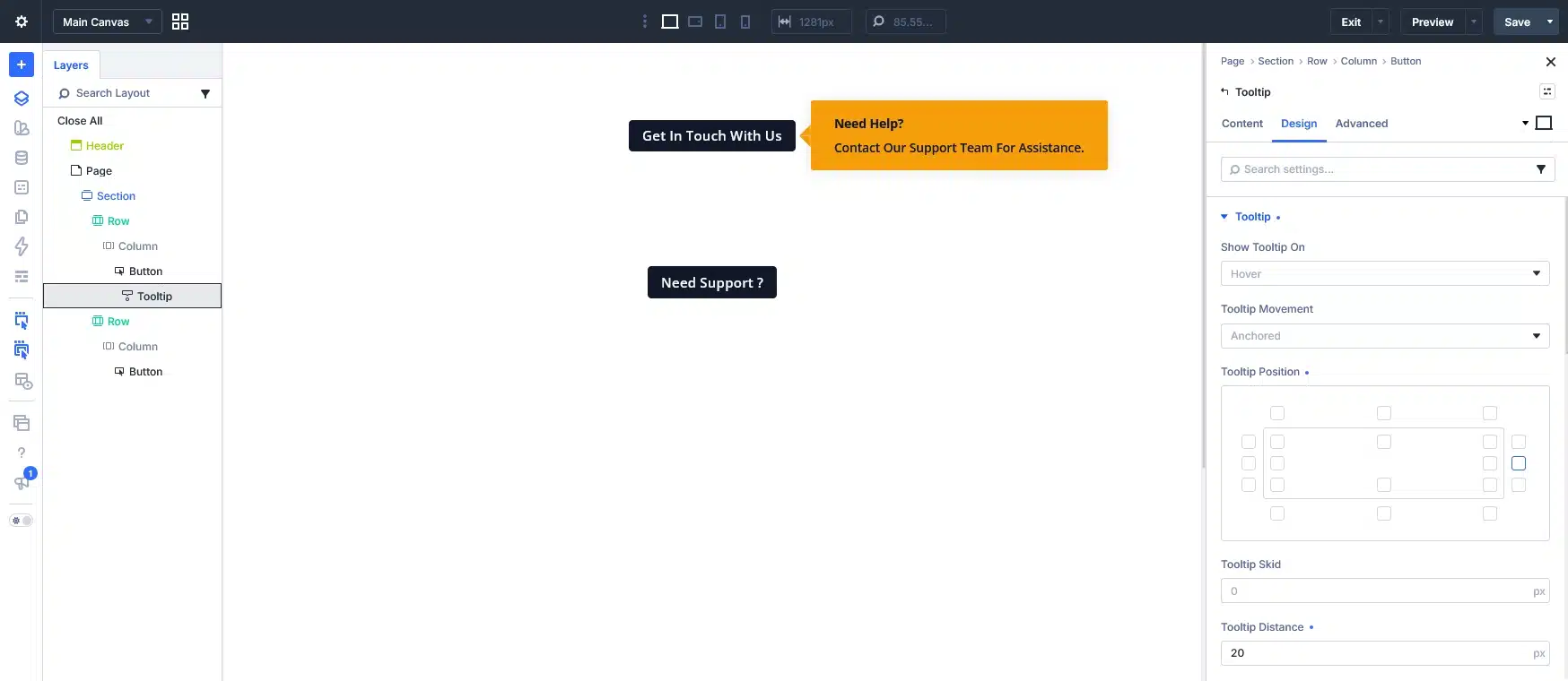
Now open the Design → Tooltip settings.
Under Show Tooltip On, you can choose how visitors will see the tooltip:
Hover
The tooltip appears when the visitor hovers over the parent element.
Click
The tooltip appears when the visitor clicks or taps the parent element.
Always
The tooltip remains visible without requiring an interaction.
For desktop websites, Hover can work well for quick hints. For mobile devices, Click is generally a better choice because touchscreens don’t have a traditional hover interaction.
Step 4: Control Tooltip Movement and Position
Divi 5 gives you more control over where the tooltip appears.
Under the Tooltip settings, you can choose:
Anchored – Keeps the tooltip positioned relative to the parent element.
Follow Cursor – Makes the tooltip follow the visitor’s cursor.
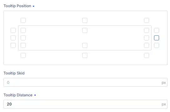
You can also choose the tooltip’s position around the parent element.
For example, you can position it:
- Top
- Bottom
- Left
- Right
You can fine-tune the position using Tooltip Skid and Tooltip Distance.
Step 5: Adjust the Tooltip Timing
Divi 5 also lets you control how quickly the tooltip opens and closes.
Tooltip Open Delay controls how long Divi waits before showing the tooltip.
Tooltip Close Delay controls how long the tooltip remains visible after the visitor moves away.
These settings are especially helpful when your tooltip contains interactive content such as a link or button.

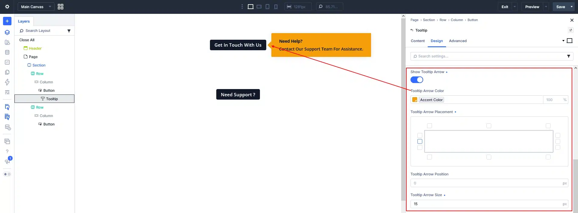
Step 6: Add a Tooltip Arrow
You can add an arrow to visually connect the tooltip with its parent element.
Enable Show Tooltip Arrow and customize its appearance and position.
An arrow can be especially useful when the tooltip is positioned farther away from the element it describes.
Step 7: Customize the Tooltip Design
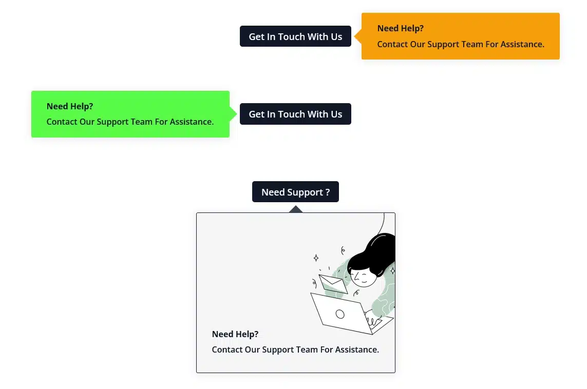
Once the tooltip behavior is ready, you can customize its appearance using Divi’s regular design options.
You can control:
- Body Text – Font, size, color, and spacing
- Sizing – Width and maximum width
- Spacing – Padding and margin
- Border – Border style and rounded corners
- Box Shadow – Add depth to the popup
- Background – Color, gradient, image, or video
- Animation – Add an entrance effect
This makes it easy to match your tooltip with the rest of your website design.
Tips for Using Divi 5 Tooltips
A tooltip should provide extra context, not hide information that visitors need.
Here are a few simple tips:
Keep the Content Short
Tooltips work best with short and useful information. If you need several paragraphs, consider placing that content directly on the page instead.
Don’t Repeat Visible Content
If your button already says Learn More, there is no need for the tooltip to say the same thing. Use the tooltip to provide additional information.
Choose the Right Trigger
Use Hover for quick desktop hints and consider Click when the tooltip needs to work well on mobile or contains interactive content.
Check the Tooltip on Different Devices
Always test the tooltip on desktop, tablet, and mobile. Make sure it doesn’t get cut off or overlap important content
Why Use Divi 5’s Tooltip Module?
The new Tooltip Module makes it much easier to add contextual information to your layouts.
Instead of relying on custom CSS or third-party tooltip plugins, you can now create tooltips directly in Divi 5 and control their content, trigger, position, timing, arrow, and styling from the Visual Builder.
Final Thoughts
Divi 5’s Tooltip Module is a simple but useful feature for keeping your layouts clean while still providing visitors with helpful information.
By nesting the Tooltip Module inside an element, you can quickly create a tooltip and customize how it appears, where it is positioned, and how it looks.
Whether you’re adding icon descriptions, form hints, pricing information, product details, or helpful tips, Divi 5 gives you everything you need to create tooltips without custom code.