





Table of Contents
- What Are CSS Units in Elementor Atomic Elements?
- How to Use CSS Units in Elementor Atomic Elements
- 1. PX – Fixed Pixel Values
- 2. % – Percentage-Based Values
- 3. EM – Relative to Font Size
- 4. REM – Relative to the Root Font Size
- 5. VW – Viewport Width
- 6. VH – Viewport Height
- CSS Functions in Elementor Atomic Elements
- Using CSS Functions with FX
- Which CSS Unit Should You Use?
- Tips for Using CSS Units in Elementor
- Create More Flexible Elementor Layouts
Elementor’s new Atomic Elements features give you more control over how you style and position elements directly inside the Elementor editor. One of the useful improvements is the ability to work with different CSS units and functions when setting sizes, spacing, positioning, and other styling properties.
Instead of using fixed values everywhere, you can use units such as PX, %, EM, REM, VW, and VH to create more flexible and responsive layouts.
In this guide, we’ll explore the CSS options available in Elementor Atomic Elements and show you when and how to use each unit and CSS function.
What Are CSS Units in Elementor Atomic Elements?
CSS units determine how a value is calculated in your design.
For example, when setting the width of an element, you could use:
- 500px – Fixed width
- 50% – 50% of the parent container
- 2rem – Relative to the root font size
- 2em – Relative to the element’s font size
- 50vw – 50% of the viewport width
- 50vh – 50% of the viewport height
Elementor Atomic Elements lets you select these units directly from the relevant CSS options.
How to Use CSS Units in Elementor Atomic Elements
When you add an Atomic Element and open one of its styling options, you may see a value field with a unit selector.
For example:
Width → 500 PX
You can click the unit dropdown and change it to another option such as %, EM, REM, VW, or VH.
This makes it easier to create responsive designs without relying only on fixed pixel values.
1. PX – Fixed Pixel Values
PX (pixels) is a fixed CSS unit.
For example:
Width: 500px
This means the element will have a width of 500 pixels regardless of the size of its parent container or viewport.
When to Use PX
PX works well when you need a specific, predictable size, such as:
- Icon sizes
- Borders
- Small spacing values
- Button heights
- Specific desktop dimensions
Example:
Padding: 20px
Border Width: 1px
Icon Size: 24px
However, using PX for everything can make a layout less flexible on different screen sizes.

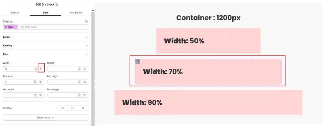
2. % – Percentage-Based Values
The % (percentage) unit is relative to another element, usually the parent container.
For example:
Width: 50%
This makes the element take up 50% of its available parent width.
When to Use %
Percentage values are useful for:
- Container widths
- Columns
- Images
- Flexible layouts
- Responsive sections
Example:
Element Width: 50%
If the parent container is 1200px wide, the element will be approximately 600px wide.
If the parent becomes smaller, the element will also adjust automatically.
3. EM – Relative to Font Size
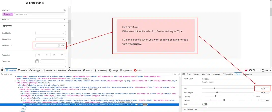
The EM unit is relative to the font size of the element or its parent, depending on the CSS property.
For example:
Font Size: 2em
If the relevant font size is 16px, 2em would equal 32px.
EM can be useful when you want spacing or sizing to scale with typography.
When to Use EM
You can use EM for:
- Padding
- Margins
- Font sizes
- Component spacing
- Typography-related sizing
For example:
Font-size: 1em
The size will scale based on the relevant font size.
4. REM – Relative to the Root Font Size
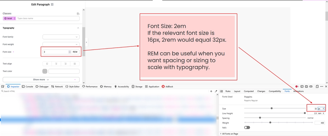
REM stands for Root EM.
Unlike EM, REM is based on the root HTML font size rather than the font size of the current element.
For example, if the root font size is 16px:
1rem = 16px
2rem = 32px
3rem = 48px
When to Use REM
REM is particularly useful for maintaining consistent spacing and typography throughout a website.
You can use it for:
- Headings
- Paragraph sizes
- Padding
- Margins
- Section spacing
- Buttons
For example:
Heading Size: 2rem
Section Padding: 4rem
This creates a more consistent sizing system across your website.
5. VW – Viewport Width
VW means Viewport Width.
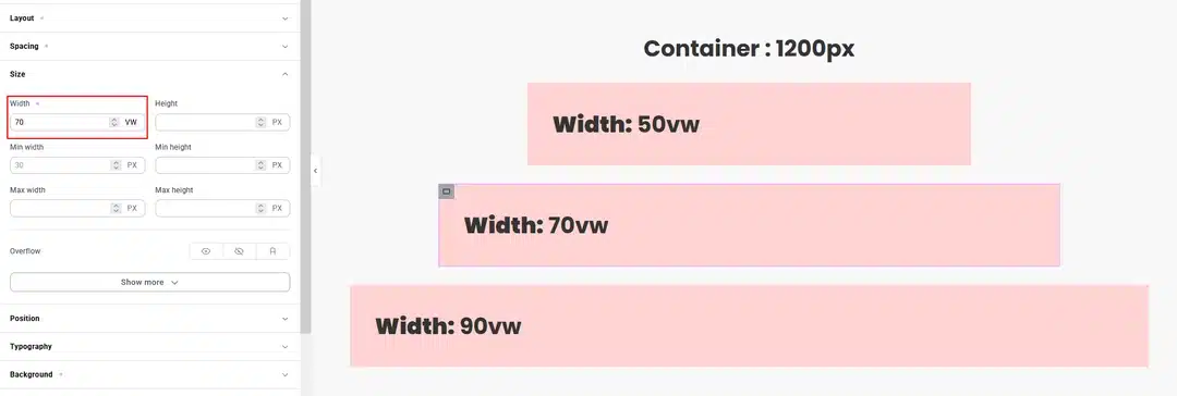
1vw represents 1% of the browser’s viewport width.
For example:
50vw
means 50% of the viewport width.
When to Use VW
VW is useful when you want an element to scale based on the screen width.
Common uses include:
- Large headings
- Full-width sections
- Hero elements
- Responsive spacing
- Large decorative elements
For example:
Width: 70vw
This allows the element to occupy 70% of the viewport width.
6. VH – Viewport Height
VH means Viewport Height.
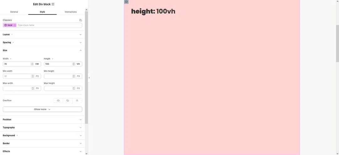
1vh represents 1% of the browser’s viewport height.
For example: 100vh
represents the full height of the viewport.
When to Use VH
VH is especially useful for:
- Hero sections
- Full-screen layouts
- Landing pages
- Vertical spacing
- Background sections
For example:
Min Height: 100vh
This can be used to create a section that fills the visible browser height.
CSS Functions in Elementor Atomic Elements
In addition to standard CSS units, Elementor Atomic Elements can also work with CSS functions such as FX, allowing you to create more flexible CSS values.
CSS functions are useful when a simple unit isn’t enough and you need to combine or calculate values.
For example, instead of using:
Width: 100%
you can use a CSS function to calculate a more specific value.
Using CSS Functions with FX
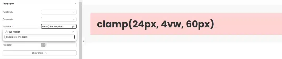
The FX option lets you enter CSS functions when a simple CSS unit is not enough. You can use functions such as calc() and clamp() to create more flexible and responsive designs.
Using calc()
The calc() function lets you combine different CSS units to calculate a value.
For example:
calc(100% – 200px)
This allows an element to use the available width while keeping 40px of space.
You can combine different units such as %, px, rem, vw, and more.

Using clamp()
The clamp() function lets you set a minimum value, preferred value, and maximum value for a property.
For example:
clamp(24px, 4vw, 60px)
This means the value will:
- Never be smaller than 24px
- Scale based on 4vw
- Never become larger than 60px
This is useful for creating responsive font sizes, spacing, and element dimensions without adding multiple breakpoint settings.
Why Use CSS Functions?
Using calc() and clamp() can help you create:
- Dynamic widths and heights
- Responsive spacing
- Fluid typography
- Flexible layouts
- Better responsive designs
- Values that adapt between minimum and maximum sizes
Which CSS Unit Should You Use?
Each CSS unit has a different purpose.
| Unit | Based On | Common Use |
|---|---|---|
| PX | Fixed pixels | Borders, icons, small spacing |
| % | Parent element | Widths and flexible layouts |
| EM | Element/parent font size | Typography and component spacing |
| REM | Root font size | Typography and consistent spacing |
| VW | Viewport width | Responsive widths and headings |
| VH | Viewport height | Full-screen sections |
| FX / CSS Functions | Calculated values | Advanced responsive layouts |
Tips for Using CSS Units in Elementor
Use PX for Fixed Elements
Use pixels when you need a specific, predictable size.
Use % for Flexible Widths
Percentages are useful when an element should adapt to its parent container.
Use REM for Consistent Typography
REM works well for creating a consistent typography and spacing system.
Use EM for Component-Based Scaling
EM is useful when you want spacing to scale with an element’s typography.
Use VW and VH for Viewport-Based Designs
Use VW and VH when your design needs to respond directly to the browser’s screen size.
Use CSS Functions for Advanced Layouts
When a simple unit isn’t enough, CSS functions such as calc() can help combine different values.
Create More Flexible Elementor Layouts
The CSS options in Elementor Atomic Elements make it easier to move beyond fixed pixel-based designs. By combining PX, %, EM, REM, VW, VH, and CSS functions, you can create layouts that adapt better to different screen sizes.
The key is to choose the unit based on what you want the value to respond to:
- Fixed size → PX
- Parent size → %
- Element typography → EM
- Root typography → REM
- Screen width → VW
- Screen height → VH
- Calculated values → CSS functions / FX
With these options, you can build more flexible and responsive layouts directly within the Elementor editor without needing to write custom CSS for every adjustment.