Table of Contents
- What Are Image Tooltips (Hotspots)?
- Why Use Hotspots in Divi 5?
- Key Features Used in Divi 5 Hotspots
- Step-by-Step: How To Add Tooltips (Hotspots) To Images In Divi 5
- Step 1: Add Your Base Image
- Step 2: Create a Hotspot Marker
- Step 3: Design Tooltip Content (Canvas)
- Step 4: Add Canvas Portal
- Step 5: Hide Tooltip by Default
- Step 6: Position the Hotspot
- Step 7: Add Interaction (Show Tooltip)
- Step 8: Add Hide Interaction
- Step 9: Duplicate for Multiple Hotspots
- Common Mistakes to Avoid
- Final Thoughts
In modern web design, user engagement is everything. Static images alone often fail to communicate detailed information effectively. That’s where image tooltips (hotspots) come into play. With Divi 5, creating interactive image hotspots has become easier than ever—without needing any custom code or third-party plugins.
In this guide, you’ll learn what hotspots are, why they matter, and how to add tooltips (hotspots) to images in Divi 5 step by step.
What Are Image Tooltips (Hotspots)?
Image hotspots are interactive elements placed on top of an image. When users hover over or click on these points, additional content appears—such as text, buttons, product info, or tooltips.
These hotspots are commonly used in:
- Product showcase pages
- Infographics
- Maps
- Real estate layouts
- Feature highlight sections
Instead of overwhelming users with too much content at once, hotspots allow users to explore information on demand, improving both UX and engagement.
Why Use Hotspots in Divi 5?
Divi 5 introduces a powerful system called Interactions, which allows you to create dynamic behavior like hover effects, toggles, and tooltips visually.
Here’s why hotspots are valuable:
1. Cleaner Design
You can hide extra information and reveal it only when needed, keeping your layout minimal.
2. Better User Engagement
Interactive elements encourage users to explore your content rather than passively scroll.
3. No Plugins Required
Divi 5 lets you create hotspots using built-in tools—saving performance and avoiding plugin conflicts.
4. Fully Customizable
You can design tooltips exactly how you want—icons, colors, animations, and layouts.
Key Features Used in Divi 5 Hotspots
Before diving into the steps, let’s understand the main tools used:
1. Interactions
Interactions are the core of hotspot functionality. They include:
- Trigger (e.g., hover, click)
- Effect (show/hide content)
- Target (element to affect)

2. Module Groups
These help you organize hotspot elements (icon + content) into one unit.
3. Canvases
A separate workspace where you design tooltip content.
4. Canvas Portal Module
This allows you to display canvas content anywhere on your page.
Together, these tools allow you to create powerful tooltip systems visually.
Step-by-Step: How To Add Tooltips (Hotspots) To Images In Divi 5
Let’s break it down into simple steps.
Step 1: Add Your Base Image
Start by adding an Image Module in Divi.
Tips:
- Enable Force Fullwidth for better responsiveness
- Use high-quality images
- Choose images with clear focal points
A well-chosen image makes hotspot placement easier and more effective.
Step 2: Create a Hotspot Marker
Now, create the clickable or hoverable marker.
- Add a Module Group
- Inside it, add an Icon Module
Why use a group?
It keeps your marker and tooltip content connected and easy to manage.
Design Tips:
- Use contrasting colors for visibility
- Add hover effects (like slight scaling)
- Use consistent styling across all hotspots
Step 3: Design Tooltip Content (Canvas)
Now it’s time to create the actual tooltip.
- Add a New Canvas
- Build your content inside it:
- Heading
- Text
- Button (optional)
Best Practices:
- Keep content short and informative
- Use padding, shadows, and background color
- Maintain a fixed or responsive width
Hotspots work best when they provide quick, digestible information rather than long paragraphs.
Step 4: Add Canvas Portal
Go back to your main layout.
- Inside the same Module Group, add a Canvas Portal Module
- Link it to your created canvas
This step connects your tooltip design to the actual page.
Step 5: Hide Tooltip by Default
Before adding interaction:
- Disable visibility of the tooltip (Canvas Portal)
This ensures the tooltip only appears when triggered.
Step 6: Position the Hotspot
To place the marker correctly:
- Open Module Group settings
- Set Position: Absolute
- Adjust:
- Horizontal Offset
- Vertical Offset
This lets you place the hotspot precisely over the image.
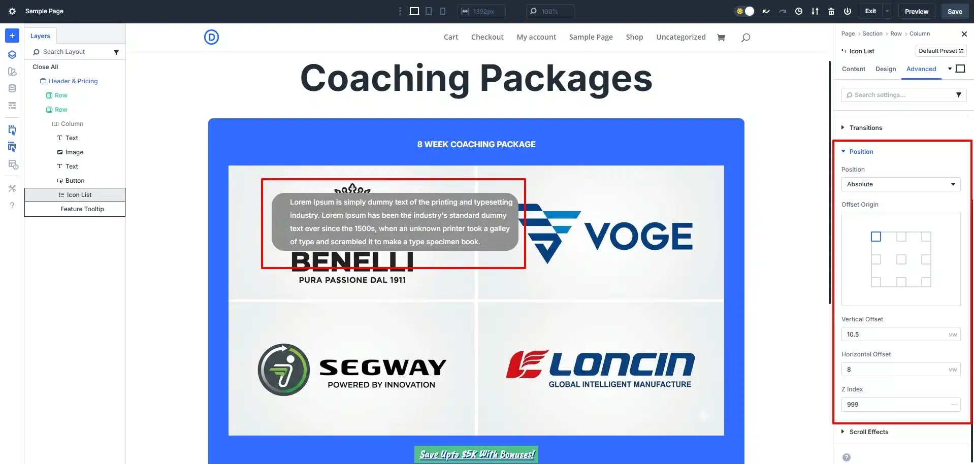
Pro Tip:
Set a higher Z-index so the hotspot stays above the image.
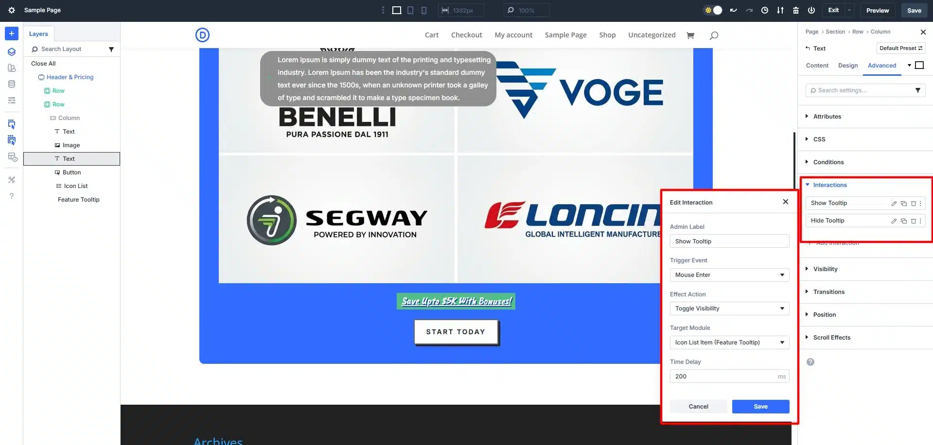
Step 7: Add Interaction (Show Tooltip)
Now connect the marker to the tooltip.
- Trigger: Mouse Enter
- Action: Show Element
- Target: Canvas Portal
This makes the tooltip appear when users hover over the icon.
Step 8: Add Hide Interaction
To hide the tooltip:
- Trigger: Mouse Exit
- Action: Hide Element
- Target: Same Canvas Portal
Important Tip:
Apply this to the Module Group (not just the icon) to prevent flickering when moving the cursor.
Step 9: Duplicate for Multiple Hotspots
To add more hotspots:
- Duplicate the Module Group
- Duplicate the Canvas
- Update content and positions
Each hotspot will have:
- Its own marker
- Its own tooltip content
- Its own interaction
Common Mistakes to Avoid
- Incorrect positioning on responsive screens
- Tooltip flickering issues
- Overloading tooltips with content
- Poor contrast in markers
- Not testing on mobile devices
Final Thoughts
Adding tooltips (hotspots) to images in Divi 5 is a powerful way to enhance your website’s interactivity and user experience. With features like Interactions, Canvases, and Module Groups, you can create professional, dynamic layouts without writing a single line of code.
The key is to keep your design clean, your content concise, and your interactions smooth.
If used correctly, hotspots can significantly improve how users engage with your content—turning simple images into interactive, informative experiences.