Table of Contents
Creating consistent and scalable layouts is one of the biggest challenges in modern web design. Whether you’re building a blog, an eCommerce store, or a corporate website, you often find yourself repeating the same design patterns—especially card layouts.
With Divi 5, this problem is solved efficiently using Module Groups. You can now create a reusable card layout once and use it anywhere across your website without rebuilding it from scratch.
In this guide, you’ll learn how to create a reusable card module group in Divi 5, step by step, along with best practices and real-world use cases.
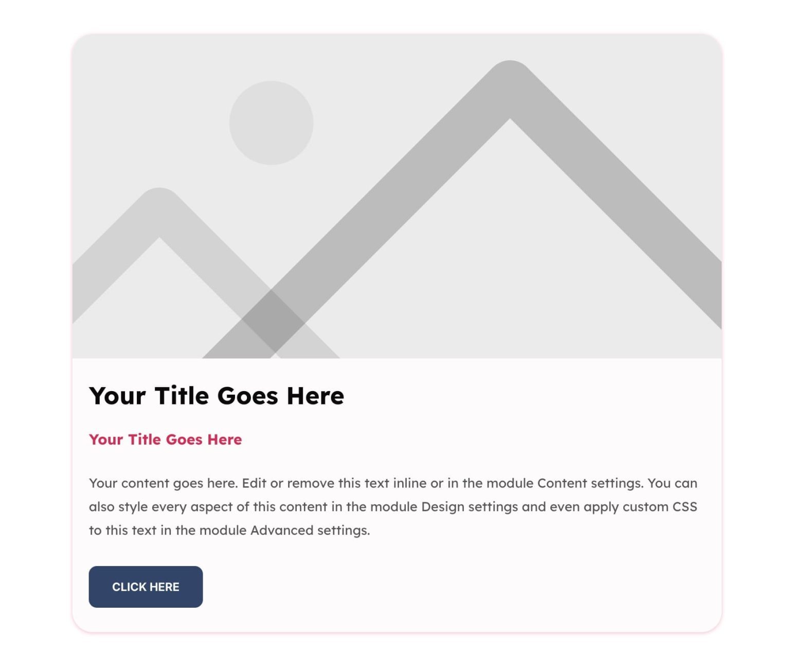
Build Your Card Design
Before we start building, here’s the card we’re aiming for.

Step-by-Step: Create a Reusable Card Module Group in Divi 5
Let’s walk through the complete process.
Step 1: Add a Row Structure
Start by creating a section and adding a Row.
- Choose a single-column layout
- This keeps your card centered and clean
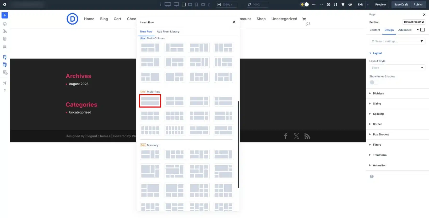
You can adjust the width (e.g., 50–60%) while designing to make it easier to style.
Step 2: Add a Module Group
Inside the column:
- Click the + icon
- Select Group Module
This will act as the main container for your card.
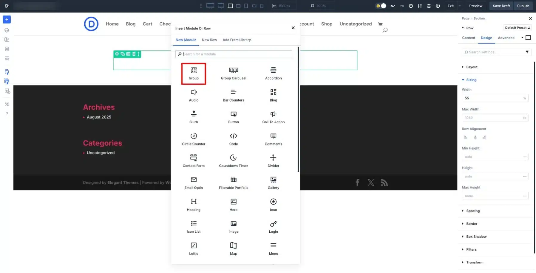
The Group Module allows you to:
- Move all elements together
- Apply styling to the entire card
- Reuse the whole structure later
Step 3: Build Your Card Structure
Now, add modules inside the group.
Typical card structure:
- Image Module (top section)
- Heading Module (H2) – Title
- Heading Module (H4) – Subtitle or category
- Text Module – Description
- Button Module – Call to action
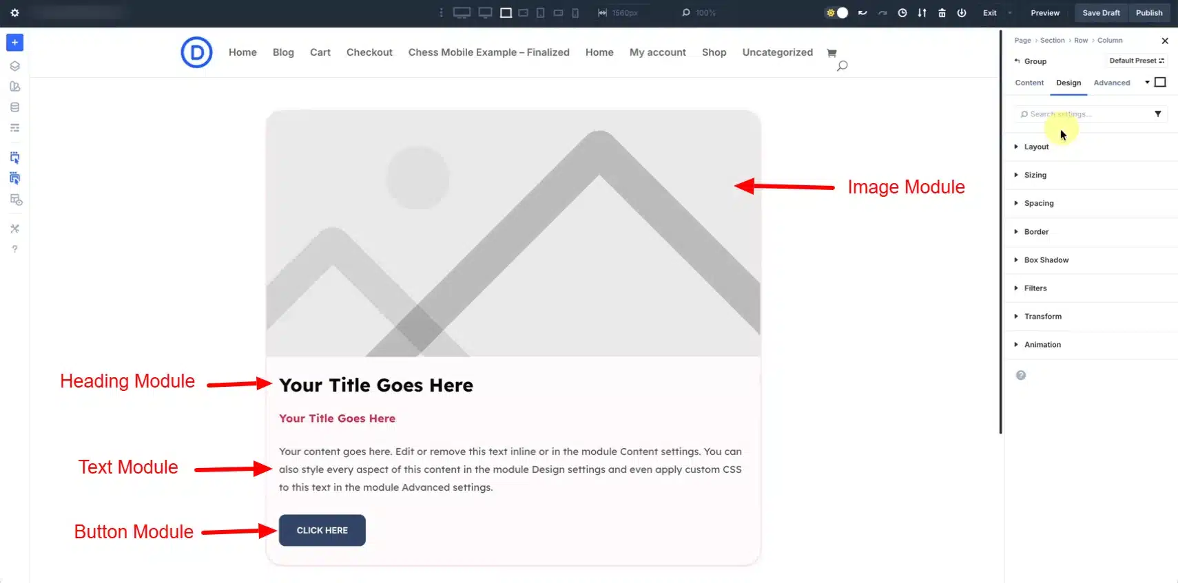
All these elements will now behave as a single unit.
This modular approach helps you maintain structure and flexibility at the same time.
Step 4: Style the Card Design
Now it’s time to make your card visually appealing.
Apply Styles to Individual Modules:
- Adjust font size and weight for headings
- Set spacing for text
- Customize button styles
Apply Styles to the Group Container:
Go to Group Module Settings → Design Tab
Add:
- Background color
- Padding and spacing
- Border radius (e.g., 20–25px)
- Box shadow
This ensures your entire card looks like a single unified component.
You can also use Flex Layout settings to control spacing between elements.
Step 5: Save Card to Divi Library
This is the most important step.
- Hover over the Module Group
- Click the three dots menu
- Select Save to Library
- Give it a name (e.g., “Reusable Card Design”)
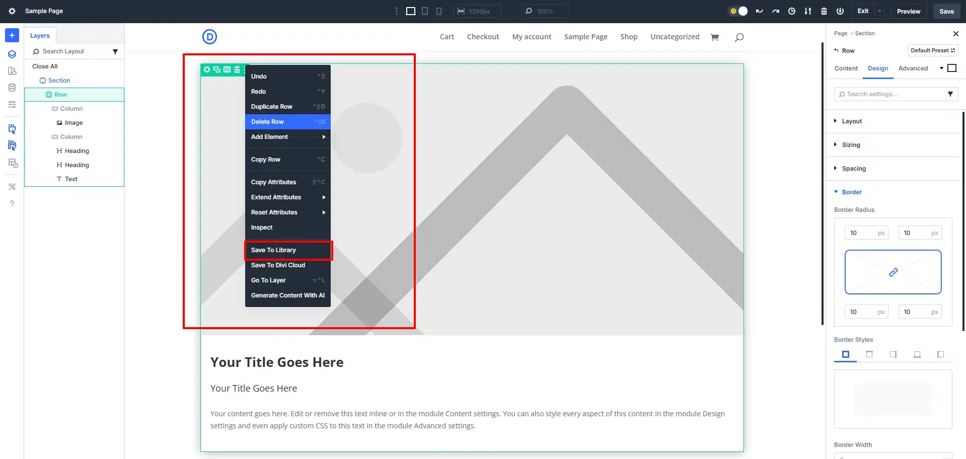
Once saved, your card becomes reusable across your website.
You can also:
- Add categories for organization
- Save to Divi Cloud for use on multiple websites
Step 6: Reuse the Card Anywhere
To use your saved card:
- Open any page in Divi Builder
- Add a Row
- Click Add From Library
- Select your saved card
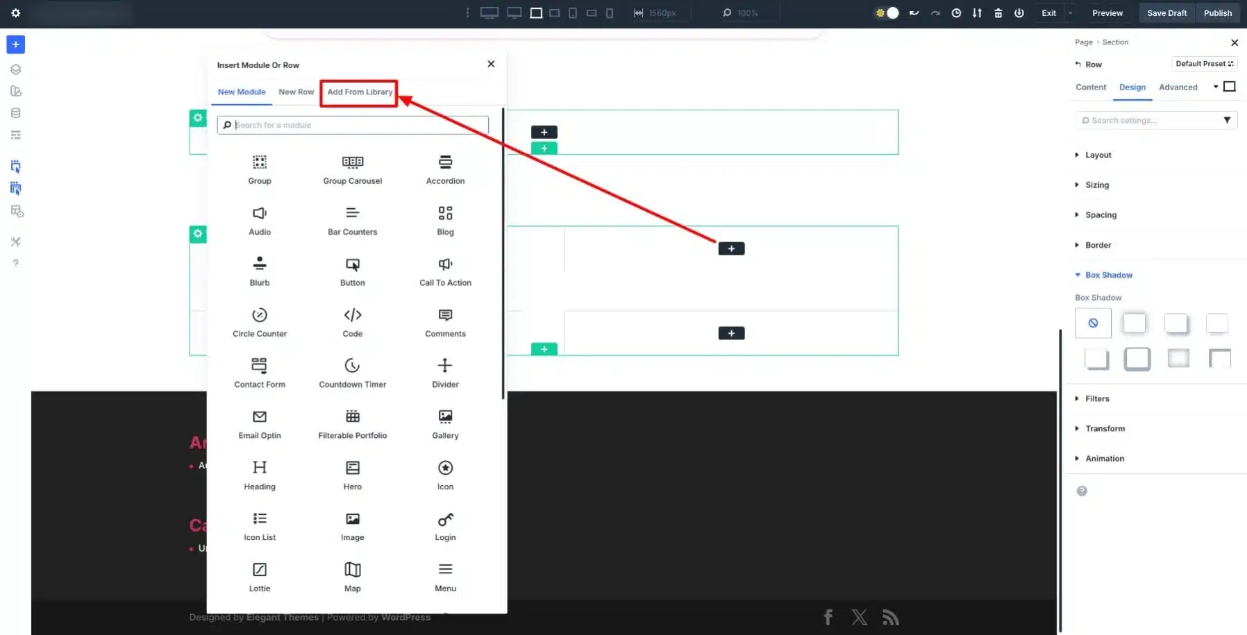
The entire design will appear instantly with all styles intact.
You only need to:
- Replace image
- Update text
- Change button link
Final Thoughts
Creating a reusable card module group in Divi 5 is one of the most powerful techniques for building modern, scalable websites.
Instead of repeating the same design over and over, you can:
- Build once
- Save it
- Reuse it anywhere
- Automate it with dynamic content
This not only improves your workflow but also ensures your website stays consistent, professional, and easy to maintain.