





Table of Contents
- Why Aspect Ratio Matters for Loop Designs
- What Does Aspect Ratio Do?
- Aspect Ratio, Object Fit, and Object Position
- Let’s Create a Consistent Blog Loop in Divi 5
- Step 1: Create a Grid Layout
- Step 2: Turn the Column Into a Loop
- Step 3: Design Your Blog Card
- Step 4: Connect the Content Dynamically
- Step 5: Set the Image Aspect Ratio
- Step 6: Change Object Fit to Cover
- Step 7: Choose the Image Position
- Choosing the Right Aspect Ratio
- Make Your Loop Responsive
- Keep Your Loop Cards Aligned
- Save Your Image Design as a Preset
- Common Problems When Using Aspect Ratio
- Create More Consistent Loops with Divi 5
Creating dynamic content with Divi 5’s Loop Builder makes it easy to display blog posts, products, portfolios, and other content in a reusable layout. However, there is one common design problem: not every image has the same dimensions.
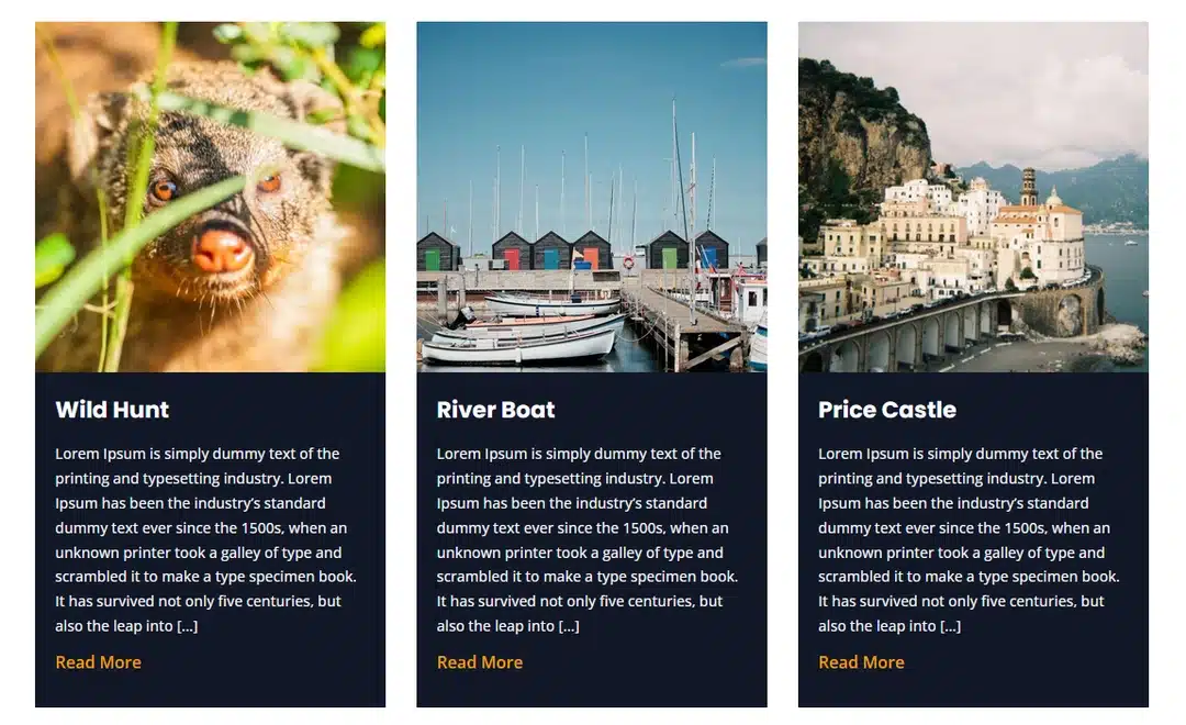
Some featured images may be horizontal, some vertical, and others may be square. When these images are placed into the same Loop layout, the different proportions can make the cards look uneven.
Divi 5 gives you a simple way to control this with its Aspect Ratio settings. When combined with image framing options, you can create a more consistent and polished Loop layout without having to edit every image individually.
In this tutorial, we’ll show you how to set up a Loop and use Aspect Ratio to create consistent image areas across your cards.
Why Aspect Ratio Matters for Loop Designs
Imagine creating a three-column blog grid where every post uses a different featured image size.
One image might look like this:
- Wide landscape image
- Tall portrait image
- Square image
If Divi displays each image according to its original proportions, every card can end up with a different image height.
This affects the overall appearance of the grid and can make the layout feel less organized.
Instead of modifying every featured image before uploading it, you can control the displayed proportions directly from the Loop design.
This is where Aspect Ratio becomes useful.
What Does Aspect Ratio Do?
Aspect Ratio determines the proportional relationship between an element’s width and height.
For example:
- 1:1 creates a square area.
- 4:3 creates a traditional landscape shape.
- 16:9 creates a wider format.
- 3:4 creates a portrait format.
The important thing is that the ratio controls the displayed frame, rather than changing the original image file.
So, if you set your Loop images to 1:1, a landscape image and a portrait image can both appear inside the same square-shaped area.
This gives your Loop a much more consistent appearance.
Aspect Ratio, Object Fit, and Object Position
Aspect Ratio works together with Divi 5’s image framing controls.
There are three settings you should understand:
Aspect Ratio
Controls the shape of the image area.
Object Fit
Controls how the image is placed inside that area.
For example, Cover allows the image to completely fill the frame while maintaining its original proportions. Parts of the image may be cropped if the source image has a different ratio.
Object Position
Controls which part of the image is prioritized when cropping occurs.
For example, you can position the image toward the top, center, bottom, left, or right.
Using these settings together gives you better control over dynamic images inside your Loop.
Let’s Create a Consistent Blog Loop in Divi 5
Now let’s build a simple blog Loop and apply an Aspect Ratio to its featured images.
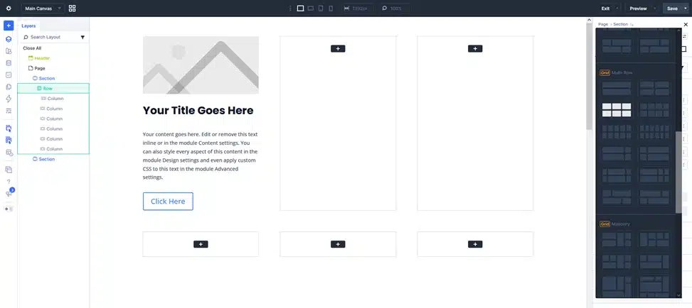
Step 1: Create a Grid Layout
Open the template or page where you want to display your blog Loop using the Divi 5 Visual Builder.
Add a new Section and insert a Grid Row.
Choose a grid structure that matches your desired layout.
For example, you might use three columns for desktop.
If you want more control over the grid, open the Grid Editor to adjust the columns, rows, spacing, and placement.
Add Image, Heading, Text & buttons in first Column.
Step 2: Turn the Column Into a Loop
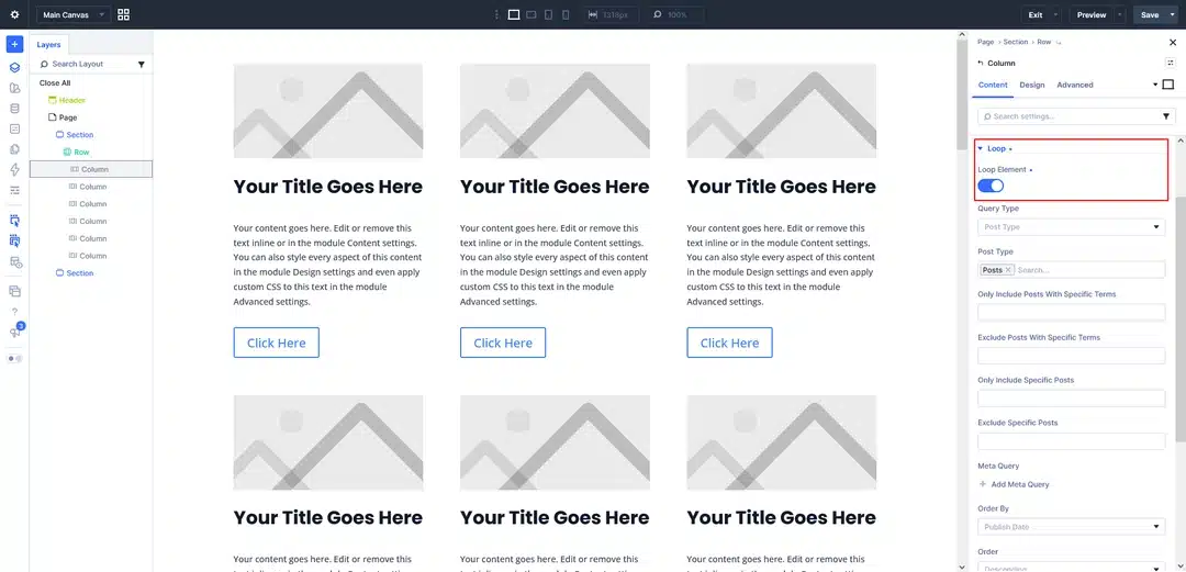
Select the Column that will contain your blog card.
Open the Content tab and find the Loop option.
Enable the Loop.
Now Divi will use this Column as the repeating structure for your posts.
You can configure the query according to your needs. For example:
- Post Type: Posts
- Posts Per Page: 9
- Order By: Title
- Order: Descending
Once the Loop is active, the card you create inside the Column will be repeated for the posts returned by the query.
Step 3: Design Your Blog Card
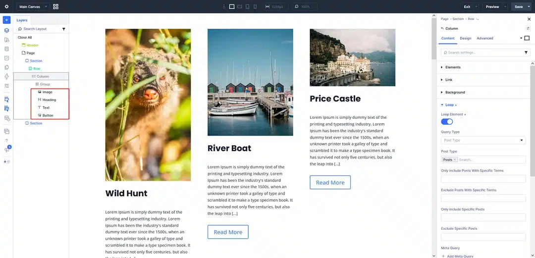
Inside the Loop Column, create the structure for one blog card.
For example, add:
- An Image module for the featured image
- A Heading module for the post title
- A Heading or Text module for the publication date
- A Text module for the post excerpt
You can also place the content inside Groups to make it easier to control the spacing and styling.
The important part is that you only need to design one card. Divi 5 will reuse that structure for the other posts in the Loop.
Step 4: Connect the Content Dynamically
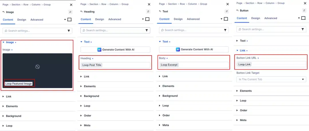
The card needs to display information from each individual post.
Use Divi 5’s Dynamic Content option to connect the modules to the Loop data.
For example:
| Element | Dynamic Content |
|---|---|
| Image | Loop Featured Image |
| Post Title | Loop Post Title |
| Date | Loop Published Date |
| Description | Loop Post Excerpt |
Now each repeated card will automatically display the information from the corresponding post.
You can also limit the excerpt length if you want to keep the cards more uniform.
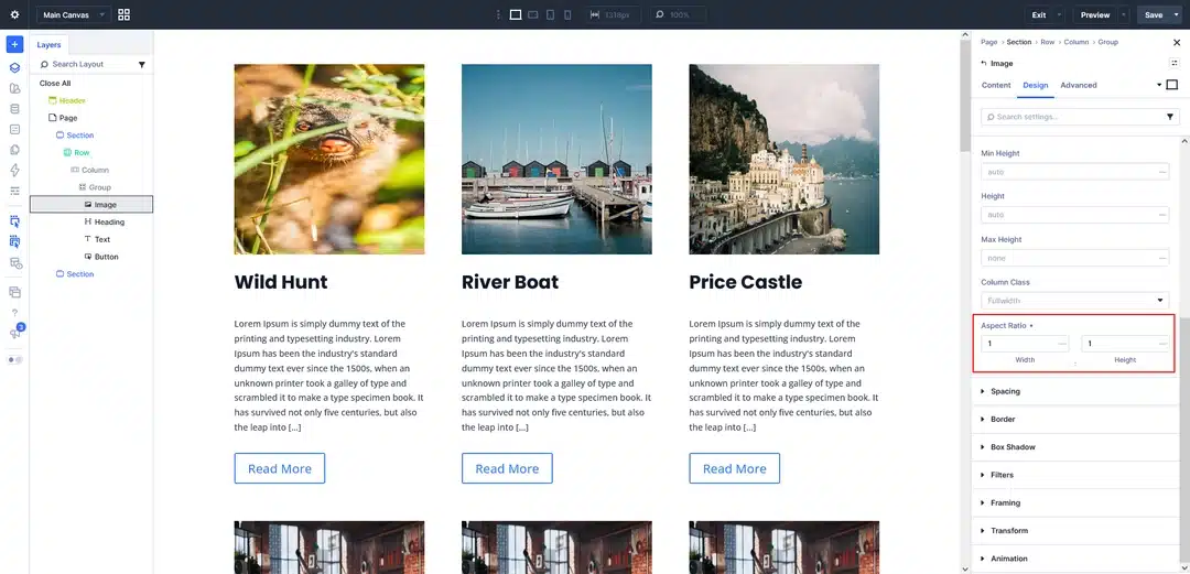
Step 5: Set the Image Aspect Ratio
Now let’s fix the inconsistent image dimensions.
Select the Image module inside the Loop.
Go to: Design → Sizing
Look for the Aspect Ratio option.
For this example, choose: 1:1
The image area will now use a square proportion.
This means your Loop can display landscape, portrait, and square source images within the same type of frame.
Step 6: Change Object Fit to Cover
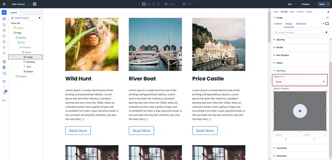
After setting the Aspect Ratio, you may notice that some images don’t look right.
If the image is being stretched, open:
Design → Framing → Object Fit
Change the setting to: Cover
This keeps the image’s original proportions while making it large enough to fill the entire frame.
If the source image has a different proportion from your selected frame, Divi will crop the parts that don’t fit.
This is generally useful for blog thumbnails because all cards can maintain the same image dimensions without distorting the source images.
Step 7: Choose the Image Position
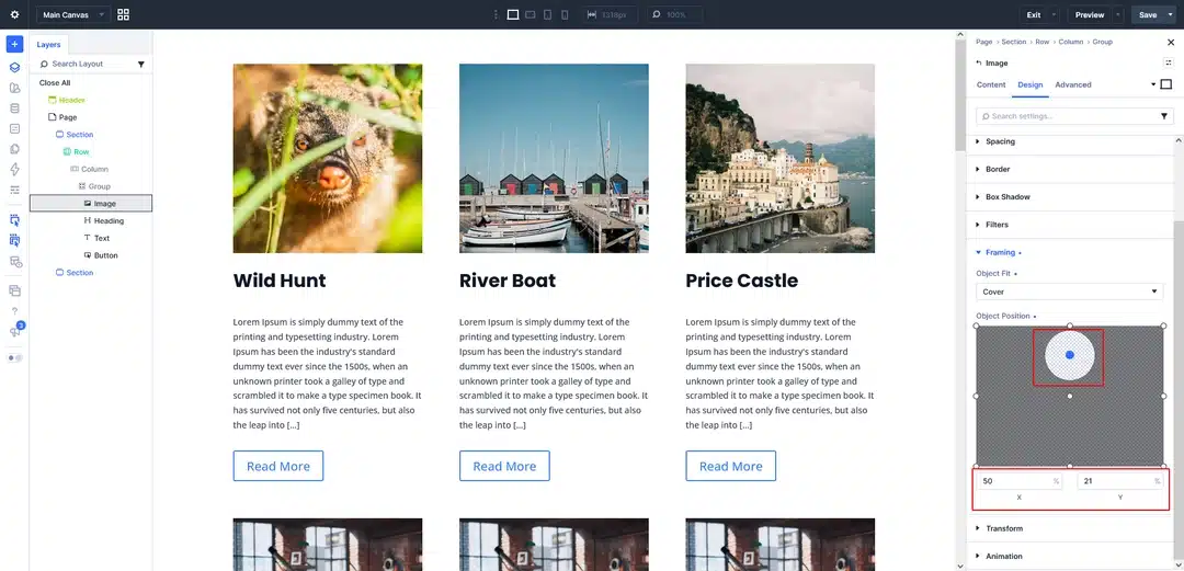
Sometimes the default crop doesn’t show the most important part of an image.
For example, consider a portrait photo where the person’s face is near the top. A centered crop could remove part of the subject.
You can adjust this using Object Position.
Try options such as:
- Top Center
- Center
- Bottom Center
- Top Left
- Top Right
Choose the position that works best with the type of images used on your website.
One important thing to remember is that the setting will be applied to the repeated images in your Loop. So test it with multiple posts rather than checking only one image.
Choosing the Right Aspect Ratio
The best ratio depends on your design and the type of content you’re displaying.
1:1 — Square
A good choice for:
- Blog card grids
- Related posts
- Directory layouts
- Compact content cards
4:3 — Balanced Landscape
Useful when you want more vertical space than 16:9 while still keeping a landscape appearance.
16:9 — Wide
Works well for:
- Featured content
- Video-related posts
- Wide blog layouts
- Large horizontal cards
3:4 or 4:5 — Portrait
Useful for:
- Portrait photography
- Team members
- Product imagery
- Editorial designs
You don’t have to use the same ratio throughout your entire website. Different Loop designs can use different ratios depending on their purpose.
Make Your Loop Responsive
Your desktop layout may use three columns, while your mobile layout may use only one.
This changes the available width of each card, so it’s worth checking how your selected Aspect Ratio looks at different screen sizes.
For example:
Desktop: 3 columns
Tablet: 2 columns
Phone: 1 column
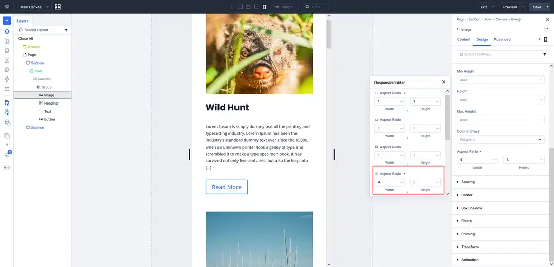
You can use Divi 5’s responsive controls to adjust the Aspect Ratio for different breakpoints when needed.
For example, you might use 1:1 on desktop but switch to a wider ratio on mobile to reduce the vertical space occupied by each image.
Keep Your Loop Cards Aligned
Even when every image has the same dimensions, the cards can still have different heights.
Why?
Because your content isn’t necessarily the same length.
One post might have a short title and excerpt, while another could have a much longer title.
To handle this, you can consider:
Shortening the Excerpt
Set a consistent word limit for your post excerpts.
Using Grow To Fill
If your layout needs the cards to fill the available space, Grow To Fill can help create better alignment.
Using an Overall Card Ratio
If you want a highly controlled card design, you can also use Aspect Ratio on the card container itself.
The right approach depends on whether you want a fixed card shape or a layout that adapts more naturally to its content.
Save Your Image Design as a Preset
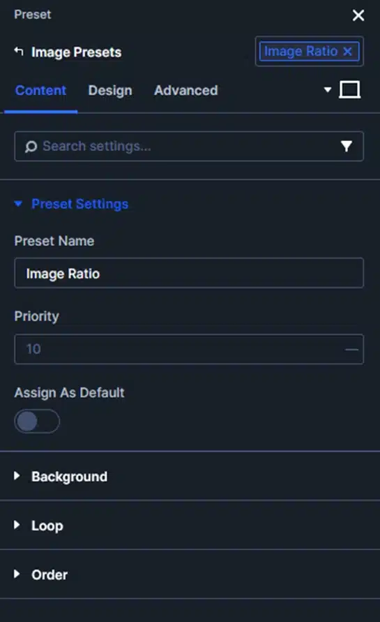
If you plan to use the same image styling in multiple Loop layouts, consider creating an Image Preset.
For example, your preset could contain:
- Aspect Ratio
- Object Fit
- Object Position
- Border
- Box Shadow
- Image effects
This means you don’t need to configure the same settings repeatedly.
If you later decide to change the image treatment, you can update the preset instead of manually editing every individual image module.
Common Problems When Using Aspect Ratio
Images Are Stretched
If your images look distorted, check the Object Fit setting.
Try using Cover instead of Fill.
Important Content Is Cropped
Change the Object Position to move the visible area toward the important part of the image.
There Is Empty Space Around the Image
If you’re using Contain, the complete image remains visible but may leave empty space inside the frame.
If you want the image to completely fill the area, try Cover.
One Image Doesn’t Look Right
Remember that the same Aspect Ratio and Object Position are being applied throughout the Loop.
Check several posts before deciding on the final settings.
If one particular image doesn’t work well, it may be better to adjust that image rather than changing the entire Loop design.
Cards Have Different Heights
Check your title and excerpt lengths. Consistent images don’t automatically mean identical content heights.
Consider limiting the excerpt length or using Grow To Fill depending on your layout.
Create More Consistent Loops with Divi 5
Dynamic content is one of the biggest advantages of using a Loop, but the content itself isn’t always consistent. Featured images can come in different sizes, shapes, and compositions.
With Divi 5, you can control how those images appear without editing the original files.
By combining: Aspect Ratio + Object Fit + Object Position
you can create a consistent image presentation across your entire Loop.
Once the settings are applied to the Loop card, Divi 5 automatically uses the same design for the other posts.
This makes it much easier to build blog grids, portfolio layouts, product displays, and other dynamic sections that look clean and consistent across your website.