





Table of Contents
- What Are :focus and :checked States?
- How to Use the :focus State in Divi 5
- Step 1: Select a Form Field
- Step 2: Add a Default Background Color
- Step 3: Select the :focus State
- Step 4: Test the Focus Effect
- How to Use the :checked State in Divi 5
- :focus vs. :checked in Divi 5
- Create More Interactive Forms with Divi 5
- Final Thoughts
Divi 5 makes it easy to create interactive form designs without adding custom CSS. With the built-in responsive state options, you can style form fields differently when users interact with them.
In this guide, we’ll show you how to use the :focus and :checked states in Divi 5 to create simple but useful form interactions.
What Are :focus and :checked States?
The :focus state is useful when a user clicks or selects a form field. For example, you can change the background color of a text field while the user is typing in it.
The :checked state works with options such as checkboxes. You can change the styling of a checkbox label when the user selects it.
Divi 5 provides these states directly in the module settings, so you don’t need to write custom CSS.
How to Use the :focus State in Divi 5
Let’s start by changing the background color of a form field when a user clicks on it.
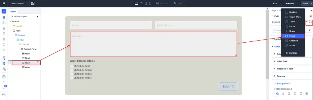
Step 1: Select a Form Field
First, add a form to your Divi 5 page and select the field you want to customize.
For this example, we’ll use a Message textarea field.
Go to:
Design → Field Options
Divi 5 provides different responsive and interaction states for the field, including:
- Desktop
- Tablet Wide
- Tablet
- Phone
- Hover
- Focus
- Checked
- Active
This allows you to customize the field for different devices and user interactions.
Step 2: Add a Default Background Color
With the field selected, open:
Design → Field Options → Background
Choose the background color you want the field to have normally.
This will be the default appearance of the field before the user interacts with it.
Step 3: Select the :focus State
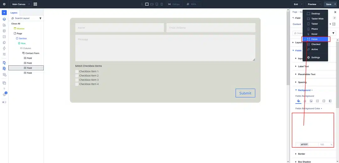
Now click the responsive/state selector next to the setting.
From the list, select Focus.
You can now set a different background color specifically for the focus state.
For example, you could use a light blue background when the field is selected.
Step 4: Test the Focus Effect
Save or update your page and test the form on the front end.
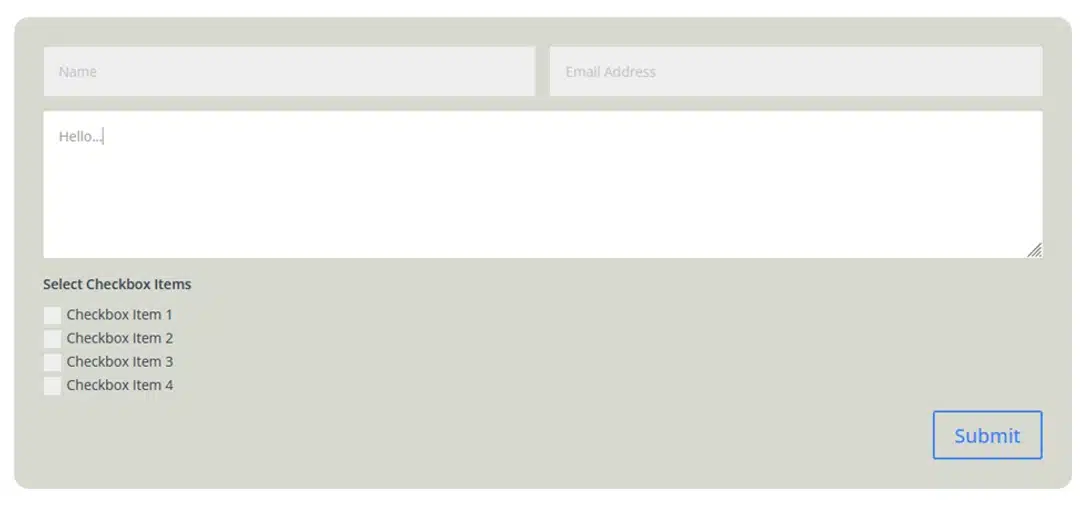
When a user clicks inside the field, the :focus style will be applied.
When the user clicks or moves to another field, the focus style will be removed and the field will return to its normal styling.
This provides a simple visual indication of which field the user is currently working with.
How to Use the :checked State in Divi 5
The :checked state is particularly useful for checkboxes.
You can use it to visually indicate that a user has selected an option.
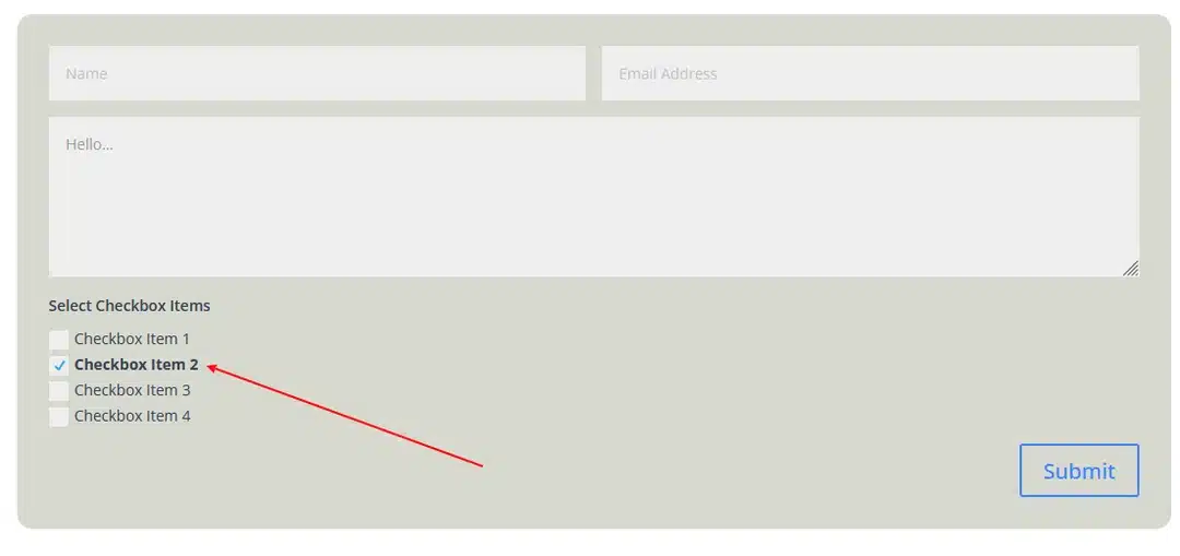
For example, you can make the checkbox label bold when the checkbox is selected.
Step 1: Add a Checkbox
Add a checkbox field to your form.
For example:
- Checkbox Item 1
- Checkbox Item 2
- Checkbox Item 3
- Checkbox Item 4
The user can select one or more of these options.
Step 2: Select the Checked State
Select the checkbox field and go to:
Design → Field Options
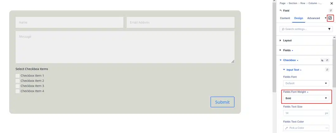
Open the state selector and choose Checked.
Divi 5 will now apply the settings you configure only when the checkbox is selected.
Step 3: Make the Checked Text Bold
With Checked selected, open the text settings and change the font weight to Bold.
Now the checkbox label will appear bold whenever the user checks that option.
When the user unchecks the option, the text will return to its normal styling.
:focus vs. :checked in Divi 5
Although both states are used to create interactive designs, they work differently.
| State | Used For | When It Applies |
|---|---|---|
| :focus | Text fields, textareas, inputs | When the user clicks or focuses on a field |
| :checked | Checkboxes and selectable options | When the user selects the option |
For example, you can use :focus to change the background of a textarea while the user is typing, while :checked can make a selected checkbox label bold.
Create More Interactive Forms with Divi 5
The :focus and :checked states are simple features, but they can make your forms feel much more interactive.
Instead of using custom CSS, you can select the appropriate state directly from Divi 5’s responsive settings and customize the field appearance.
You can use these states to:
- Highlight the field a user is currently editing
- Change field background colors
- Make selected checkbox labels bold
- Create clearer visual feedback
- Make forms easier to understand and interact with
Final Thoughts
Divi 5’s built-in state options make it easier to create interactive form designs without writing additional CSS. By combining :focus, :checked, :hover, and other available states, you can create forms that respond visually to user actions.
If you’re already using Divi 5’s form fields, try experimenting with these states to give your forms a more engaging and user-friendly design.