
Table of Contents
Divi 5 introduces a modern Flexbox-based layout system that completely changes how advanced designs are built in Divi. With flexible alignment, improved responsiveness, and support for multiple nested rows, designers and developers now have far more control than ever before—without relying on custom CSS.
WHY FLEXBOX MATTERS IN DIVI 5
Flexbox is a CSS layout system designed to arrange elements dynamically in a row or column while distributing space intelligently—even when content sizes change.
- Key Benefits:
- Faster development with fewer CSS hacks
- Better responsiveness across all devices
- Precise alignment control
- Cleaner, maintainable layouts
GETTING STARTED
- Open Section / Row / Module Group Settings
- Go to Layout
- Set Layout Style → Flex
Once enabled, the container becomes a Flex container and its children become Flex items.
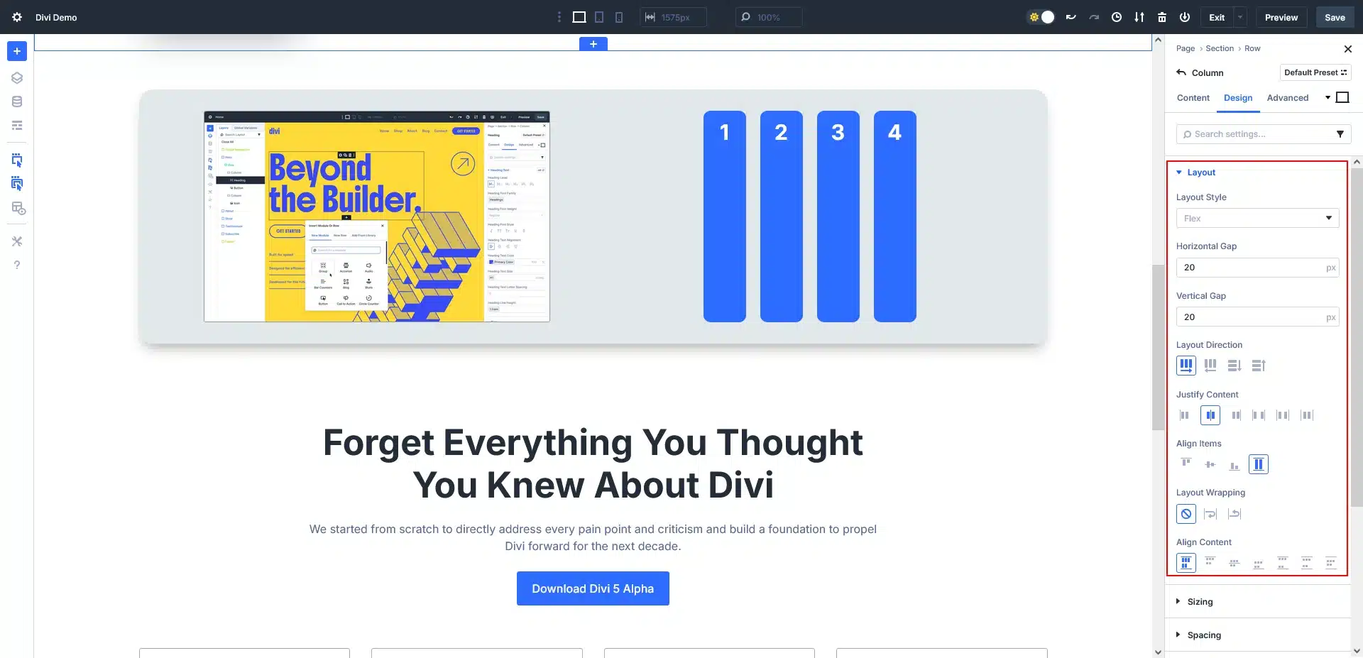
Divi 5 Flexbox Layout Panel Overview
Layout Style – Flex
Enables CSS Flexbox for better alignment, spacing, and responsive layouts.
Horizontal Gap
Controls left-to-right spacing between items (useful for columns or cards).
Vertical Gap
Controls top-to-bottom spacing between stacked items.
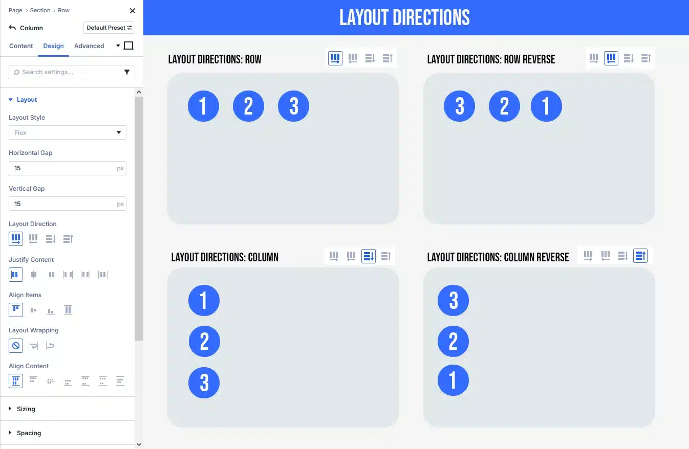
Layout Direction
- Row: Items align horizontally (left → right)
- Row Reverse: Horizontal, reversed order
- Column: Items stack vertically
- Column Reverse: Vertical, reversed order
Justify Content (Main axis alignment)
- Start / Center / End: Align items at beginning, middle, or end
- Space Between: First and last items at edges
- Space Around / Evenly: Equal spacing between items

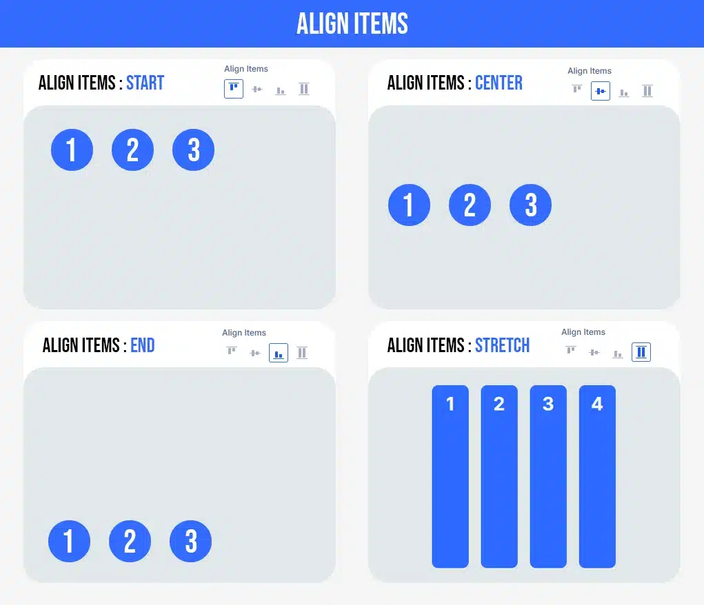
Align Items (Cross-axis alignment)
- Start / Center / End: Align items top, center, or bottom
- Stretch: Items stretch to equal height or width
Layout Wrapping
- No Wrap: All items stay on one line
- Wrap: Items move to next line on smaller screens
- Wrap Reverse: Wrap with reversed order
Align Content (Only works with Wrap enabled)
Controls spacing between multiple rows: Start, Center, End, Space Between, Around, or Evenly.
NESTED ROWS
Divi 5 allows multiple nested rows using Flexbox, enabling advanced layouts such as dashboards, cards, and complex sections.
RESPONSIVE DESIGN
Flexbox works perfectly with Divi 5’s responsive controls.
Example:
- Desktop → Row layout
- Tablet → Row with wrap
- Mobile → Column layout
Final Thoughts
Divi 5’s Flexbox system—combined with multiple nested rows—finally brings modern layout engineering into the Divi Builder. You can now create advanced, scalable, and responsive designs faster, cleaner, and with far less technical debt.
If you’re building professional or client-ready websites, mastering Flexbox in Divi 5 is a must.
Want to master advanced Divi 5 layouts with Flexbox for better design control?
Let TechnoCrackers help you build responsive, flexible layouts that deliver engaging user experiences – Contact us today.