






Table of Contents
- What Is the Divi 5 Charts Module?
- How to Add the Charts Module in Divi 5
- 1. Line Chart
- 2. Area Chart
- 3.Bar Chart
- 4. Radar Chart
- 5.Pie Chart
- 6. Doughnut Chart
- 7. Polar Area Chart
- 8. Scatter Chart
- 9. Bubble Chart
- Adding Your Chart Data
- Customize Your Charts
- Which Divi 5 Chart Type Should You Use?
- Why Use the Divi 5 Charts Module?
- Final Thoughts
Data is easier to understand when it is presented visually. Instead of showing visitors a large table of numbers, you can use charts to highlight trends, comparisons, percentages, and relationships in a much more engaging way.
With the new Charts Module in Divi 5, you can create different types of charts directly inside the Visual Builder and customize them to match your website design.
In this guide, we’ll look at the available chart types in Divi 5 and explain how you can use the Charts Module on your website.
What Is the Divi 5 Charts Module?
The Charts Module is a new Divi 5 module designed to display data visually using different chart styles.
You can add the module to a page, choose the type of chart you want, add your data, and customize its appearance using Divi’s design options.
This makes it useful for websites that need to display:
- Business statistics
- Sales data
- Website analytics
- Survey results
- Financial information
- Performance reports
- Product comparisons
- Progress and growth
- Percentage breakdowns
The module provides several chart styles, so you can choose the visualization that best fits your data.
How to Add the Charts Module in Divi 5
Adding a chart is similar to adding any other Divi 5 module.
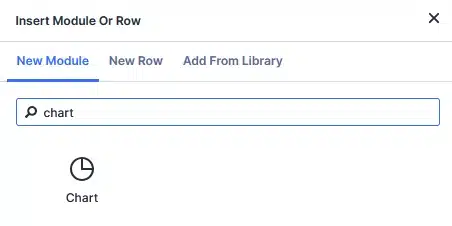
Step 1: Add the Charts Module
Open your page in the Divi 5 Visual Builder and add a new module.
Search for Chart in the module list and add it to your layout.
Step 2: Choose a Chart Type
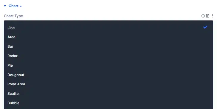
Once the module is added, you can select the chart style from the Chart Type option.
Divi 5 currently provides these chart types:
- Line
- Area
- Bar
- Radar
- Pie
- Doughnut
- Polar Area
- Scatter
- Bubble
Let’s look at what each option is useful for.
1. Line Chart
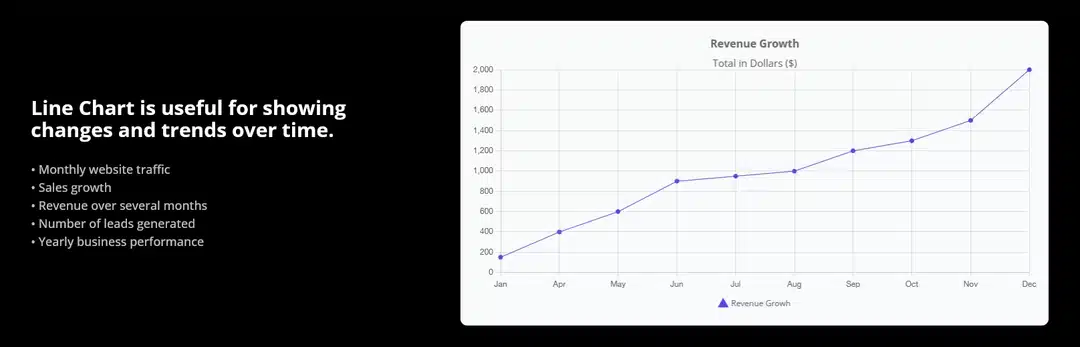
A Line Chart is useful for showing changes and trends over time.
For example, you could use it to display:
- Monthly website traffic
- Sales growth
- Revenue over several months
- Number of leads generated
- Yearly business performance
A line connects each data point, making it easy for visitors to understand whether a value is increasing or decreasing.
Best for: Trends and changes over time.
2. Area Chart
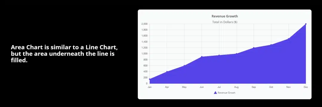
An Area Chart is similar to a Line Chart, but the area underneath the line is filled.
This gives the chart more visual emphasis and works well when you want to highlight the overall scale or movement of your data.
For example, you could show monthly revenue, website visitors, or user growth.
Best for: Showing trends while emphasizing the volume of data.
3.Bar Chart
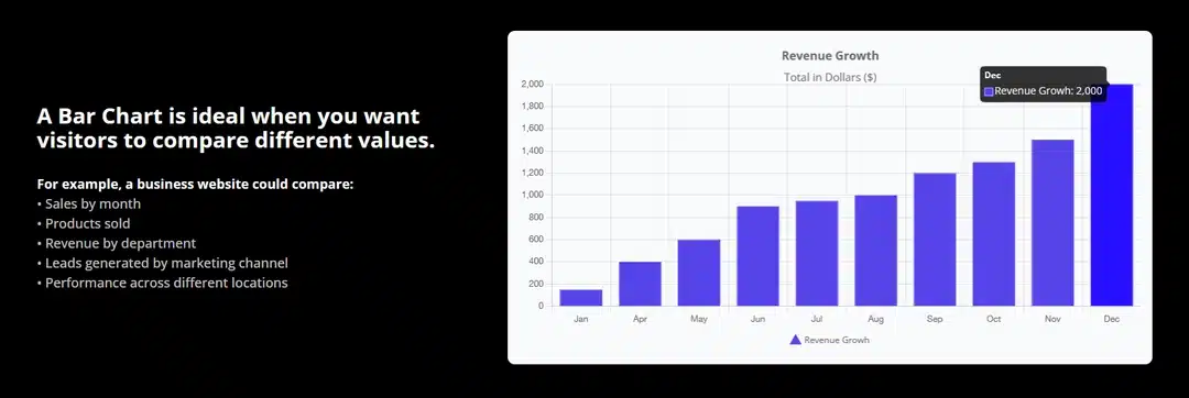
A Bar Chart is ideal when you want visitors to compare different values.
For example, a business website could compare:
- Sales by month
- Products sold
- Revenue by department
- Leads generated by marketing channel
- Performance across different locations
Because the bars have different lengths, visitors can quickly identify which category has the highest or lowest value.
Best for: Comparing different categories.
4. Radar Chart
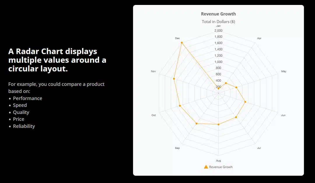
A Radar Chart displays multiple values around a circular layout.
This can be useful when you want to compare several characteristics of the same item.
For example, you could compare a product based on:
- Performance
- Speed
- Quality
- Price
- Reliability
You can also use radar charts for employee performance, service comparisons, or product evaluations.
Best for: Comparing multiple characteristics across categories.
5.Pie Chart
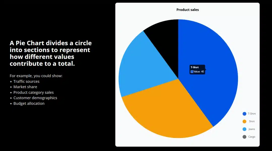
A Pie Chart divides a circle into sections to represent how different values contribute to a total.
For example, you could show:
- Traffic sources
- Market share
- Product category sales
- Customer demographics
- Budget allocation
If one category represents 40% of the total, its slice will visually occupy 40% of the chart.
Best for: Showing percentages and part-to-whole relationships.
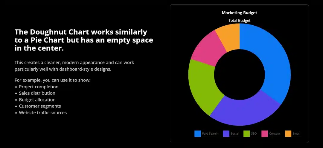
6. Doughnut Chart
The Doughnut Chart works similarly to a Pie Chart but has an empty space in the center.
This creates a cleaner, modern appearance and can work particularly well with dashboard-style designs.
For example, you can use it to show:
- Project completion
- Sales distribution
- Budget allocation
- Customer segments
- Website traffic sources
Best for: Showing proportions with a modern dashboard-style design.
7. Polar Area Chart
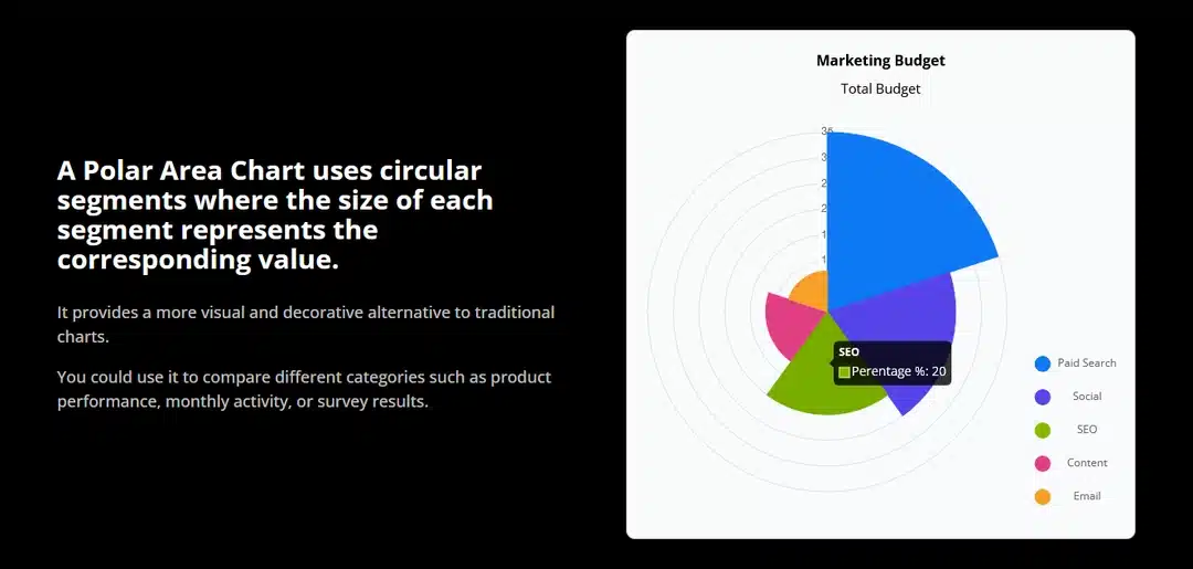
A Polar Area Chart uses circular segments where the size of each segment represents the corresponding value.
It provides a more visual and decorative alternative to traditional charts.
You could use it to compare different categories such as product performance, monthly activity, or survey results.
Best for: Comparing multiple categories in a circular visualization.
8. Scatter Chart
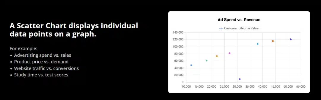
A Scatter Chart displays individual data points on a graph.
This is useful when you want to understand the relationship between two different numerical values.
For example:
- Advertising spend vs. sales
- Product price vs. demand
- Website traffic vs. conversions
- Study time vs. test scores
Instead of connecting the points, the chart lets you see how the values are distributed.
Best for: Finding relationships and patterns between two sets of data.
9. Bubble Chart
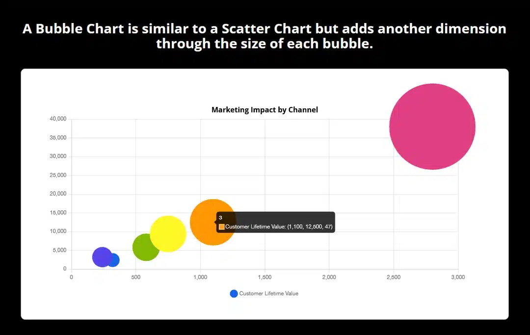
A Bubble Chart is similar to a Scatter Chart but adds another dimension through the size of each bubble.
This means you can compare multiple values at the same time.
For example, a business could use a Bubble Chart to compare:
- Sales
- Profit
- Number of customers
The position of each bubble can represent two values, while its size represents another.
Best for: Comparing multiple dimensions of data visually.
Adding Your Chart Data
After choosing your chart type, you can configure the data displayed in the chart.
The Divi 5 Charts Module provides options for defining the chart’s labels and values, allowing you to create a visualization based on your own information.
The attached Divi 5 reference also demonstrates working with chart data through the builder and importing data from a CSV file when you need to work with larger datasets.
This can be especially useful when creating charts from existing business or analytics data instead of entering every value manually.
Customize Your Charts
One of the biggest advantages of using the Charts Module inside Divi is that your chart can be customized as part of your normal Divi page design.
You can use Divi’s module settings to adjust the appearance of your chart and make it fit naturally with the rest of your website.
For example, you can create charts that match your:
- Brand colors
- Typography
- Website layout
- Spacing
- Overall visual style
This means your charts don’t have to look like separate third-party widgets—they can become part of the page design.
Which Divi 5 Chart Type Should You Use?
Choosing the right chart depends on the type of information you want to communicate.
| Chart Type | Best Use |
|---|---|
| Line | Trends over time |
| Area | Trends with stronger visual emphasis |
| Bar | Comparing categories |
| Radar | Comparing multiple characteristics |
| Pie | Showing parts of a whole |
| Doughnut | Showing proportions in a modern style |
| Polar Area | Circular category comparisons |
| Scatter | Finding relationships between values |
| Bubble | Comparing multiple dimensions |
The goal isn’t to use the most visually impressive chart. Instead, choose the chart that makes your data easiest for visitors to understand.
Why Use the Divi 5 Charts Module?
Before the Charts Module, adding custom charts to a Divi website could require additional plugins, external chart services, or custom code.
With the new module, you can build chart-based sections directly within the Divi 5 Visual Builder.
Some key advantages include:
- Multiple chart types in one module
- Visual editing directly inside Divi
- Customizable design
- Useful for business and analytics data
- CSV data support
- Reusable Divi Library layouts
- No need to build every chart from scratch
This makes the Charts Module a useful addition for websites that regularly work with data.
Final Thoughts
The Divi 5 Charts Module makes it easier to turn raw numbers into visual content.
Whether you need a simple Line Chart to show growth, a Bar Chart to compare products, a Pie or Doughnut Chart to display percentages, or a Scatter or Bubble Chart to show relationships, Divi 5 gives you several options inside the Visual Builder.
By choosing the right chart type and customizing it to match your website, you can make complex information easier to understand while keeping your design consistent with the rest of your Divi website.
Looking to build modern, data-driven websites with Divi 5? The new Charts Module is a great tool to add visual storytelling to your pages without relying on separate chart-building tools.