





Table of Contents
- What Can You Create with the Divi 5 Dropdown Module?
- How Divi 5’s Dropdown Module Works
- Step 1: Create Your Custom Menu
- Step 2: Add the Dropdown to a Link
- Step 3: Build Your Custom Content Inside the Dropdown
- Step 4: Configure the Dropdown Settings
- Step 5: Choose the Horizontal Position Mode
- Step 6: Choose When the Dropdown Opens
- Step 7: Choose the Dropdown Direction
- Step 8: Set the Dropdown Alignment
- Step 9: Adjust the Dropdown Offset
- Step 10: Customize the Dropdown Design
- Step 11: Test Your Custom Dropdown
- Why Use the Divi 5 Dropdown Module?
- Final Thoughts
Creating custom dropdown menus and mega menus in Divi 5 is easier with the new Dropdown Module.
The Dropdown Module lets you add a dropdown inside a Link element and then build your own custom content inside that dropdown. You can add links, images, buttons, layouts, and other Divi elements to create a completely custom navigation experience.
In this tutorial, we’ll show you how to add a Dropdown Module to a Link and explain the different Dropdown settings you can use to control its position, direction, alignment, and interaction.
What Can You Create with the Divi 5 Dropdown Module?
The Dropdown Module gives you a flexible area where you can create your own dropdown content.
For example, you can create:
- Multi-column mega menus
- Product navigation
- Category menus
- Image-based menus
- Featured product sections
- Promotional sections
- Call-to-action areas
- Custom navigation layouts
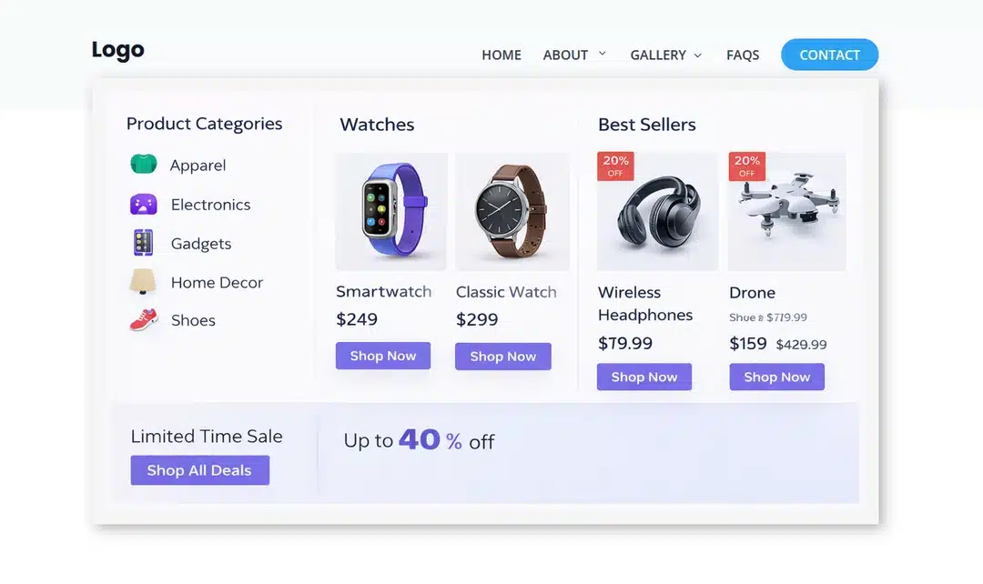
For this tutorial, we’ll create a custom mega menu inside the About link.
The final design can contain multiple columns with categories, images, product information, buttons, and promotional content.
The important thing is that you are not limited to a predefined dropdown design. You can design the content inside the Dropdown Module based on your own requirements.
How Divi 5’s Dropdown Module Works
The Dropdown Module works as a child element of a Link.
The basic structure looks like this:
Custom Link Menu
│
├── Link
├── Link
├── Link
│   └── Dropdown
│       ├── Link
│       ├── Image
│       ├── Button
│       └── Other Elements
│
├── Link
└── Link
In our example, the About Us link contains the Dropdown Module.
When the visitor interacts with the About us link, the content inside the Dropdown can appear based on the settings you configure.
This gives you much more control than a traditional dropdown menu.
Step 1: Create Your Custom Menu
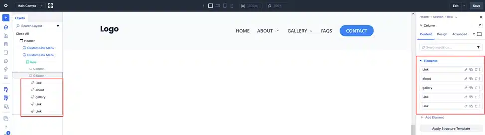
First, add the Custom Link Menu to your header.
Create the main navigation links you want to display.
For example:
- Home
- About
- Gallery
- FAQs
- Contact
You can customize your links using the available typography, spacing, color, and other design settings.
For this tutorial, we’ll use About as the link that contains our custom dropdown.
Step 2: Add the Dropdown to a Link
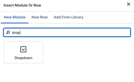
Select the About Link element.
Inside the Link element, add the Dropdown Module.
Your Layers panel will look similar to this:
Custom Link Menu
   ├── Link
   ├── Link
   ├── Link
   │    └── Dropdown
   ├── Link
   └── Link
The Dropdown is now connected to the About link.
This means you can use the About link as the trigger while using the Dropdown Module to create the content that appears underneath or around it.
Step 3: Build Your Custom Content Inside the Dropdown
Now comes the most flexible part.
Select the Dropdown Module and start adding the content you want to display.
You are not required to follow a specific layout. You can design the dropdown based on the needs of your website.
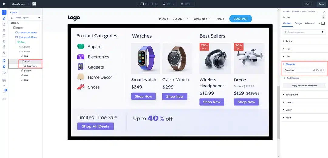
For example, in our demo, we created a multi-column layout containing:
Product Categories
- Apparel
- Electronics
- Gadgets
- Home Decor
- Shoes
Featured Products
We also added product images, product names, prices, and buttons.
Promotional Content
At the bottom, we added a promotional section with a sale message and a call-to-action button.
Your dropdown could look completely different. You can use the available Divi elements to create your own layout.
For example:
Step 4: Configure the Dropdown Settings
Once you’ve created your content, you can use the Dropdown settings to control where, when, and how the dropdown appears.
Select the Dropdown Module and open its settings.
You’ll find several options that control the dropdown behavior.
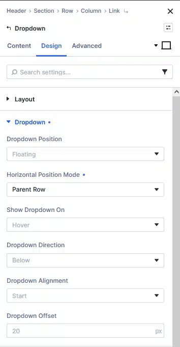
Dropdown Position
The Dropdown Position setting determines how the dropdown is positioned in relation to the menu.
You can choose from:
- Floating
- Inline
- Parent Row
Floating
The dropdown is positioned as a floating element rather than taking up space in the normal layout.
This is useful for typical dropdown and mega menu navigation.
Inline
The dropdown remains part of the normal layout flow.
This can be useful when you want the dropdown content to behave more like an inline section rather than an overlay.
Parent Row
The dropdown is positioned relative to the parent row.
This can be useful when building larger navigation layouts where the dropdown needs to align with the row containing the menu.
Choose the option that best matches the layout you are creating.
Step 5: Choose the Horizontal Position Mode
When using a floating dropdown, Divi 5 also provides the Horizontal Position Mode setting.
You can choose:
- Parent Module
- Parent Row
- Viewport
These options determine what the dropdown uses as the reference point for its horizontal positioning.
Parent Module
The dropdown is positioned relative to its parent module.
This is useful when you want the dropdown to align with the individual Link element.
Parent Row
The dropdown uses the parent row as the positioning reference.
This can be useful when creating a wider mega menu that needs to align with the menu row.
Viewport
The dropdown uses the browser viewport as the positioning reference.
This gives you more flexibility when positioning larger dropdowns across the page.
Step 6: Choose When the Dropdown Opens
The Show Dropdown On setting controls how visitors open the dropdown.
Divi 5 provides two options:
- Hover
- Click
Hover
With Hover selected, the dropdown opens when the visitor moves their cursor over the link.
This is commonly used for desktop navigation and traditional mega menus.
For example:
About → Hover → Dropdown Opens
Click
With Click selected, the dropdown opens when the visitor clicks the link.
This gives you an alternative interaction method when you don’t want the dropdown to open simply by hovering over the menu item.
Choose the interaction that best fits your navigation and user experience.
Step 7: Choose the Dropdown Direction
The Dropdown Direction setting controls which direction the dropdown opens.
You can choose:
- Above
- Below
- Left
- Right
Above
The dropdown opens above the link.
Below
The dropdown opens below the link.
This is commonly used for navigation menus.
Left
The dropdown opens toward the left side of the link.
Right
The dropdown opens toward the right side of the link.
The best option depends on where your menu is located and how much space is available around it.
Step 8: Set the Dropdown Alignment
The Dropdown Alignment setting controls how the dropdown aligns with its positioning reference.
You can choose:
- Start
- Center
- End
Start
Aligns the dropdown with the starting edge of the positioning reference.
Center
Centers the dropdown relative to the positioning reference.
End
Aligns the dropdown with the ending edge of the positioning reference.
These options are especially useful when you’re creating a wider mega menu and need to control exactly how it lines up with the menu or parent row.
Step 9: Adjust the Dropdown Offset
The Dropdown Offset setting lets you add additional spacing between the dropdown and its positioning reference.
The value is measured in pixels.
For example, you could use:
20px
to create additional space between the menu link and the dropdown.
You can adjust this value depending on the design of your menu.
Step 10: Customize the Dropdown Design
After configuring the dropdown behavior, you can customize its appearance.
Depending on your design, you can adjust settings such as:
- Background
- Spacing
- Width
- Borders
- Border radius
- Box shadow
- Typography
- Alignment
The important thing to remember is that the Dropdown settings control the dropdown behavior and positioning, while the elements you add inside the Dropdown are where you build your actual content and design.

Step 11: Test Your Custom Dropdown
Once you’ve finished building and configuring the dropdown, save your changes and preview the page.
If you selected Hover, move your cursor over the menu link.
For example:
About → Hover → Custom Dropdown Opens
If you selected Click, click the About link to open the dropdown.
Test the menu on different screen sizes as well to make sure the dropdown fits correctly within your navigation layout.
Why Use the Divi 5 Dropdown Module?
The biggest advantage of the Dropdown Module is its flexibility.
Instead of being limited to a simple list of submenu links, you can create an entire custom layout inside the dropdown.
You can use it for:
- Ecommerce mega menus
- Product navigation
- Category navigation
- Image-based navigation
- Featured products
- Promotional content
- Multi-column menus
- Custom call-to-action sections
You can also control how the dropdown behaves using settings such as Hover or Click, Above or Below, Start, Center, or End, and different positioning modes.
Final Thoughts
Divi 5’s new Dropdown Module gives you a flexible way to create custom dropdowns and mega menus directly inside the Visual Builder.
The process is simple: add a Dropdown Module inside a Link, build whatever content and layout you need inside the Dropdown, and then use the Dropdown settings to control its position, direction, alignment, and interaction.
In our example, we created an ecommerce-style mega menu with product categories, product cards, images, pricing, buttons, and a promotional section. However, you can create a completely different design depending on your website’s requirements.
With the new Dropdown Module, you have much more control over how your navigation works and what visitors see when they interact with your menu.