





Table of Contents
- 1. What Are Grid Offset Rules in Divi 5?
- 2. How to Set Up a Grid Layout
- 3. How to Open the Visual Grid Editor
- 4. How to Create Grid Offset Rules Visually
- Step 1: Select the Item
- Step 2: Resize the Item
- Step 3: Inspect the Generated Rule
- Step 4: Refine the Layout
- 5. How to Edit Existing Grid Offset Rules
- 6. How to Use Custom and Repeating Offset Patterns
- 7. How to Test Grid Layouts with More Items
- 8. How to Troubleshoot Common Grid Offset Issues
- Items Appear in Unexpected Positions
- Empty Cells Appear in the Grid
- The Wrong Card Receives the Rule
- The Layout Breaks on Mobile
- Changes Do Not Produce the Expected Result
- 9. Best Practices for Managing Grid Offset Rules
- 10. Conclusion
Designing a flexible website layout becomes much easier when you can control how individual elements fit into a grid. Divi 5’s CSS Grid system lets you create layouts where selected items occupy extra columns or rows, start at specific grid lines, or follow repeating placement patterns.
However, managing these layouts can become challenging when several Grid Offset Rules work together. Changing a single value may affect the position of other elements, making it difficult to understand the final arrangement from the settings alone.
Divi 5 addresses this challenge with its visual Grid Editor. You can resize items on the canvas, identify which rules affect them, and fine-tune their placement using the available settings.
In this guide, you’ll learn how to visually manage Grid Offset Rules in Divi 5, create custom placement patterns, edit existing rules, and troubleshoot common grid layout issues.
1. What Are Grid Offset Rules in Divi 5?
Grid Offset Rules allow you to control the placement and size of selected items inside a CSS Grid container. Instead of displaying every item in an identical cell, you can make specific elements wider, taller, or positioned at particular grid lines.
For example, consider a blog archive with four columns. You might want the first article to span two columns, a featured article to occupy two rows, and every fourth article to appear wider than the others.
Grid Offset Rules make these layouts possible without manually adjusting each item’s margins or creating additional columns just to achieve a particular arrangement.
Understanding the Main Rule Settings
Each Grid Offset Rule contains a target that identifies the affected items and placement properties that determine how those items behave.
The Grid Template Columns option can also define the column structure within a targeted grid item.
For most visual layout adjustments, Column Span and Row Span are useful starting points. Start and End properties provide more precise control when an item needs a specific position.
2. How to Set Up a Grid Layout
Before creating or editing offset rules, configure the container that will hold your content.
Follow these steps:
- Open your page in the Divi 5 Visual Builder.
- Add a Section, Row, Column, or Group to hold your elements.
- Open the container’s settings.
- Navigate to Design → Layout.
- Set the Layout Style to Grid.
- Configure the number of columns and the spacing between grid items.
- Add the modules or elements you want to display.
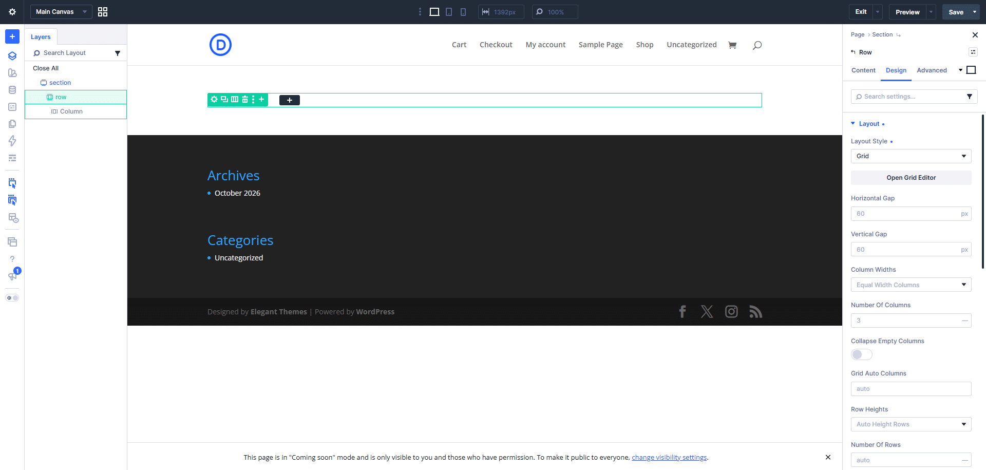
For this tutorial, imagine creating a portfolio gallery with four columns. Each project initially occupies one grid cell, giving you a consistent starting point.
Once the basic structure is ready, you can introduce offset rules to make selected projects stand out.
Tip: Establish the main grid structure before adding several offset rules. This makes it easier to understand how individual placement changes affect the complete layout.
3. How to Open the Visual Grid Editor
The visual Grid Editor helps you understand the relationship between the grid structure, individual items, and their placement rules.
To access it:
- Select the container configured with the Grid layout.
- Open its settings.
- Locate the Open Grid Editor
- Click it to display the grid editor.
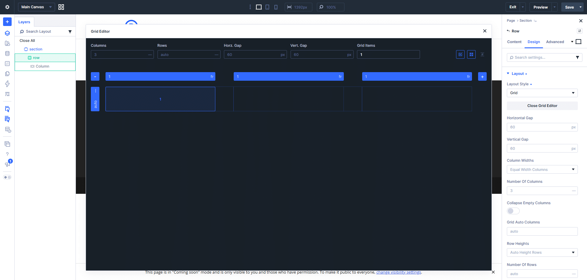
The editor displays the grid’s rows, columns, and numbered items. You can inspect the arrangement and make visual adjustments instead of relying entirely on numerical values.
When working with an existing layout, the editor is particularly helpful for identifying items that span multiple cells or follow repeating patterns.
For example, if a portfolio card occupies two columns, you can inspect its placement on the canvas and compare it with the corresponding rule in the container’s settings.
The settings panel provides the exact values, while the visual editor shows their effect on the layout.
4. How to Create Grid Offset Rules Visually
One of the easiest ways to create an offset rule is to resize a grid item directly on the canvas.
Let’s make the first portfolio card larger than the remaining items.
Step 1: Select the Item
Open the Grid Editor and locate the first item in the grid.
Hover over it to reveal the available resizing controls.
Step 2: Resize the Item
Drag the item’s corner handle across the grid cells you want it to occupy.
For example, expand the first item across two columns and two rows. The item will occupy a larger area, while the remaining items adjust according to the grid’s placement behavior.
Step 3: Inspect the Generated Rule
Open the container’s Grid Offset Rules settings.
The visual adjustment creates a corresponding rule that targets the selected item and specifies its placement properties.
For this example, the rule can be represented by the following settings:
- Target Offset: First Item
- Column Span: 2
- Row Span: 2
These values instruct the grid to make the first item span two columns and two rows.
Step 4: Refine the Layout
Review the surrounding items and check whether the new arrangement looks balanced.
If the featured item appears too large, adjust its span values or resize it again using the visual controls.
This workflow is useful for creating featured portfolio cards, promotional banners, image galleries, and other layouts where some elements need more space than others.
5. How to Edit Existing Grid Offset Rules
When a grid already contains several rules, you can edit the existing settings instead of rebuilding the layout.
Follow these steps:
- Select the grid container.
- Open Design → Layout.
- Locate the Grid Offset Rules section.
- Open the rule you want to change.
- Review the Target Offset and placement properties.
- Update the necessary values.
- Return to the visual editor to inspect the result.
Example: Making a Featured Card Narrower
Suppose the first card in your grid spans three columns, but you want it to occupy only two.
Open its rule and change Column Span from 3 to 2.
The card becomes narrower, allowing the remaining grid items to reposition according to the available space.
Alternatively, you could keep the card narrow and increase Row Span to make it taller.
The important thing is to change only the properties needed to achieve the desired result. If an item is already positioned correctly, there may be no reason to change its starting grid line.
Use Admin Labels to Organize Rules
When several rules are active, descriptive Admin Labels make them easier to identify.
For example, use labels such as:
- Featured Project — Double Width
- First Card — Two Rows
- Every Fourth Item — Wide Layout
- Promotional Banner — Full Row
These labels help you understand the purpose of each rule without having to inspect every property.
6. How to Use Custom and Repeating Offset Patterns
Grid Offset Rules are not limited to individual items. You can also target multiple items using repeating patterns.
The Target Offset setting includes options such as First Item, Last Item, Odd Items, Even Items, and repeating targets from Every Third Item through Every Tenth Item. For more specific patterns, you can use a custom nth-child rule.
Example 1: Make Every Third Item Wider
Suppose you want every third card in a blog grid to occupy two columns.
- Open the grid container’s settings.
- Navigate to Grid Offset Rules.
- Add a new rule.
- Select Every Third Item as the target.
- Set Column Span to 2.
- Review the result in the Grid Editor.
The rule targets items 3, 6, 9, 12, and subsequent multiples of three.
This is useful for creating visual variety in article archives, product listings, and project galleries.
Example 2: Target a Specific Sequence
A custom nth-child rule lets you define exactly which items should receive a placement adjustment.
For example, the expression 4n+1 targets items 1, 5, 9, 13, and so on.
To create this pattern:
- Add a new Grid Offset Rule.
- Choose Custom nth-child Rule.
- Enter 4n+1 as the pattern.
- Set Column Span to 2.
- Inspect the matching items in the visual editor.
This creates a repeating sequence in which every fourth item, starting with the first, spans two columns.
You can use other expressions to create different patterns. For instance, 3n+2 targets items 2, 5, 8, 11, and subsequent matching positions.
Tip: Remember that repeating rules target items according to their source order, not simply the order in which they appear visually after placement adjustments.
7. How to Test Grid Layouts with More Items
A repeating rule may look correct with four cards but behave differently when the grid contains twelve or twenty items.
Divi 5’s Grid Editor allows you to adjust the preview’s Grid Items count to visualize how a pattern behaves with more items.
For example, suppose you have configured a rule that makes every fourth item span two columns.
Start by previewing eight items. Then increase the preview count to twelve or sixteen and inspect the additional rows.
This helps you identify:
- Unexpected empty cells.
- Items that move to another row.
- Repeating patterns that become visually unbalanced.
- Placement rules that overlap with other rules.
Keep in mind that changing the Grid Items preview count does not create actual modules or increase the number of results returned by a Loop. It is a way to test the layout with a different number of preview items.
For dynamically generated content, also inspect the actual page to confirm that the layout works with the real content returned by the Loop.
8. How to Troubleshoot Common Grid Offset Issues
Even when a grid rule is configured correctly, the overall arrangement may not look as expected. Understanding a few common causes makes troubleshooting easier.
Items Appear in Unexpected Positions
Check whether another rule affects the same item. Multiple placement instructions can interact, so review the relevant rules and their values.
Also verify that the Target Offset matches the item’s source position.
Empty Cells Appear in the Grid
An item that spans multiple columns may not fit into the remaining space in a row. The grid can move it to the next row, leaving an empty cell behind.
Review the span values and grid structure. If appropriate, investigate the container’s auto-placement settings to determine whether a different placement behavior would better suit the design.
The Wrong Card Receives the Rule
Grid Offset Rules count items in their source order. An item that visually appears at the start of the second row might actually be the sixth item in the structure.
Use the Layers View and the numbered items in the Grid Editor to verify which element the rule targets.
If you insert, remove, or reorder modules, revisit any rules that target specific positions.
The Layout Breaks on Mobile
A rule that works well on desktop may not suit a narrower viewport.
Switch to the mobile preview and inspect the number of columns, item spans, and placement values. Adjust the relevant responsive settings so that cards fit the available space.
For a single-column mobile layout, a Column Span of 1 is often a useful starting point for items that were wider on desktop.
Changes Do Not Produce the Expected Result
Confirm that you are editing the correct grid container and that the rule targets the intended child elements.
Then review the other placement properties and any overlapping rules. Test the change in the visual editor before saving the page.
9. Best Practices for Managing Grid Offset Rules
Use these guidelines to keep your layouts easier to maintain.
Start with a simple grid. Establish the number of columns and spacing before introducing complex placement patterns.
Use visual resizing for initial adjustments. Dragging an item across grid cells is an intuitive way to create a starting rule.
Inspect the generated values. Understanding the rule behind a visual adjustment makes future edits more predictable.
Keep rule names descriptive. Admin Labels help distinguish individual-item rules from repeating patterns.
Avoid unnecessary overlapping rules. When multiple rules affect the same item, identifying the cause of an unexpected layout becomes more difficult.
Test with different item counts. Repeating patterns should be checked beyond the first row.
Review responsive layouts separately. Confirm that your placement values make sense on desktop, tablet, and mobile.
Check the finished page. The visual editor helps you understand the grid, but the actual content and final page preview are essential for checking spacing, readability, and overall balance.
10. Conclusion
Divi 5’s visual Grid Editor makes Grid Offset Rules easier to understand and manage by connecting placement settings with their visible effects on the canvas.
You can resize items to create rules, edit their values through the settings panel, and apply custom or repeating patterns to control how grid items occupy rows and columns.
Whether you are building a portfolio gallery, a blog archive, or a product grid, the key is to begin with a clear structure and introduce offset rules only where they improve the layout.
By combining visual adjustments with a careful review of each rule’s target and placement properties, you can create more flexible grid layouts and maintain them more confidently as your website evolves.