Table of Contents
Introduction
Mobile users expect fast, simple, and intuitive navigation. However, many websites still use the same desktop menu structure on mobile devices, which often creates a poor user experience. A large desktop mega menu may work well on wider screens, but on smartphones it can become cluttered and difficult to use.
With JetMenu, you can create a completely custom mobile menu in WordPress that is separate from your desktop navigation. This gives you better control over design, usability, and conversions.
In this guide, we’ll show you how to build a professional custom mobile menu using JetMenu step by step.
Plugins Required
Before starting, install and activate:
- Elementor
- JetMenu
- (Optional) JetThemeCore for custom headers
Step 1: Edit The Header And Enable Mobile Menu Mode
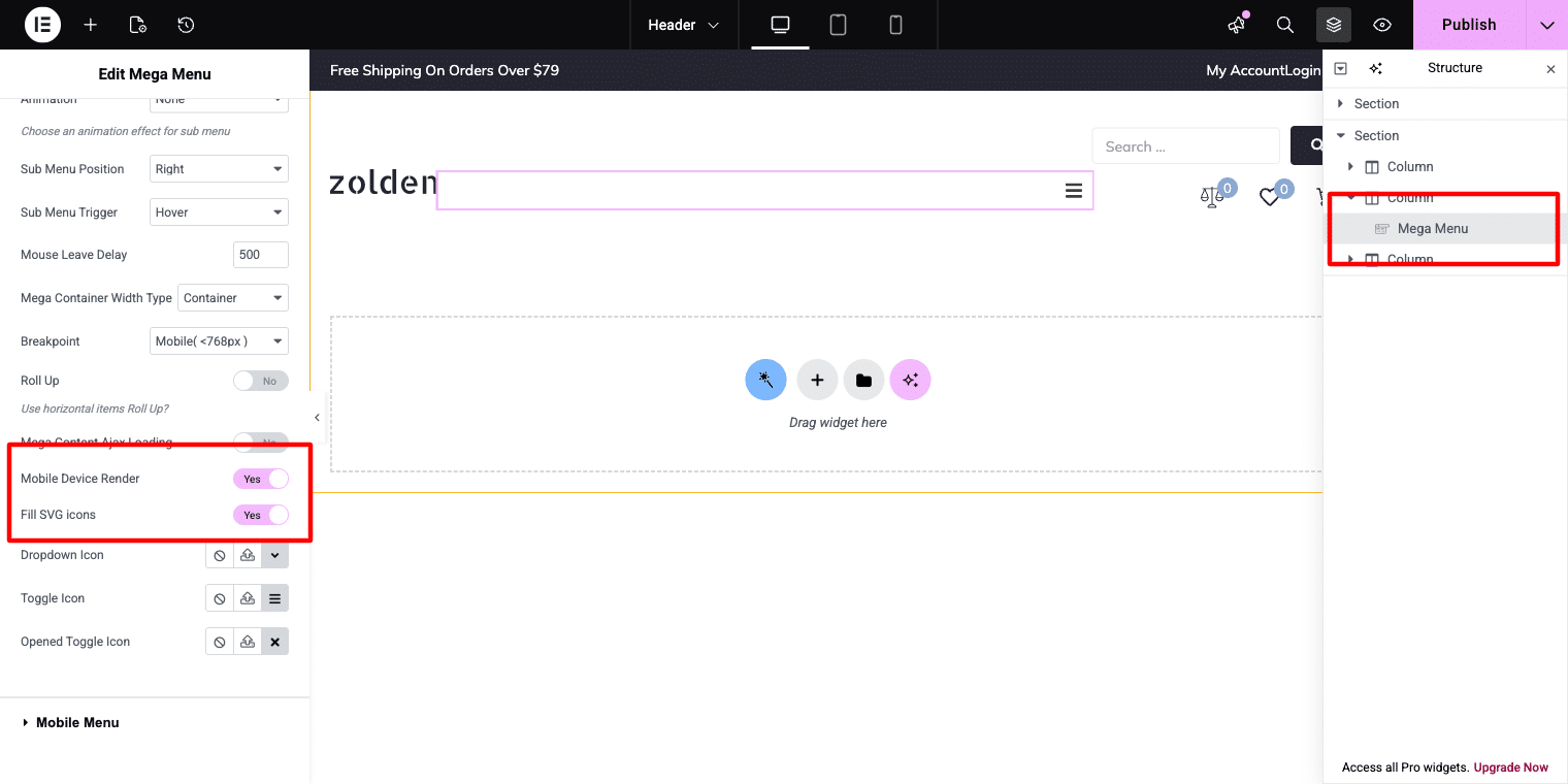
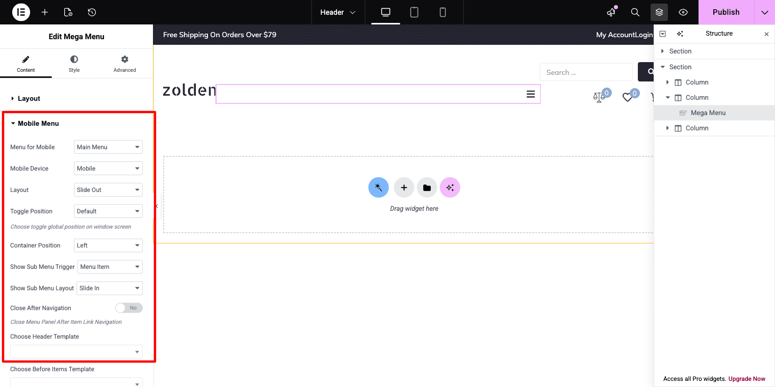
Open your website header template in Elementor and click on the Mega Menu widget added to the header. This will display the widget options in the left settings panel.
Scroll through the settings until you find the Mobile Device Render option. Turn this setting on to activate mobile-specific controls. After enabling it, a new Mobile Menu tab will be added, where you can create and customize a separate navigation menu for mobile users using JetMenu.
Step 2: Configure The Mobile Panel Settings
Go to the Mobile Menu tab inside the JetMenu widget settings. Here, you can customize how the mobile navigation panel appears on smaller devices.
Adjust options such as:
- Panel width
- Display style (slide-in panel or overlay)
- Opening position (left side or right side)
- Close when clicking outside the panel
- Show or hide the close icon
If you plan to use the same navigation items from your desktop menu and simply optimize them for mobile screens, choose your existing main menu in the Menu for Mobile option. This allows the menu to stay consistent across devices while using a mobile-friendly layout.
For the Zolden store example, using a right-side slide-in panel with a visible close icon creates a familiar and user-friendly mobile shopping experience. It feels natural for visitors browsing a fashion or eCommerce website on mobile devices.
Step 3: Optimize Mega Menu Content For Mobile Screens
If your desktop navigation includes a mega menu item, it may contain too much content for smaller screens. To keep the mobile menu clean and easy to use, simplify the mega menu layout by hiding non-essential sections.
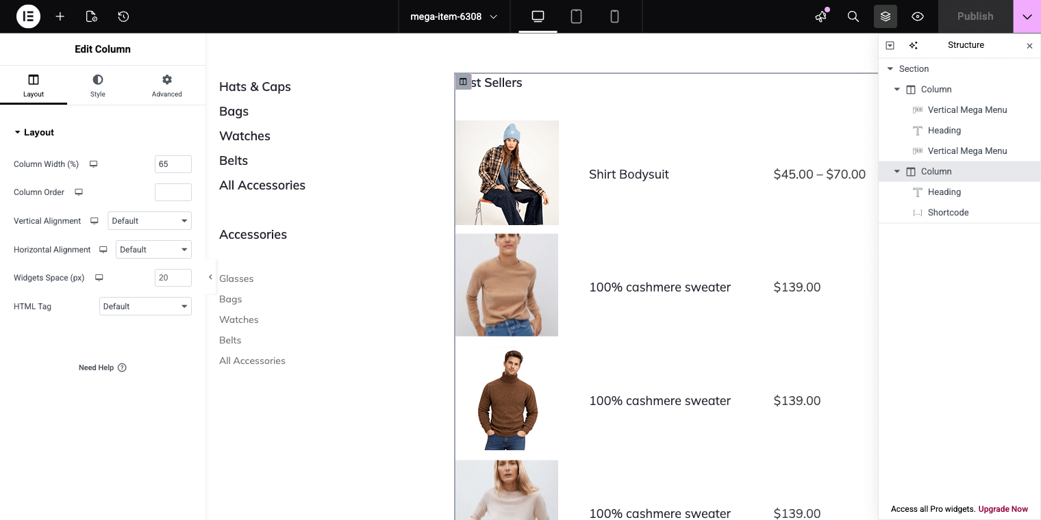
For example, if one column contains a Best Sellers table or promotional content, you can hide that section on mobile devices.
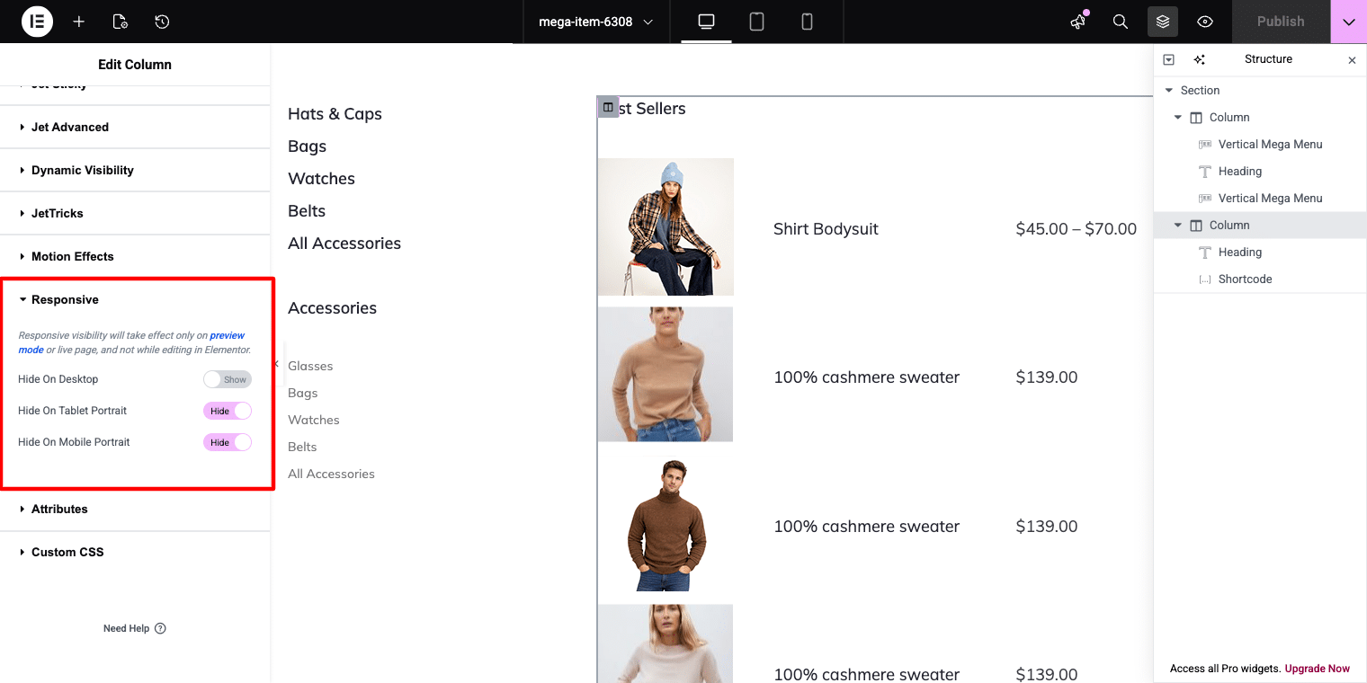
Open the mega menu layout in Elementor and select the column you want to remove. Then go to:
Column → Advanced → Responsive
Enable these options:
- Hide on Tablet Portrait
- Hide on Mobile Portrait
This will hide the selected column on smaller devices while keeping it visible on desktop screens.
Step 4: Preview And Test The Mobile Menu
After finishing your mobile menu setup, use the responsive preview mode in Elementor to test how the menu looks on different screen sizes such as mobile phones and tablets.
Carefully check that:
- All menu links are visible and easy to tap
- Navigation items are fully accessible
- The slide-in panel opens smoothly
- The menu closes properly using the close button or outside click
- Spacing and layout look clean on smaller screens
Testing the menu before publishing helps ensure a smooth user experience across all devices when using JetMenu.
Conclusion
Mobile navigation should be designed for smaller screens instead of simply copying the desktop menu layout.
For websites with large product catalogs, multiple categories, or complex navigation structures, a dedicated mobile menu often delivers a smoother and more user-friendly browsing experience.
With JetMenu, you can build separate mobile navigation directly inside WordPress, display it in stylish slide-out panels, and fully customize the design using Elementor.
The final result is a clean, responsive, and easy-to-use mobile menu while keeping your full desktop mega menu unchanged for larger screens.