In today’s digital world, patients don’t search phone directories — they search “dentist near me”, “best dentist in [city]”, or “emergency dental clinic near me.” If your dental practice isn’t visible in local search results, you’re losing highly qualified patients to competitors.
That’s where local SEO for dentists becomes essential. A strong local SEO strategy helps dental clinics appear in Google’s local pack, maps, and organic search — bringing more calls, bookings, and walk-ins.
This guide explains how to do local SEO for dentists, how to rank locally for high-intent searches, and proven strategies to dominate your local market.
What is Local SEO for Dentists?
Local SEO for dentists is the process of optimizing a dental practice’s online presence to rank higher in location-based searches on Google — especially for keywords like:
- seo for dentist
- dental seo marketing
- dental seo services
- dentist near me
- local dentist near me
- best dentist in [city]
- emergency dentist near me
- dental clinic near me
The goal is to appear in:
- Google Map Pack (Top 3 local listings)
- Local organic search results
- Google Business Profile results
- Voice searches
- AI-generated search summaries
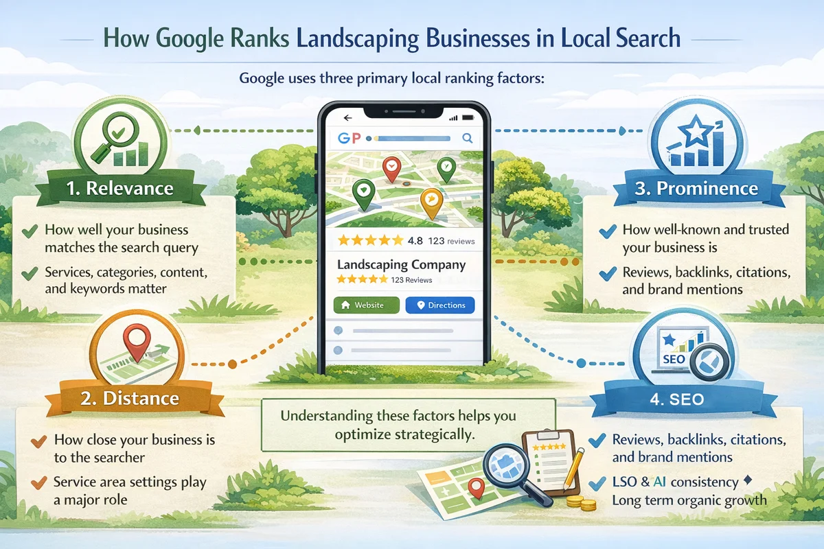
Why Local SEO Matters for Dental Clinics
Local SEO isn’t optional anymore — it directly impacts patient acquisition.
Key Benefits
- Higher patient bookings from local searches
- Better visibility in Google Maps
- More website traffic and calls
- Builds trust and credibility
- Higher ROI than traditional advertising
According to industry data, most people searching for local healthcare services visit or contact a business within 24 hours. That means ranking locally equals immediate revenue.
How to Do Local SEO for Dentists (Step-by-Step)
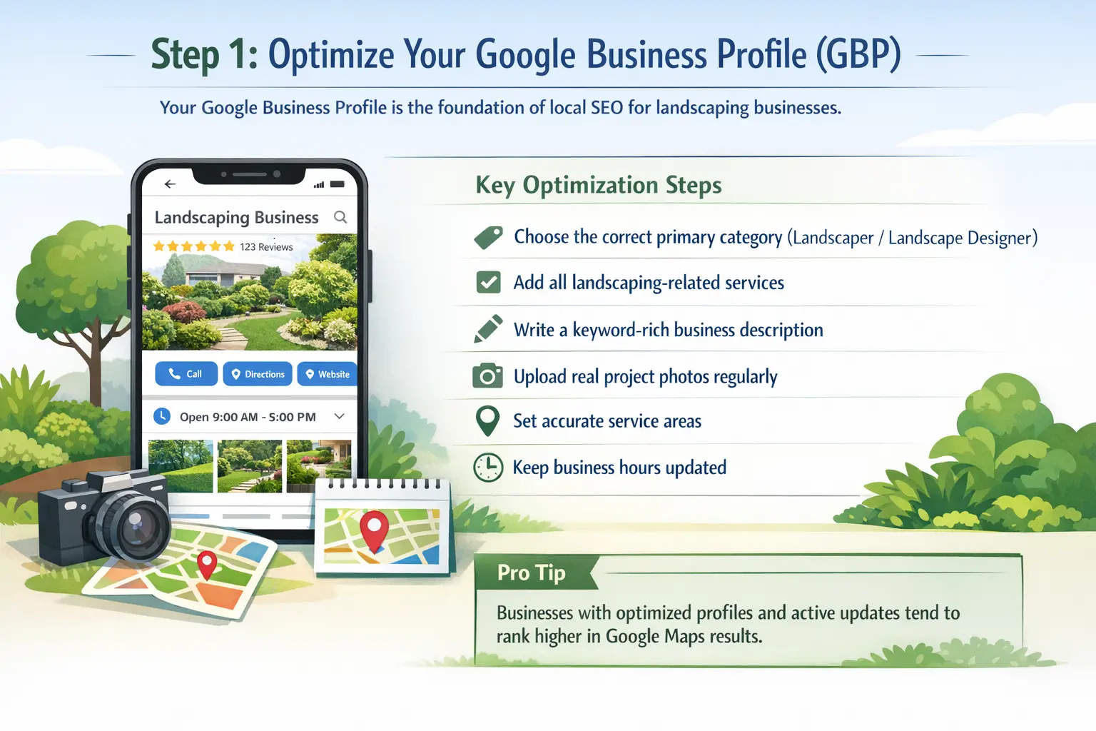
1. Optimize Your Google Business Profile (Most Important Step)
Your Google Business Profile is the foundation of dental local SEO. It determines whether you appear in the Google Map Pack.
Optimization Checklist
- Use your exact business name
- Add accurate address and phone number (NAP)
- Select correct category: Dentist
- Add clinic hours
- Upload clinic photos and videos
- Add services (teeth cleaning, implants, orthodontics)
- Write keyword-rich business description
- Enable appointment booking
- Post weekly updates
Pro Tip
Include keywords like:
- dental clinic in [city]
- cosmetic dentist [city]
- family dentist near me
This significantly improves local rankings.
2. Target High-Intent Local Keywords
To rank for “dentist near me” searches, your website must include high-volume local keywords naturally.
Where to Use Keywords
- Page titles
- Meta descriptions
- H1/H2 headings
- Service pages
- Blog content
- Image alt text
- URLs
Create separate pages for each dental service and location to maximize visibility.
3. Create Location-Specific Landing Pages
If your dental practice serves multiple areas, create dedicated pages like:
- Dentist in Miami
- Dentist in Brooklyn
- Emergency Dentist in Dallas
- Pediatric Dentist in Chicago
What to Include
- Location-based keywords
- Patient testimonials from the area
- Local landmarks
- Service details
- Google Map embed
- Contact details
This helps search engines connect your clinic with specific geographic areas.
4. Build Local Citations & Directory Listings
Local citations are mentions of your business across the web.
Important Dental Directories
- Google Business Profile
- Yelp
- Healthgrades
- Zocdoc
- Yellow Pages
- Bing Places
Consistency in Name, Address, Phone (NAP) across all platforms is critical for rankings.
5. Get More Patient Reviews (Major Ranking Factor)
Reviews directly influence local rankings and patient trust.
How to Get More Reviews
- Ask satisfied patients after treatment
- Send SMS/email review requests
- Place QR codes in clinic
- Respond to all reviews professionally
Clinics with more positive reviews rank higher in local results.
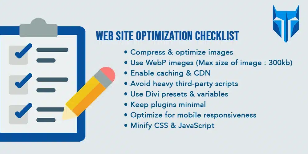
6. Optimize Your Website for Local SEO
Your website must clearly show your location relevance.
Website Optimization Tips
- Add location in title tags
- Include schema markup
- Display contact details on every page
- Embed Google Map
- Create FAQ sections
- Optimize images and speed
- Ensure mobile-friendly design
Local SEO and technical SEO work together to improve rankings.
7. Create Helpful Blog Content
Blog content helps you rank for informational searches and builds authority.
Blog Ideas for Dentists
- How to choose the best dentist in [city]
- Teeth whitening cost guide
- Emergency dental care tips
- Dental implant benefits
- Oral health tips
Regular blogging improves organic traffic and AI overview visibility.
8. Build High-Quality Local Backlinks
Backlinks remain a powerful ranking factor.
Ways to Get Local Backlinks
- Sponsor local events
- Partner with nearby businesses
- Local news features
- Guest blogging
- Local chamber of commerce listings
Quality links signal trust to search engines.
9. Optimize for “Near Me” Searches
“Near me” searches use proximity, relevance, and authority.
How to Rank for Dentist Near Me
- Accurate business address
- Strong Google Business Profile
- Location keywords in content
- Local backlinks
- Positive reviews
- Mobile optimization
Google prioritizes businesses closest to users with strong authority signals.
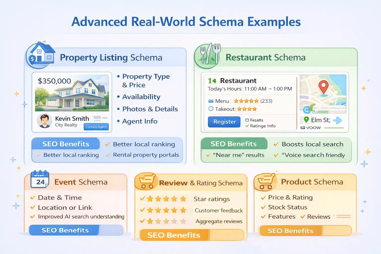
10. Implement Schema Markup for Dental Practices
Schema helps search engines understand your business better.
Recommended Schema Types
- Local Business schema
- Dentist schema
- FAQ schema
- Review schema
- Organization schema
This increases chances of rich results and AI overview visibility.
Advanced Local SEO Strategies for Dentists
Voice Search Optimization
Many users search via voice assistants.
Optimize for conversational queries:
- “Where is the best dentist near me?”
- “Affordable dentist open now”
- “Emergency dental clinic nearby”
Use natural language and FAQ sections.
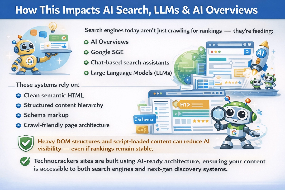
AI Search & LLM Optimization
To rank in AI-generated answers and search summaries:
- Write clear, structured content
- Answer user questions directly
- Use authoritative information
- Include statistics and expertise
- Provide comprehensive guides
Search engines now prioritize helpful, expert-driven content.
Mobile Optimization is Critical
Most local searches happen on mobile devices. Your site must:
- Load under 3 seconds
- Be responsive
- Have click-to-call buttons
- Offer easy navigation
Poor mobile experience reduces rankings.
Common Local SEO Mistakes Dentists Should Avoid
- Ignoring Google Business Profile
- Inconsistent contact details
- No patient reviews
- No location pages
- Slow website speed
- Keyword stuffing
- No content strategy
Avoiding these mistakes alone can improve rankings significantly.
How Long Does Local SEO Take for Dentists?
Typical timeline:
- 1–3 months: Initial improvements
- 3–6 months: Strong ranking growth
- 6–12 months: Dominant local presence
SEO is a long-term investment that generates sustainable patient growth.
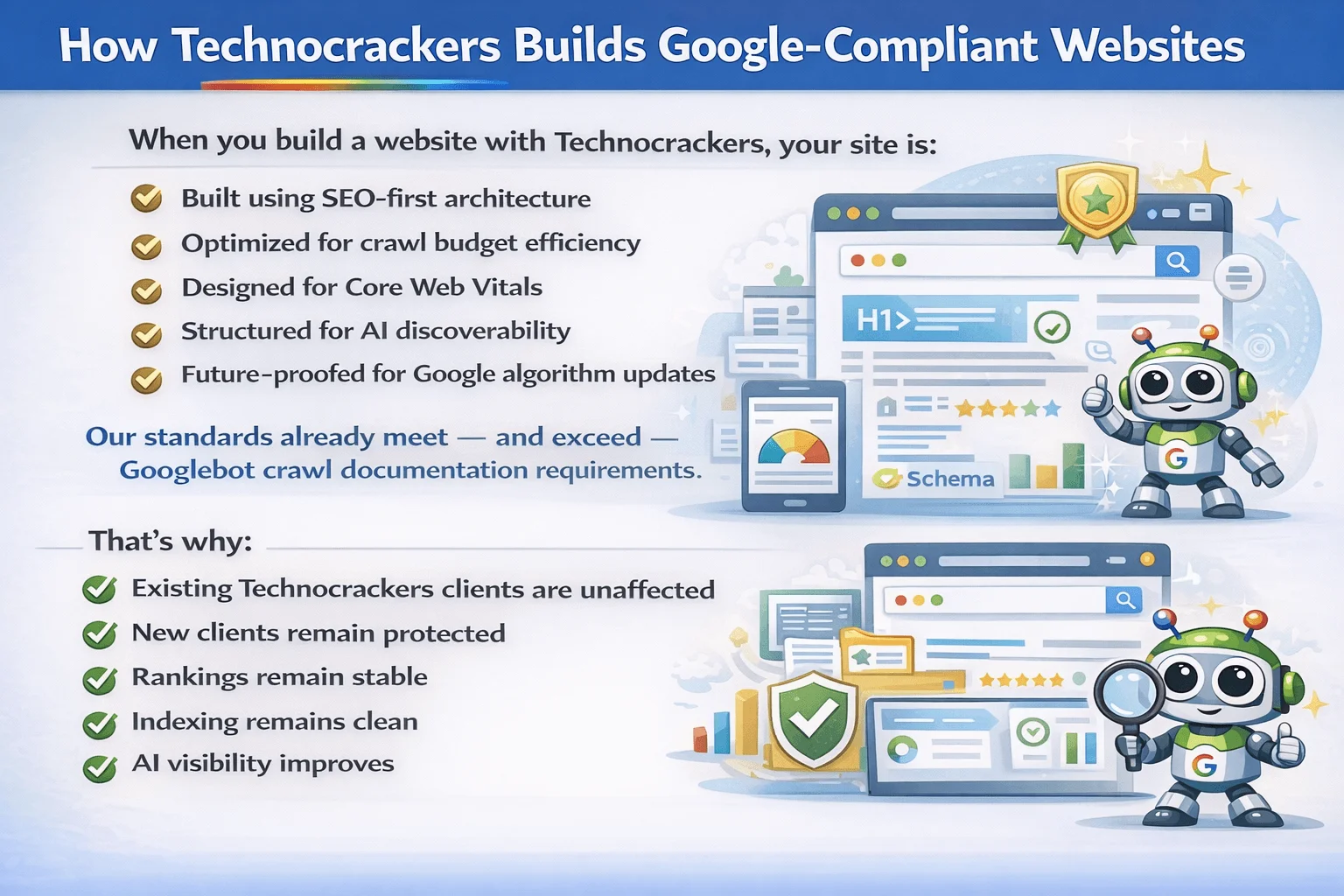
Why Professional Dental SEO Gets Better Results
While dentists can attempt SEO themselves, professional strategies deliver faster and stronger results.
An experienced SEO agency provides:
- Keyword research
- Technical optimization
- Local ranking strategies
- Content marketing
- Link building
- Performance tracking
- AI search optimization
This ensures consistent growth and maximum ROI.
Get More Patients with Complete Dental SEO — Partner with Technocrackers
Ranking for competitive searches like “dentist near me” requires advanced expertise, consistent optimization, and proven strategies. That’s where Technocrackers helps dental practices dominate local search results.
Why Choose Technocrackers?
- Complete SEO strategy for dental clinics
- Local SEO and Google Maps ranking expertise
- High-converting keyword targeting
- Technical SEO optimization
- Authority backlink building
- AI search & LLM optimization
- Transparent reporting and measurable results
If you want more patient bookings, stronger online visibility, and long-term growth, our team delivers results-driven SEO solutions tailored specifically for dentists.
Request your free SEO consultation today and grow your dental practice with Technocrackers.


